At a glance
Taskbroz is a two-sided marketplace concept connecting people who need small jobs done with people who can do them. Job discovery, structured bidding, communication, task management, payments, verification, and reputation live in one mobile experience. As the sole product designer and researcher, I owned the end-to-end process — problem framing, user research, synthesis, interaction design, visual system, and branding.
The propositionMake small, local, real-world work feel as easy to discover and manage as ordering something online.
I started from a simple hypothesis:
If Taskbroz can reduce uncertainty around who, what, when, and how much, users will feel more comfortable hiring and completing small jobs through the platform.
That led to four product pillars:
Discoverability
Help customers find relevant tasks, and help taskers find work that fits their skills, location, availability, and price expectations.
Trust
Make identity, verification, experience, ratings, completion history, and payment status visible at the moments when users need reassurance.
Negotiation
Replace uncomfortable phone-based back-and-forth with a structured bidding model.
Completion
Connect assignment, communication, payment, and feedback so every transaction has a clear beginning and end.
Honest framingTaskbroz is a product design concept, not a shipped product. What it demonstrates is research synthesis, system thinking, and senior-level trade-off decisions — not measured product metrics, which are not claimed.
The problem
Small jobs have a surprisingly large trust problem
Hiring someone for a small task sounds simple:
“I need this done. Who can do it?”
In reality, the user has to answer several questions before they feel comfortable moving forward:
- Is this person actually capable of doing the job?
- Can I trust them in or around my home?
- Did I explain the task clearly enough?
- Is the price reasonable?
- What happens if the job changes?
- How do I know the person will show up?
- Where do we communicate, and how do I pay?
- What happens if something goes wrong?
Existing freelancer platforms solve parts of this problem, but their interaction models assume larger, remote, or primarily digital projects. Taskbroz was an exploration of a different proposition — a marketplace where the job itself becomes the shared source of truth, and trust is built into the transaction rather than bolted on as a profile feature.
Research
I researched both sides of the marketplace
Because Taskbroz is a two-sided marketplace, interviewing only customers would have produced an incomplete product.
The conversations were initially structured around two themes — hiring someone for a job, and finding or applying for work. As the research progressed, a third theme became increasingly important: payment and what happens after the job is completed.
I explored:
- How people currently find workers
- How taskers currently find small jobs
- What makes someone trustworthy
- What information is needed before hiring
- How users communicate requirements
- How people negotiate price
- How workers track completed jobs
- How customers and taskers handle payment
- What happens when expectations are unclear
What I learned
Five findings that reshaped the product
Trust is not a profile feature. It is a product flow.
People did not simply want to see a rating. They wanted enough evidence to answer: “Can I safely trust this person with this particular job?” That shifted the work from “add ratings” to a broader trust system — identity and verification, completion rate, ratings and reviews, previous work context, payment verification, clear job details, and structured communication. Design implication: trust signals need to appear at decision points, not be hidden in a profile.
Small jobs are difficult to describe over a phone call
Moving furniture, installing something, cleaning, or creating a small design may require images, files, location, timing, specific requirements, and price expectations. Phone calls are flexible, but they leave very little structured information behind. Design implication: the job itself needed to become the shared source of truth.
Taskers need discovery, not another job board
For workers, the problem was not simply “find a job.” It was “find a job that is worth my time.” Location, price, availability, task type, and competition all matter — which led to location-based discovery, availability states, price filters, competitive and open task states, sorting, and map-based exploration.
Negotiation creates friction
For small jobs, a fixed price can be difficult to establish before the task is fully understood — but negotiating by phone or text creates too much back-and-forth and too little structure. Instead of “How much would you charge?”, the platform could support an explicit model: task price → service fee → worker receives → submit offer.
Payment is part of the job experience
Payment could not be treated as an isolated checkout screen. Users also need to understand which payment method is being used, what they paid, what they earned, payment history, deposits and withdrawals, rewards, and verification status. Design implication: Taskbroz needed a lightweight financial layer rather than simply a “Pay” button.
The reframe
From job board to transaction system
The initial problem sounded like:
“How might we help people find someone for small jobs?”
After research, the more useful problem became:
“How might we reduce uncertainty across the entire small-job transaction — from discovering the job to agreeing on a price, completing the work, getting paid, and leaving feedback?”
That reframing significantly changed the scope of the product. Taskbroz was no longer just a marketplace — it became a transaction system for small jobs. I organized the experience around four connected journeys:
Customer
Post → Discover offers → Compare → Assign → Communicate → Complete → Pay → Review
Tasker
Discover → Filter → Review task → Bid → Get assigned → Communicate → Complete → Get paid → Build reputation
Shared trust layer
Verification → Ratings → Completion history → Payment signals → Reporting / help
Financial layer
Payment methods → Task payment → Earnings → Wallet → Points → Withdrawal
This architecture helped prevent the product from becoming a collection of disconnected screens.
Job discovery
List first, map as an exploration mode
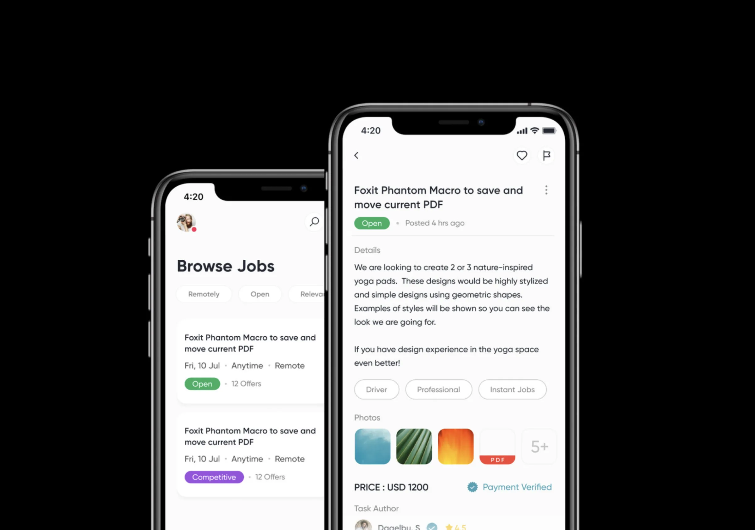
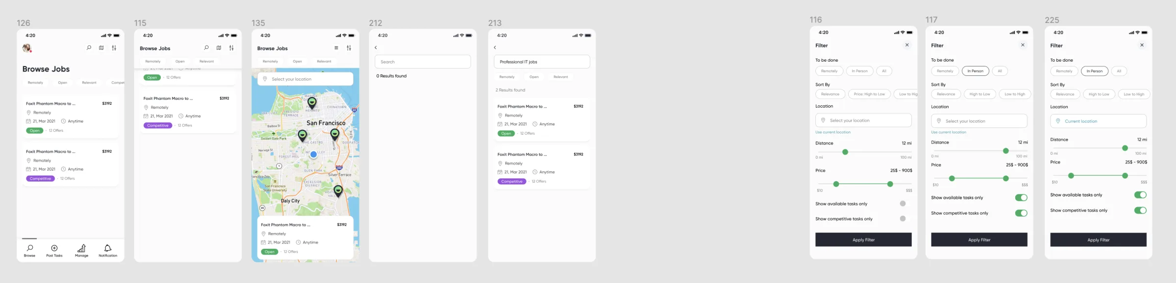
The browse experience was designed to help users quickly scan the market. Task cards surface the information needed for an initial decision — job title, location, timing, price, availability and competition, and the number of offers received.
Trade-off: list vs. map
A map gives immediate spatial context, but it consumes valuable screen space and can visually compete with the actual job information.
Decide: list as the primary surface
Keep the list as the primary discovery surface and treat the map as an exploration mode. Physical proximity matters for many jobs, but information density wins for the default experience.
The filter system explored remote/in-person, location, distance, price range, available tasks, competitive tasks, and sort order. The deeper product principle was:
Give taskers control over whether a job is worth pursuing.
More filters can improve relevance, but they also increase setup cost. The solution was to keep the primary filter categories understandable and use progressive disclosure for more detailed controls.
The job as source of truth
Answering the questions before the conversation starts
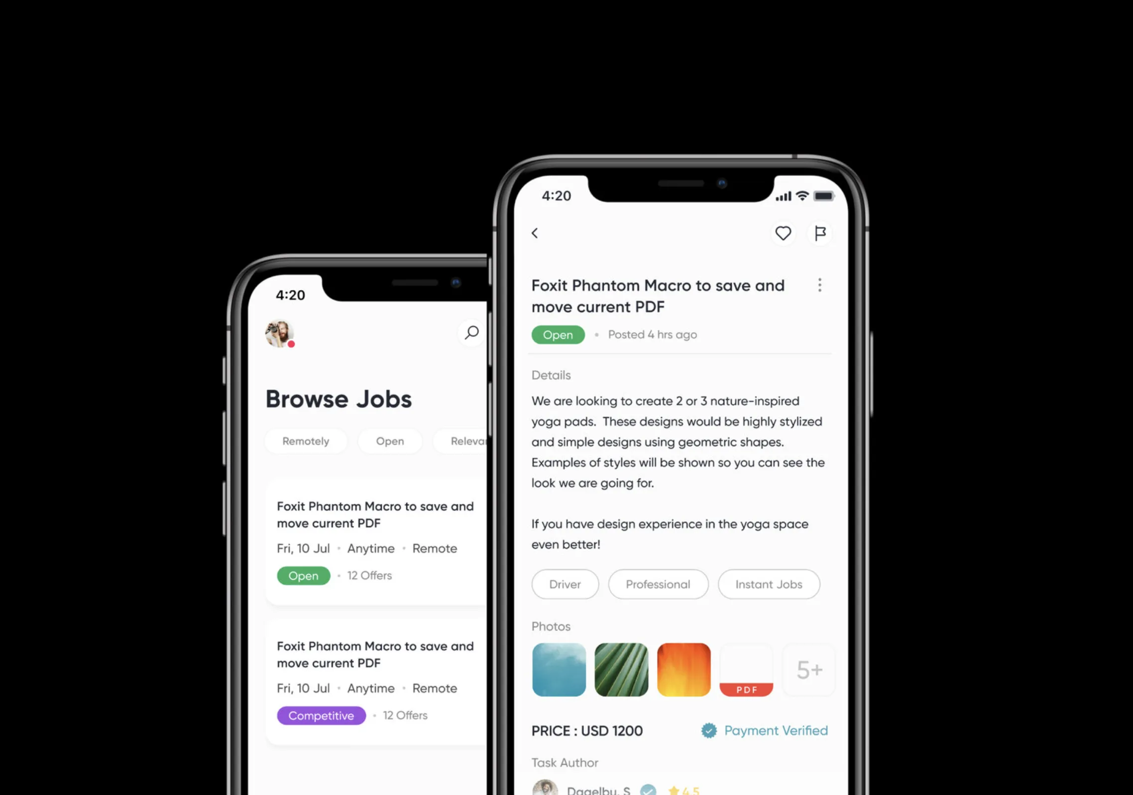
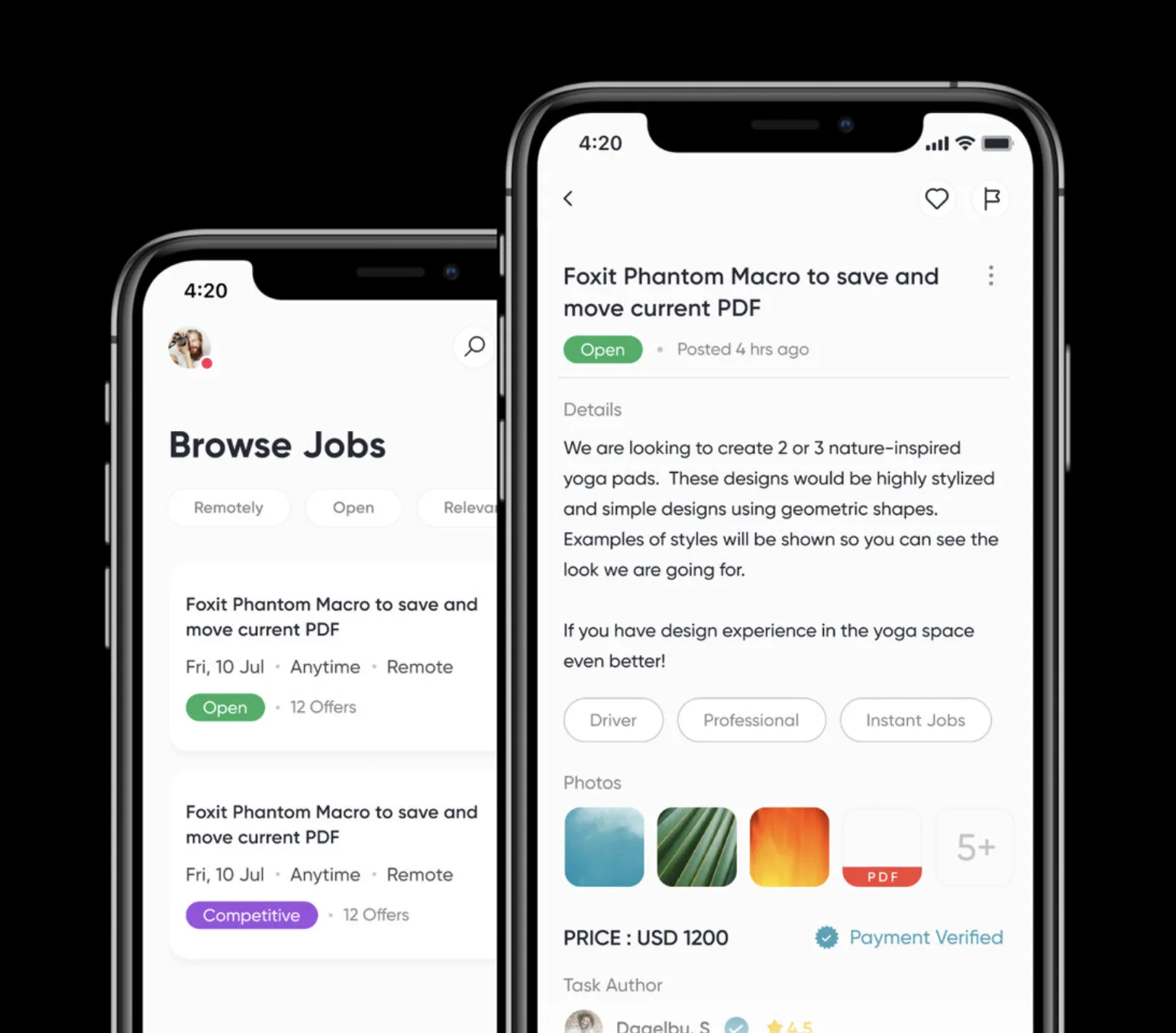
The job-detail screen became one of the most important screens in the product. It brings together description, status, time posted, price, payment verification, photos and files, tags, author, location, offers, comments, and trust signals.
Trade-off: information density vs. decision confidence
Removing too much makes the task ambiguous; showing everything at once makes the screen difficult to scan. I grouped information according to the user's decision sequence:
What is it? → Can I trust it? → What does it cost? → Who is involved? → What are others offering?
Bidding
Structured bidding instead of awkward negotiation
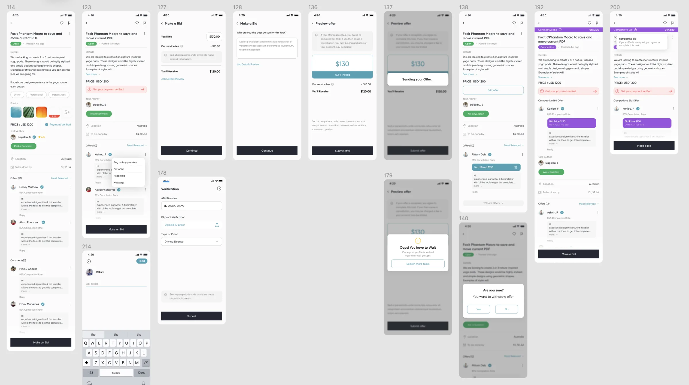
One of the biggest product decisions was introducing a structured bidding model. A tasker reviews the task, chooses a bid amount, sees the service fee, understands the expected payout, adds context, and submits the offer. The customer can then compare offers.
It turns an ambiguous conversation into an explicit transaction — the UI makes the money flow understandable.
Trade-off: transparent bidding vs. race-to-the-bottom pricing
A bidding system can create healthy competition — but it can also encourage workers to underprice themselves. That is a meaningful marketplace risk. The design therefore surfaces reputation, completion rate, and worker context alongside price, rather than presenting the cheapest offer as the only meaningful choice.
Trust & verification
Trust at the decision point, not in the profile
Finding 01 reshaped this part of the product: trust signals need to appear where decisions happen. Verification was connected to the transaction rather than treated as a generic account setting — a tasker provides ABN or identification information, identity proof, and a proof type, and the verified status travels with every offer they make.
Every additional onboarding step can reduce conversion, so the product uses a progressive trust model — it avoids forcing every user through the highest-friction flow before they understand the value of the platform.
Reputation is the long-term trust engine of a marketplace. I explored star ratings, written feedback, completion rate, and reviews from previous transactions — and the difference between:
“This person has 5 stars” vs. “This person is reliable for this type of work.”
Future iterations should make reputation contextual — home cleaning 4.9, furniture assembly 4.7, design 5.0 — which is more useful than a single aggregate number.
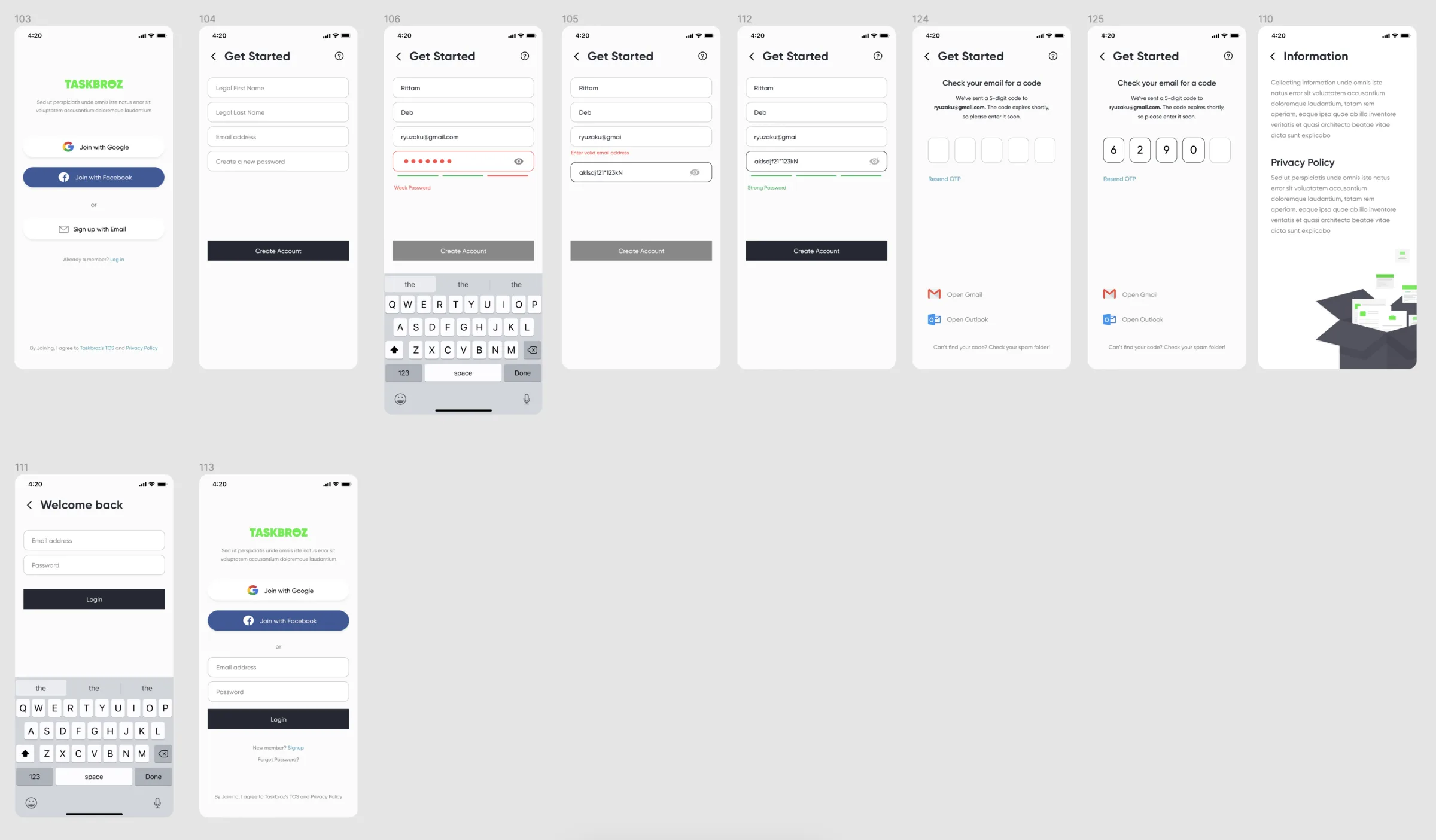
Authentication supports email, Google, and Facebook signup, OTP verification, and password recovery — and the visual language was deliberately lightweight, because authentication is not the product's value proposition. Social login reduces friction; email signup gives the product more direct control over account recovery and communication. The design supports both rather than forcing one path.
Task & offer management
After discovery, the product changes character
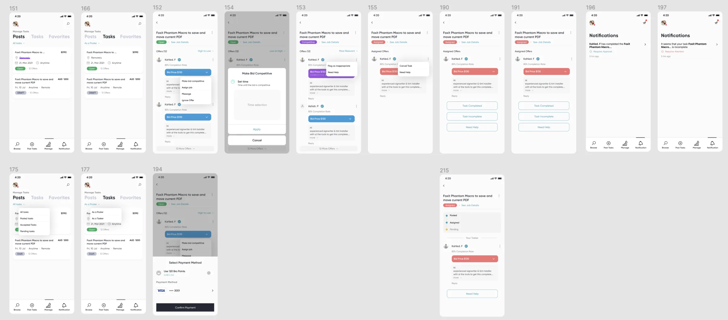
After discovery, the user is no longer browsing — they are managing work. I designed task-management states around Posted, Assigned, Pending, Completed, Incomplete, and Need help — making the task lifecycle visible rather than relying on messages to communicate status.
Trade-off: explicit states vs. flexibility
Real-world jobs are messy, and a rigid state machine can fail when a task changes unexpectedly. But without explicit states, both parties can have different interpretations of what is happening. The compromise keeps the primary workflow structured while providing recovery paths:
- Need help
- Task incomplete
- Cancel or withdraw
- Report
- Contact
For customers, multiple offers create a comparison problem. The offer-management experience supports viewing bidders, comparing completion rates, seeing bids, reviewing responses, assigning a task, withdrawing or changing an offer, and reporting inappropriate content. The goal was to make the decision less about:
“Who is cheapest?” — and more about — “Who is the best fit for this task?”
A marketplace must protect its supply side
A marketplace should not optimize the customer decision at the expense of the supply side. If taskers feel they must constantly underbid each other, quality workers leave. Future iterations should test ranking models that balance price, relevance, reputation, distance, availability, and quality signals — rather than ranking purely by price.
Notifications are part of the transaction. A marketplace cannot rely on users repeatedly checking the app — offer received, offer accepted, task assigned, task completed, review requested, help requested, and payment events need to generate actionable notifications. Each should answer:
What happened? → Why does it matter? → What can I do now?
Payments & wallet
A lightweight financial layer, not just a Pay button
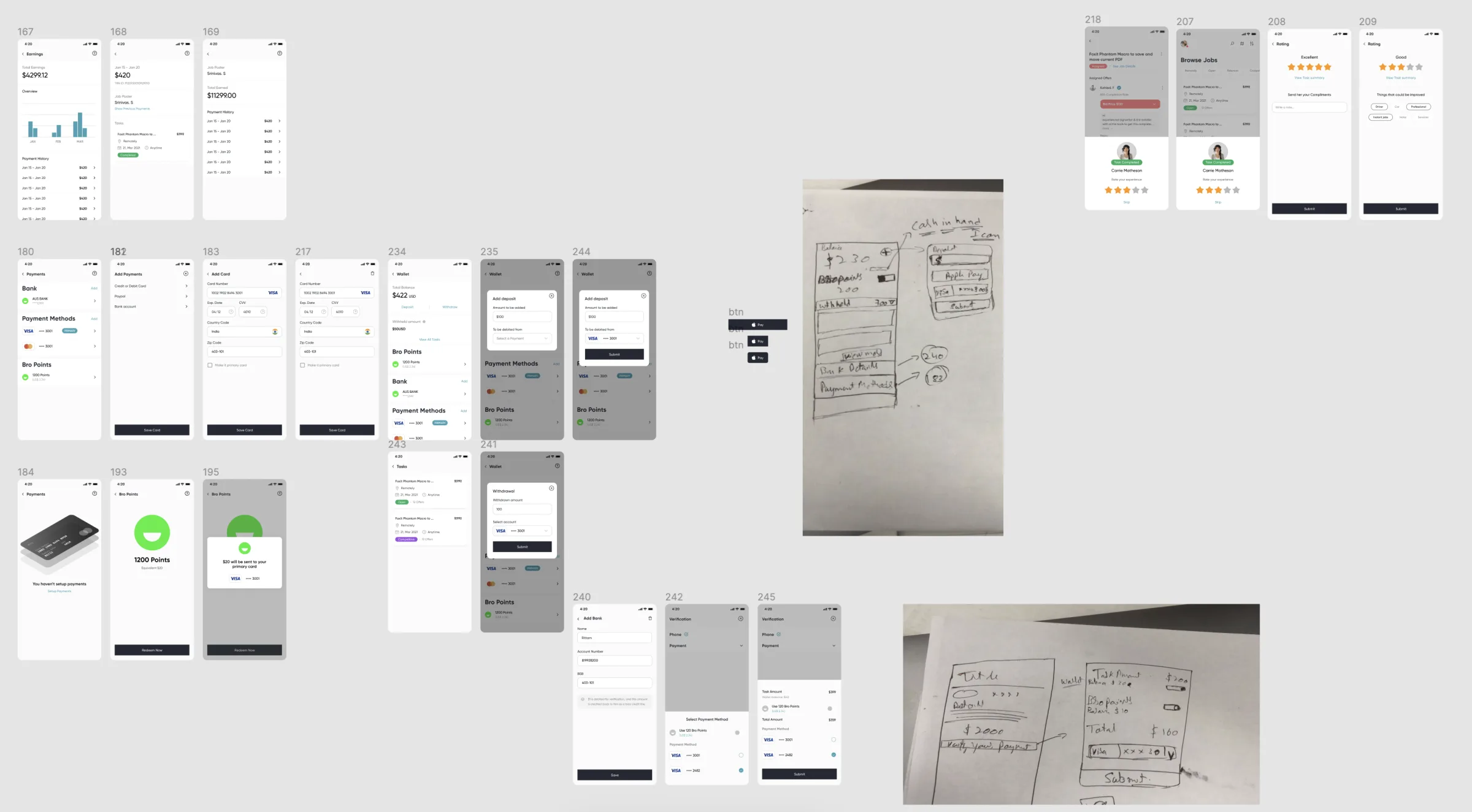
Payment was designed as a broader system: payment methods, adding a card, selecting a payment method, wallet balance, deposits, withdrawals, earnings, payment history, and points or rewards. The wallet gives taskers a persistent view of their financial activity instead of forcing them to reconstruct earnings from individual tasks.
Trade-off: build a wallet vs. outsource payments
Recommendation: simple first, extensible later
For an MVP, keep the underlying payment infrastructure simple while designing the product architecture so a richer wallet can be introduced later. A first-class wallet creates opportunities — earnings visibility, faster repeat transactions, rewards, withdrawal management, and marketplace retention — but it should not gate the first release.
Brand & visual system
Energetic, approachable — not classifieds
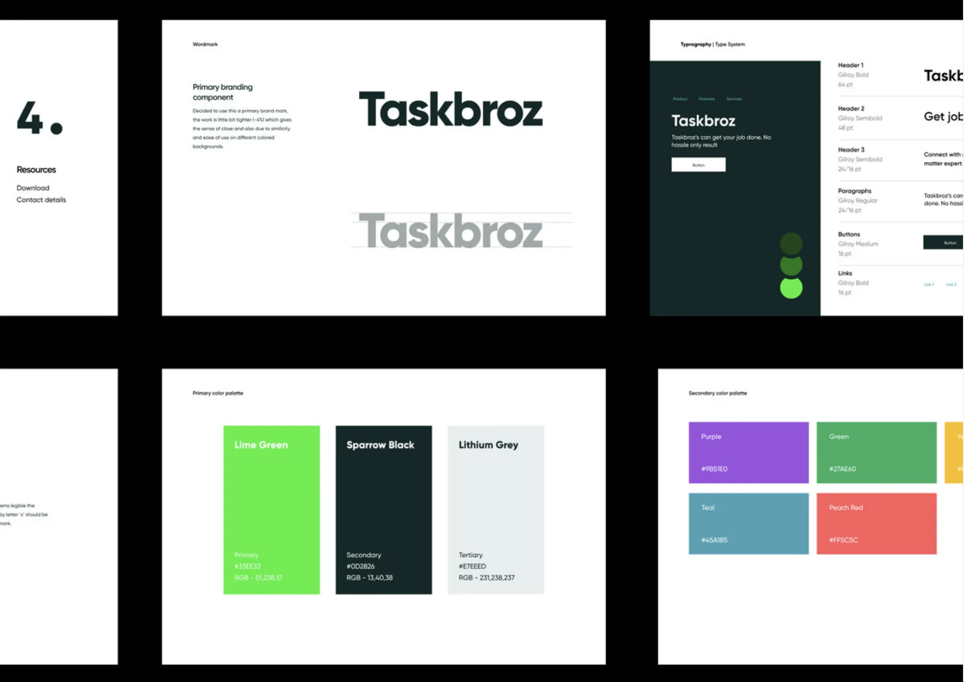
The brand direction was intentionally energetic and approachable. Bright lime green acts as the primary action signal against a dark, grounded neutral — the intention was to make the product feel fast, approachable, useful, and trustworthy, rather than like a traditional classifieds platform.
| Palette | Color | Role |
|---|---|---|
| Lime Green | #33E333 | Primary action signal |
| Sparrow Black | #0D2826 | Dark grounded neutral |
| Lithium Grey | #E7EEED | Secondary surface |
| Purple | #9B51E0 | Secondary palette |
| Green | #27AE60 | Secondary palette |
| Teal | #45A1B5 | Secondary palette |
| Peach Red | #FF5C5C | Secondary palette |
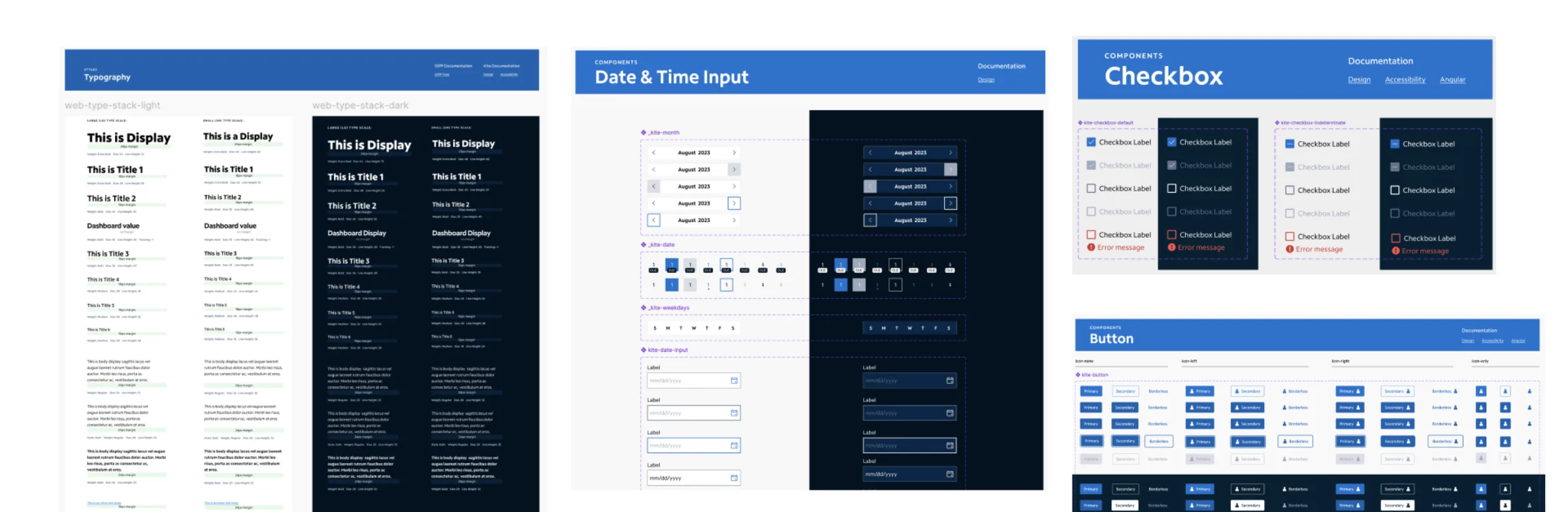
The design system uses Gilroy across headings, subheadings, body copy, buttons, and links — a clear type hierarchy helps the dense marketplace screens remain scannable.
Key product trade-offs
Nine decisions, each a judgment call
Senior product design is as much about deciding what not to build as what to build. The table records the main trade-offs and the direction chosen:
| Decision | Option A | Option B | Direction | Why |
|---|---|---|---|---|
| Discovery | List only | List + map | List + map | Physical proximity matters for many jobs |
| Pricing | Fixed price | Competitive bids | Bids | Small jobs can be difficult to price upfront |
| Communication | Phone / chat | Structured job + chat | Structured job + chat | Keeps critical context attached to the task |
| Trust | Ratings only | Verification + ratings + history | Layered trust | One signal is not enough for high uncertainty |
| Onboarding | Minimal | Verification-first | Progressive verification | Reduces early friction while enabling stronger trust |
| Payment | External checkout | Full wallet | Simple first, extensible later | Avoid overbuilding financial infrastructure |
| Job status | Free-form | Explicit lifecycle | Explicit lifecycle | Reduces ambiguity after assignment |
| Offer ranking | Lowest price | Multi-factor ranking | Multi-factor direction | Protects quality and supply-side health |
| Reviews | Generic stars | Contextual reputation | Contextual direction | Better fit for different job categories |
Taskbroz also deliberately avoided becoming: a generic freelancer marketplace (it is optimized around small, often local jobs); a pure social network (profiles and reviews exist to reduce transaction uncertainty, not to create social engagement for its own sake); a chat-first product (important task information lives in the structured job itself); a price-comparison engine (the cheapest bid is not necessarily the best outcome); and a complex financial application (the wallet supports the marketplace; it is not a banking product).
What I would test next
The concept is not proof of product-market fit
The project is a product design concept, so I would not treat the visual prototype as proof of product-market fit. The next phase would focus on validating the riskiest assumptions:
Will taskers actually bid?
Test fixed-price jobs, suggested-price jobs, and open bidding. Measure offer rate, time to first offer, average number of offers, and task completion rate.
Does verification improve conversion?
Compare minimal-profile → bid against verification → bid. Measure signup completion, verification completion, first-bid conversion, and job acceptance.
What makes customers choose a tasker?
Test ranking combinations of price, rating, completion rate, distance, experience, and response speed. Measure time to assignment, acceptance rate, cancellation rate, and post-task satisfaction.
Does bidding create unhealthy price competition?
Watch for extremely low bids, worker churn, lower task quality, increased cancellations, and disputes. If those signals appear, introduce stronger pricing guidance rather than adding more bidding functionality.
If I were taking Taskbroz from concept to production, I would simplify the first release:
- Post a task with photos, timing & location
- Receive offers
- Compare taskers
- Assign
- Pay
- Review
- Create & verify profile
- Discover & filter tasks
- Bid
- Communicate
- Complete
- Get paid
- Build reputation
- Advanced rewards
- Rich wallet functionality
- Complex map interactions
- Multiple financial products
- Overly detailed profile customization
- Sophisticated social features
This would allow the team to validate the marketplace's most important loop first:
Can we reliably match a person who needs a small job with someone willing and able to do it?
Reflection
Trust is a result, not a feature
Trust is not a feature you add to a marketplace. Trust is the result of reducing uncertainty at every important decision.
For Taskbroz, that meant connecting many small signals:
Clear task → real identity → useful profile → visible history → transparent bid → structured status → secure payment → review
None of these solves trust alone. Together, they make the transaction feel more predictable. The strongest product decisions were not individual screens — they were the connections between screens:
- Job details connect to bidding.
- Bidding connects to verification.
- Verification connects to trust.
- Assignment connects to task states.
- Completion connects to payment.
- Payment connects to reputation.
- Reputation improves future discovery.
What the project demonstrates:
Product thinking
I reframed a broad “find a worker” problem into a transaction and trust problem.
Research synthesis
I looked at both sides of the marketplace and let emerging themes — especially payments and trust — change the product direction.
Systems thinking
The experience covers discovery, matching, negotiation, execution, payment, and reputation as one connected lifecycle.
Interaction design
I designed explicit states, structured bidding, progressive verification, filtering, task management, and financial flows.
Business awareness
I considered marketplace health, supply-side incentives, pricing behavior, onboarding friction, and the cost of overbuilding an MVP.
Visual design
I created a coherent visual language, typography system, color palette, and reusable UI patterns.
Taskbroz started as an idea about helping people find someone for a small job. The deeper design problem turned out to be much more interesting: how do you make an uncertain real-world transaction feel predictable? The answer was not one feature — it was a connected system of discovery, trust, negotiation, task state, payment, and reputation.