At a glance
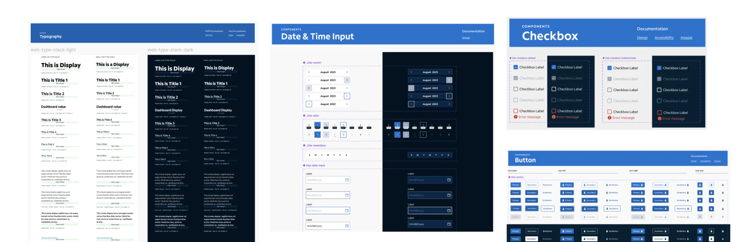
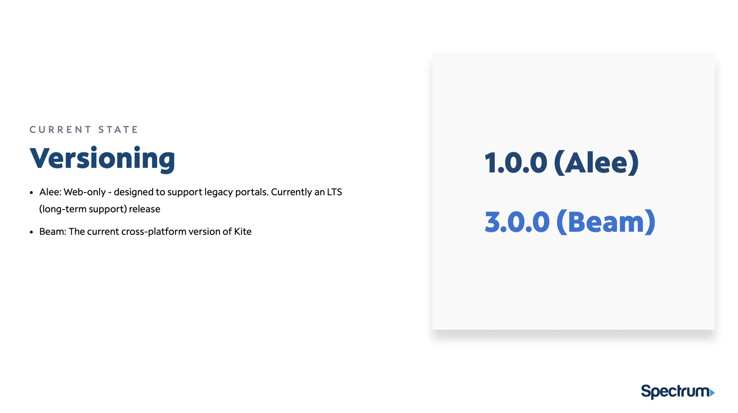
Kite is Spectrum’s second-generation design system, built to replace Alee — a first-generation system that had become a bottleneck. The work unified a fragmented design ecosystem across 10+ product teams, engineering, and product leadership, with the goal of increasing velocity, eliminating technical debt, and fostering a culture of shared ownership.
A design system is not a UI project. It is a change management project.
As a Senior Design Manager, the most valuable work wasn’t designing the buttons — it was designing the workflow: the governance, the documentation culture, and the design–engineering partnership that made the system adoptable.
The problem
Scaling chaos, not just design
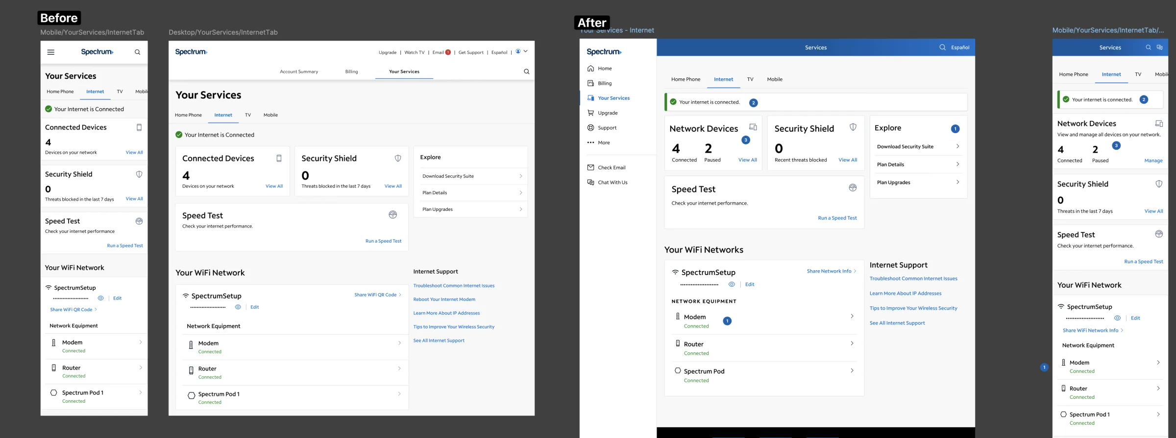
When I stepped into the role, Alee was failing the organization. The issues weren’t just visual inconsistencies — they were systemic organizational bottlenecks. Mapping the before/after comparison made it clear: the UI differed wildly across teams because there was no single source of truth.
The specific pain points were:
- Technical debt — 10+ design teams were maintaining their own custom local components, resulting in hundreds of “rogue” elements that engineers had to code twice.
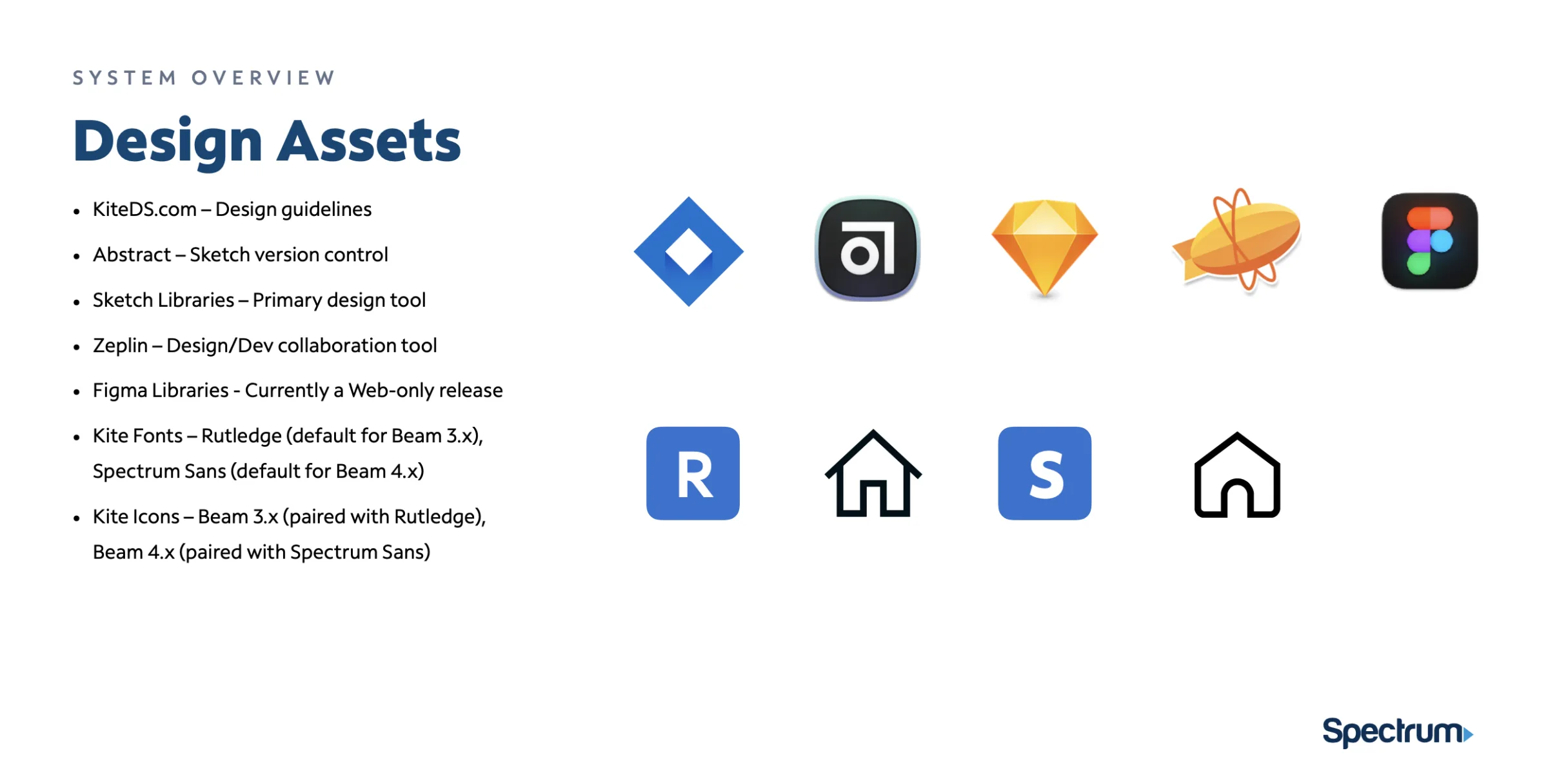
- Tooling fragmentation — the reliance on Sketch, Abstract, and Zeplin created a disjointed, asynchronous workflow.
- The “black hole” effect — new designers had no idea how to use the system correctly because documentation didn’t exist or was outdated, creating an immense onboarding burden.
The strategic shift
Focus on the underbelly
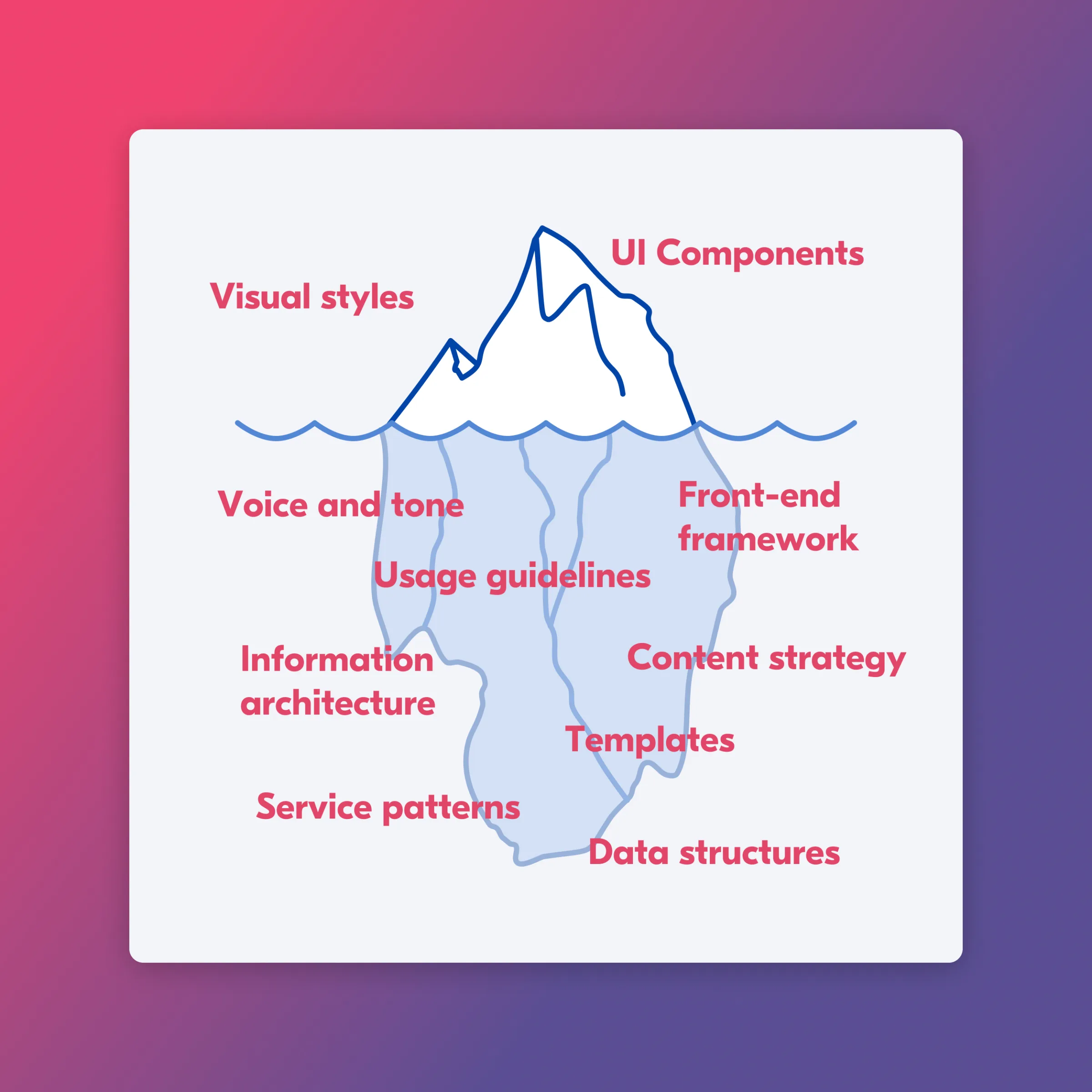
To get executive buy-in, I introduced the Design System Iceberg: while leadership saw the “tip” — the UI components — the actual strategic and operational failures were hidden deep beneath the surface, in the voice and tone, usage guidelines, data structures, and architecture. My strategy was to rebuild the hidden infrastructure first.
The migration trade-off: Sketch → Figma
To enable the rebuild, I made a strategic executive decision to migrate to Figma.
The trade-off
Deeply unpopular initially — senior designers were highly proficient in Sketch and frustrated by the learning curve.
Why it was worth it
I framed this as an investment in governance, not aesthetics. Figma’s branching and centralized library capabilities were non-negotiable for eliminating the “version spaghetti” that was killing our engineering trust.
Execution · documentation
Phase 1 — documentation as a product, not an afterthought
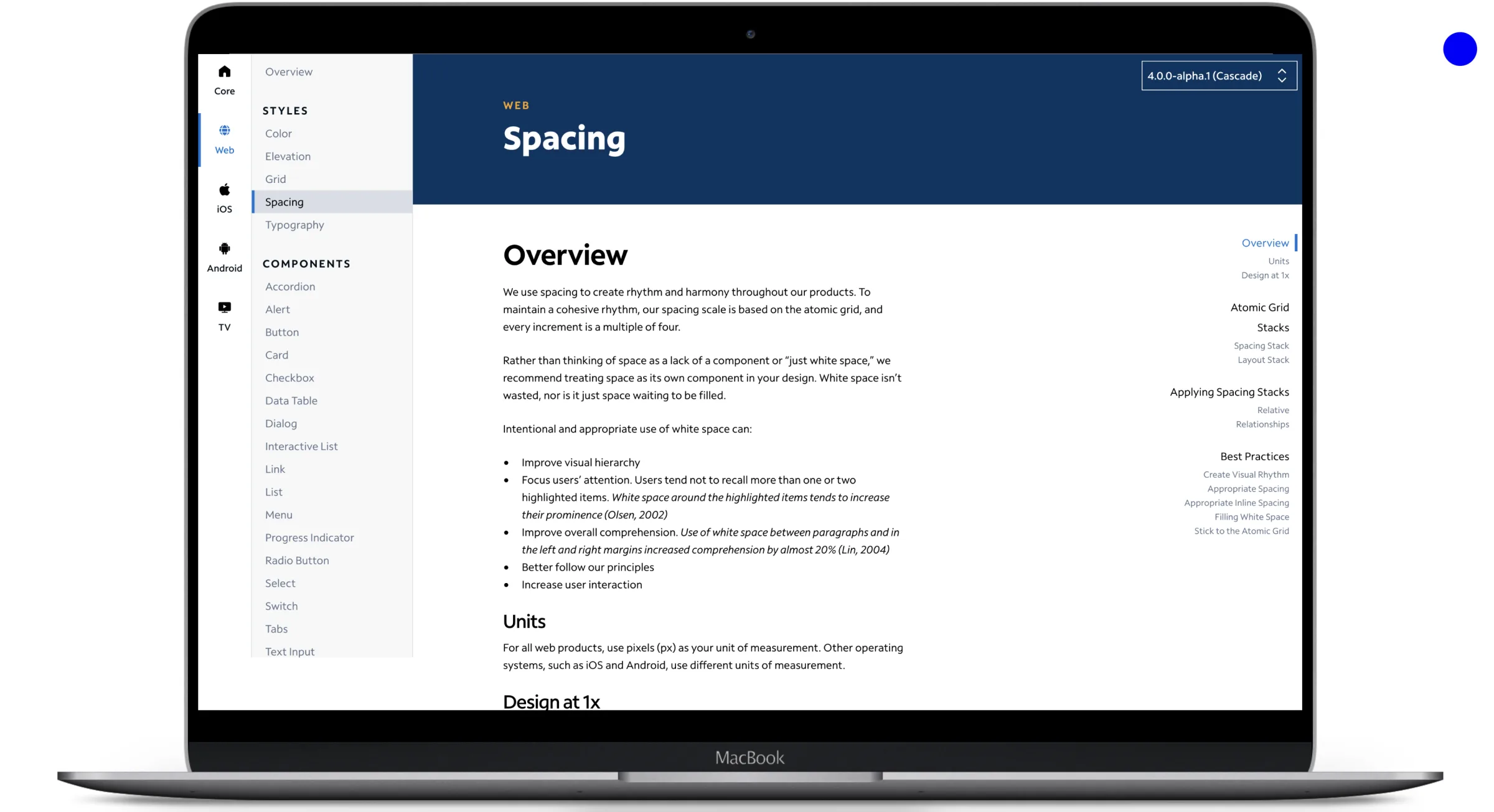
A design system is only as good as its adoption. I prioritized building a comprehensive Figma-based documentation prototype before pushing any new UI, with detailed guidelines for every single component.
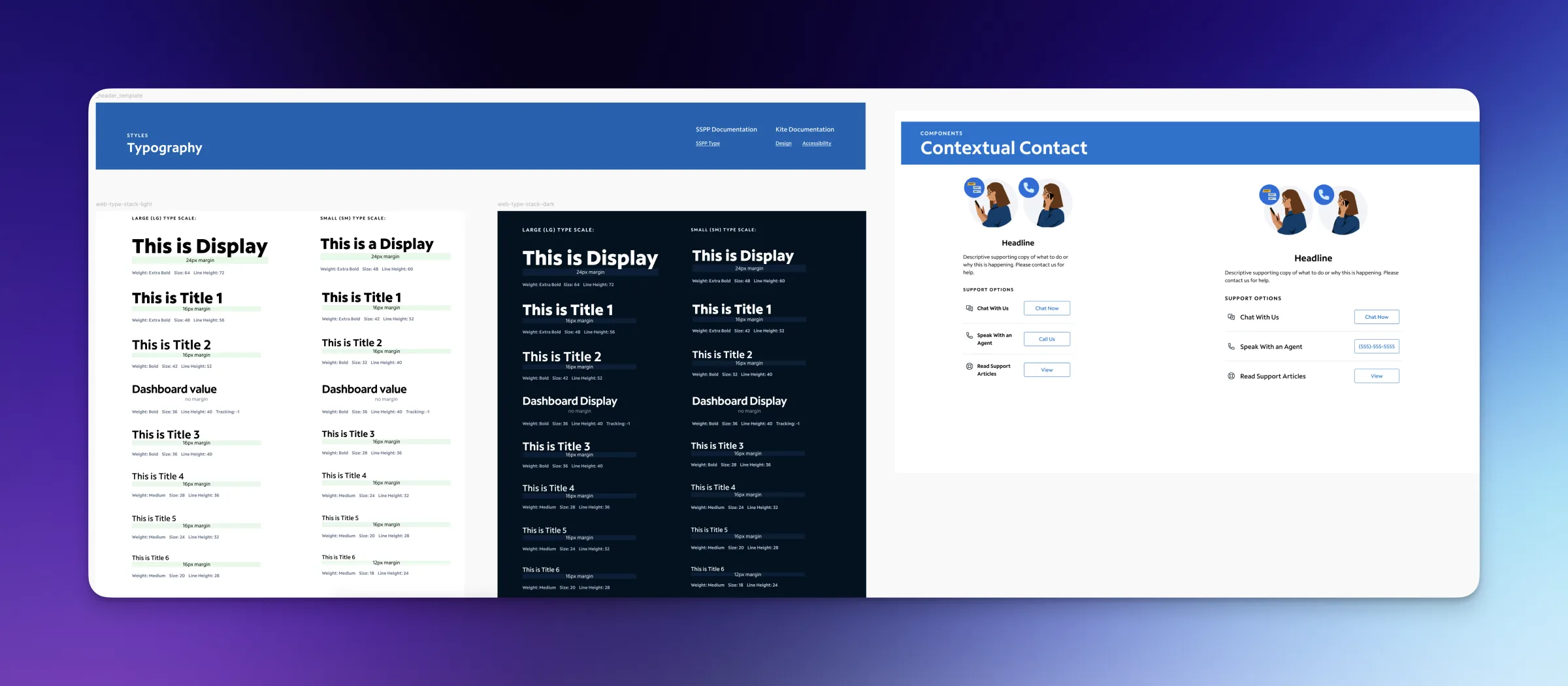
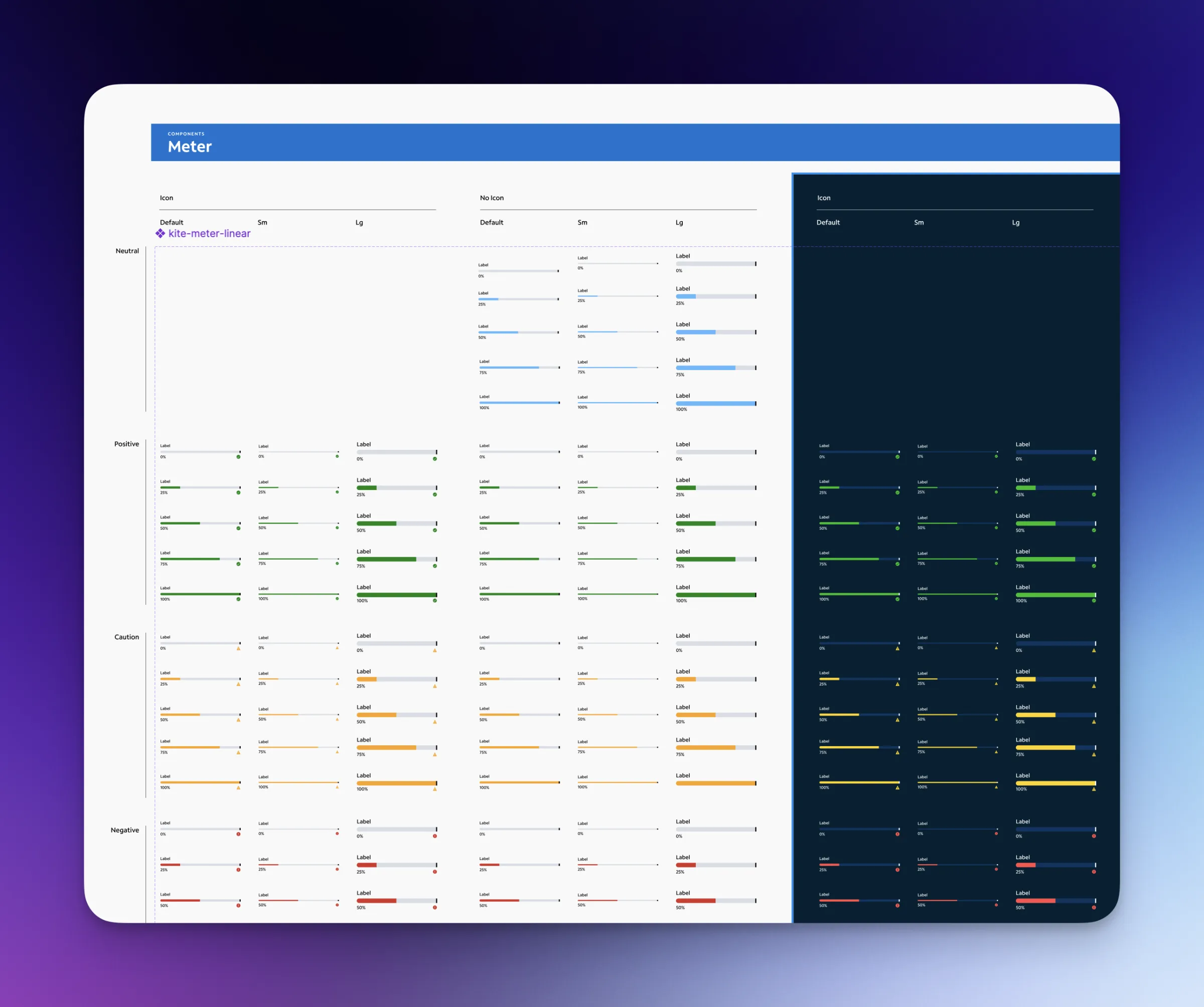
The impactBy clearly defining “Dos and Don’ts,” usage rules, and states, I removed the guesswork from the design process — drastically reducing cognitive load on the teams and speeding up early-stage design work.
Execution · governance
Phase 2 — formalizing governance & the battle against sprawl
To prevent the system from becoming stale again, I introduced a formal governance model using Figma’s branching workflow:
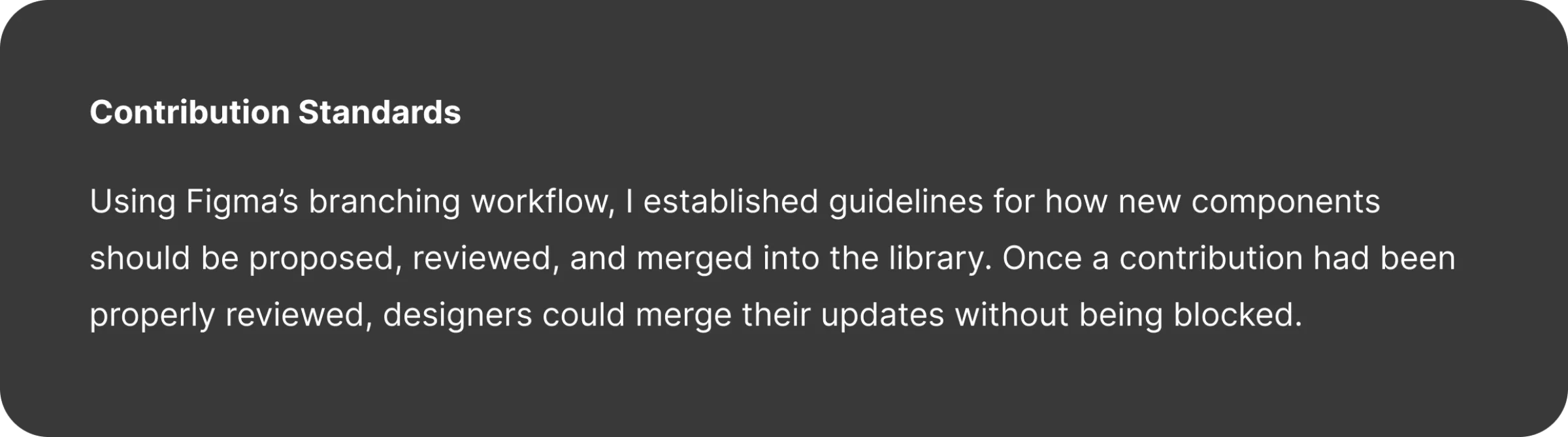
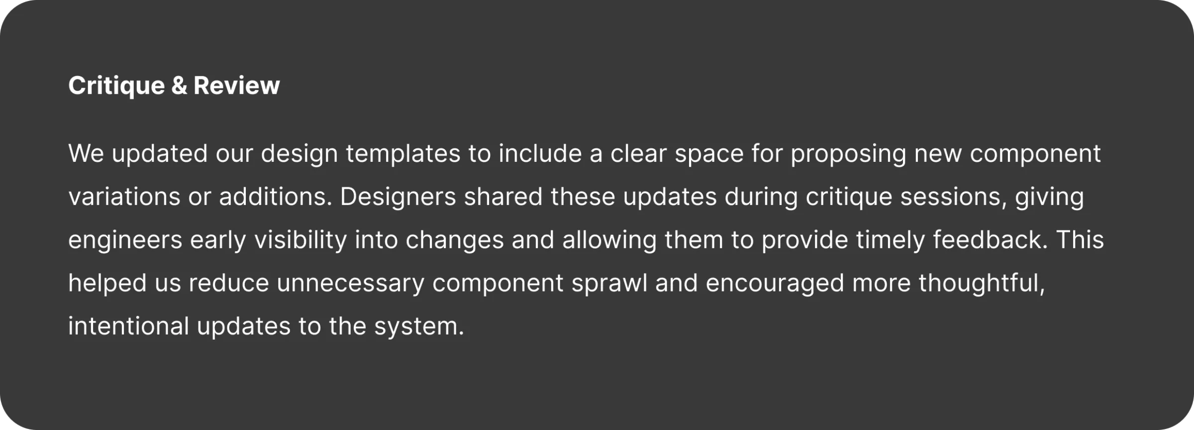
The impactDesigners became contributors rather than consumers. By opening the conversation to engineers early, we radically reduced unnecessary “component sprawl” and ensured only intentional, reusable patterns made it into the final library.
Execution · slot components
Phase 3 — the innovation of “Slot” components
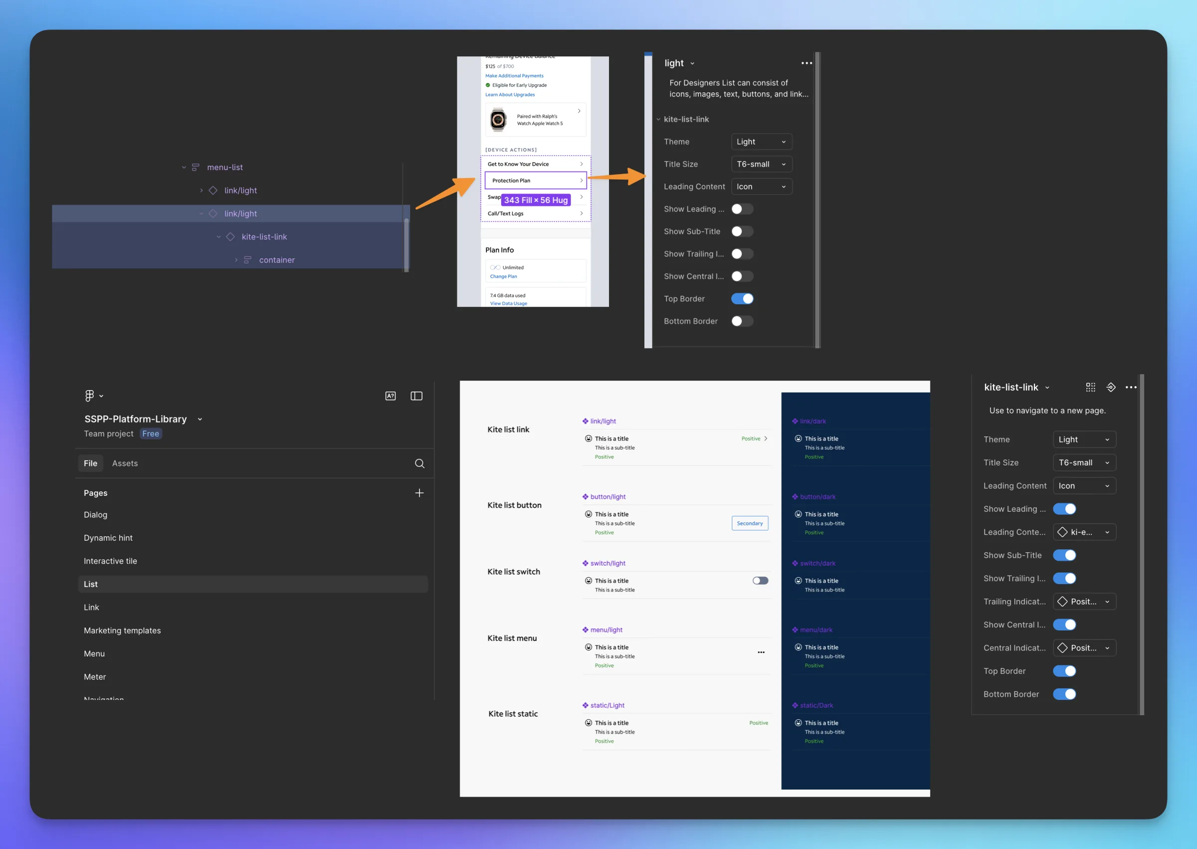
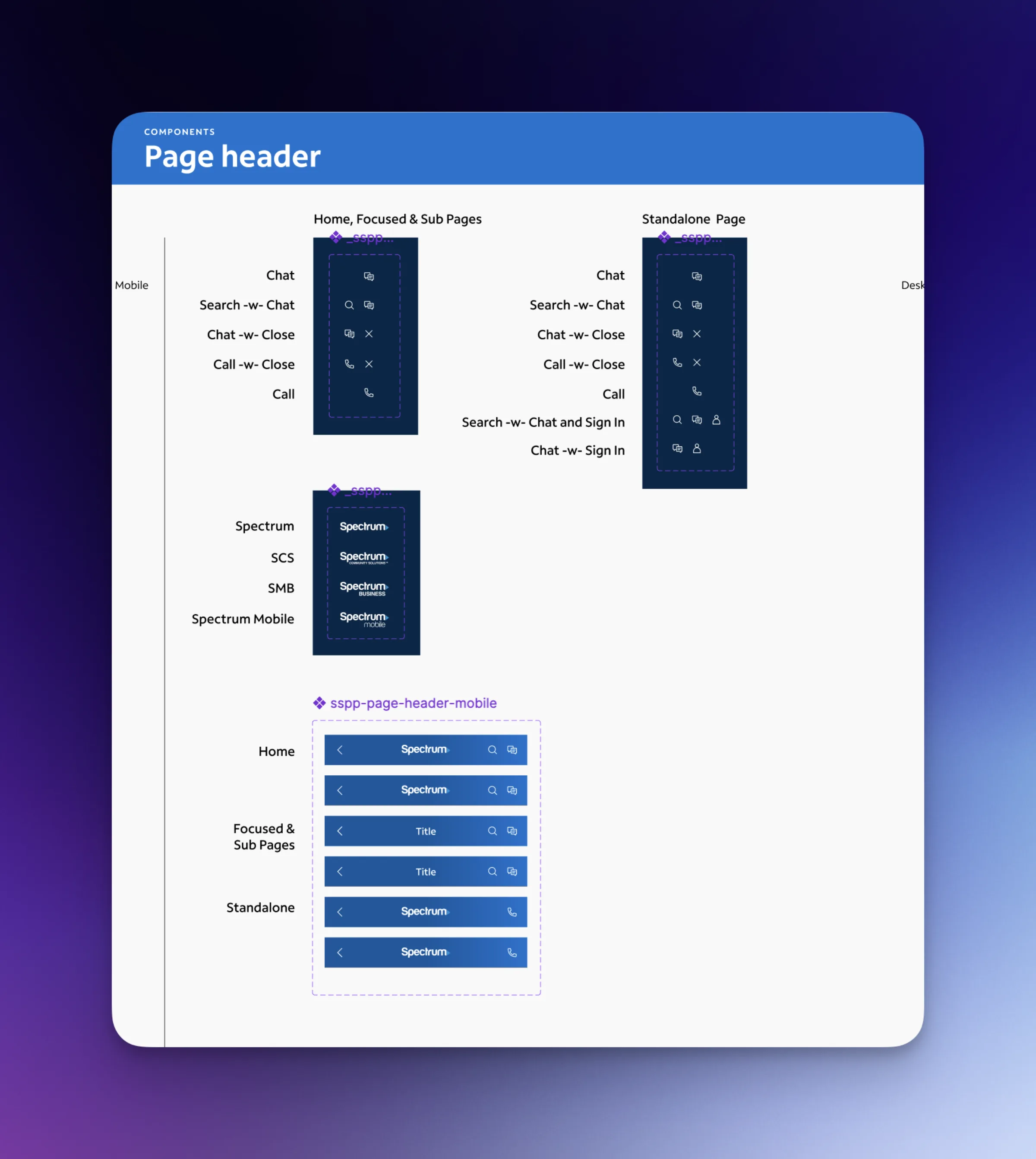
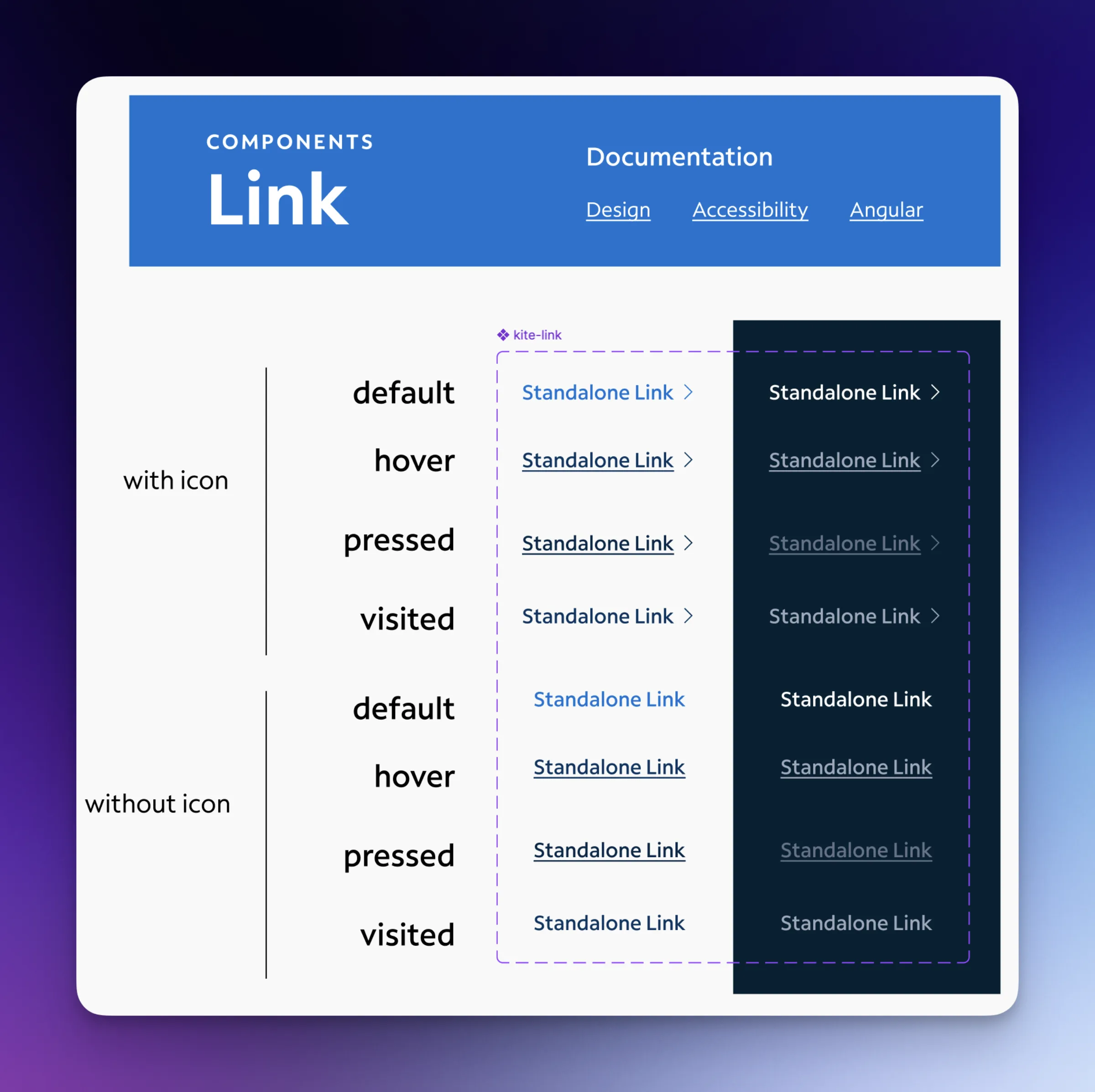
To counter a major user behavior — designers detaching components to customize them — I introduced Slot Components, using Figma’s advanced config features.
The trade-off
Building these complex, nested components took significantly more time than building static ones.
The payoff
The architecture gives designers the flexibility to swap content — changing a card’s header or footer — while keeping the core structural rules intact. The perfect balance of freedom and control: it virtually eliminated the need for designers to break the system.
Execution · engineering partnership
Phase 4 — breaking down the design-engineering wall
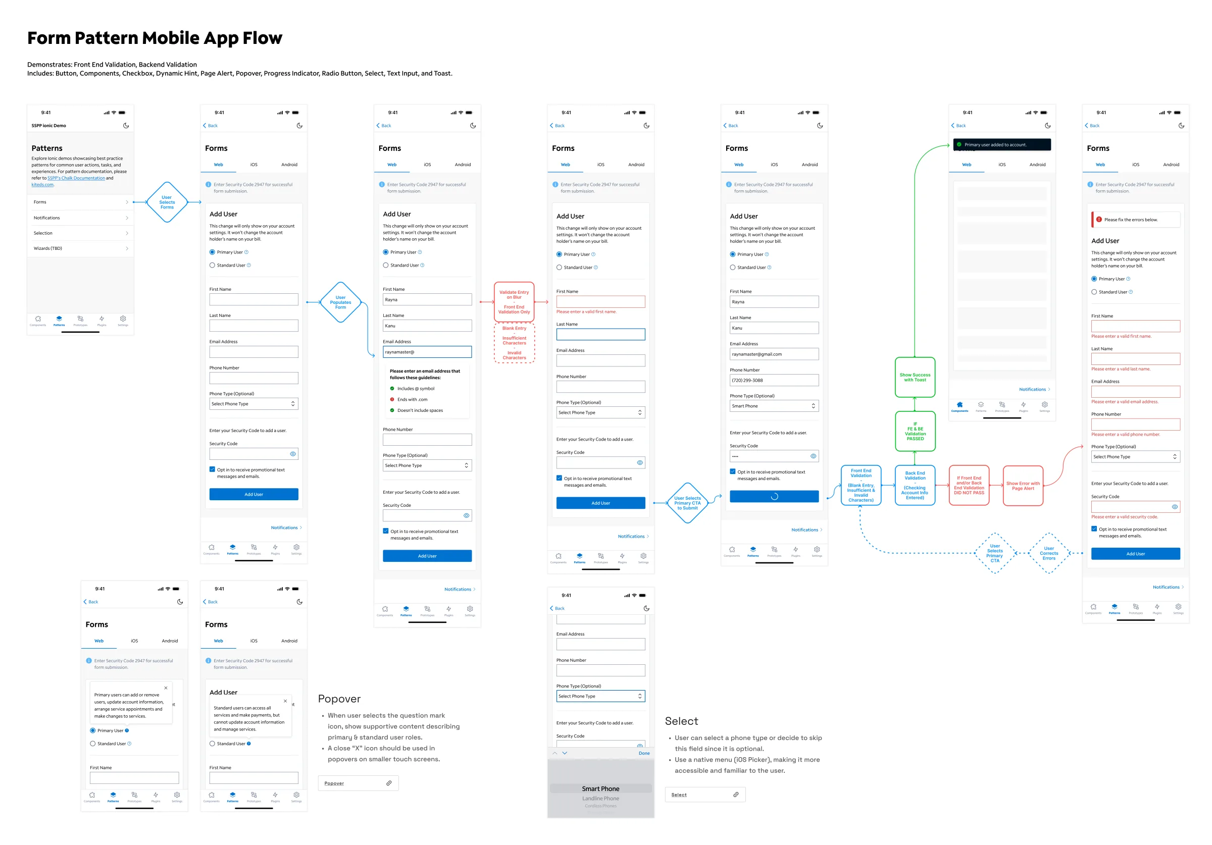
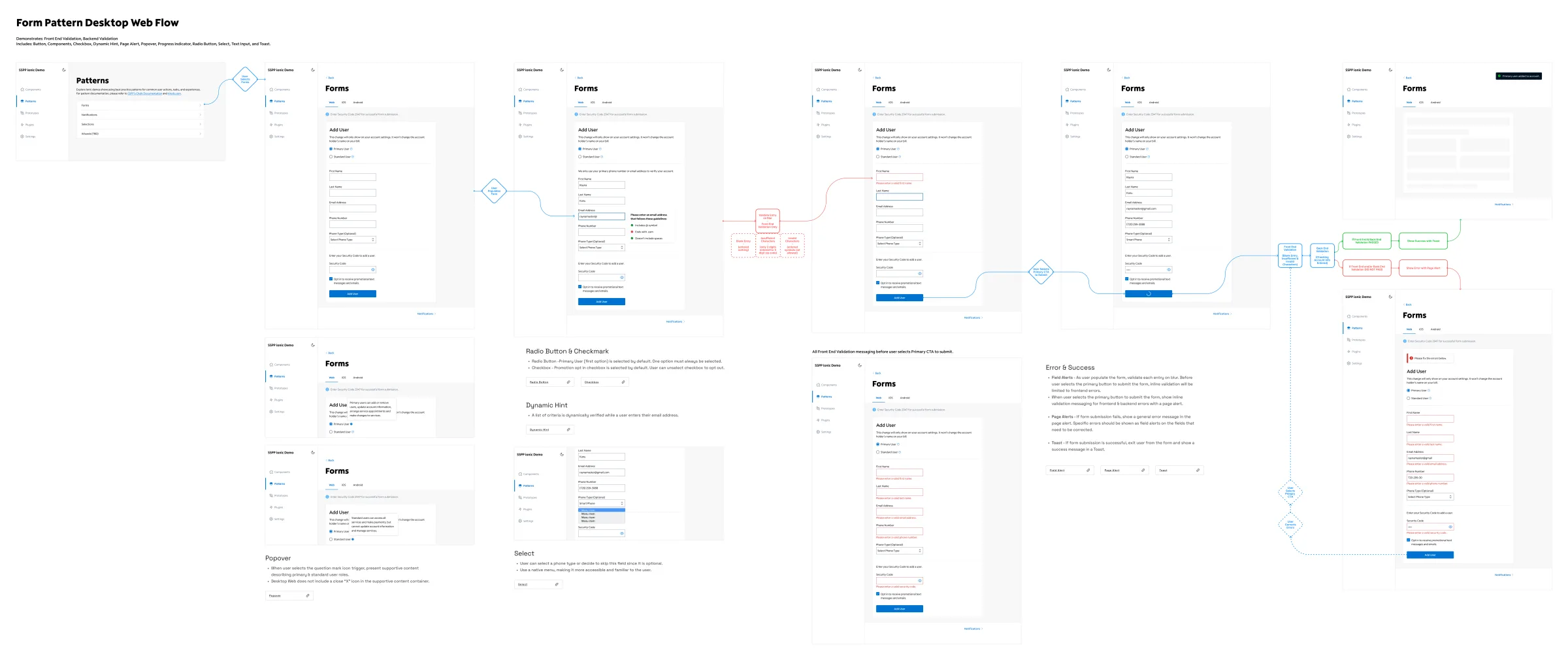
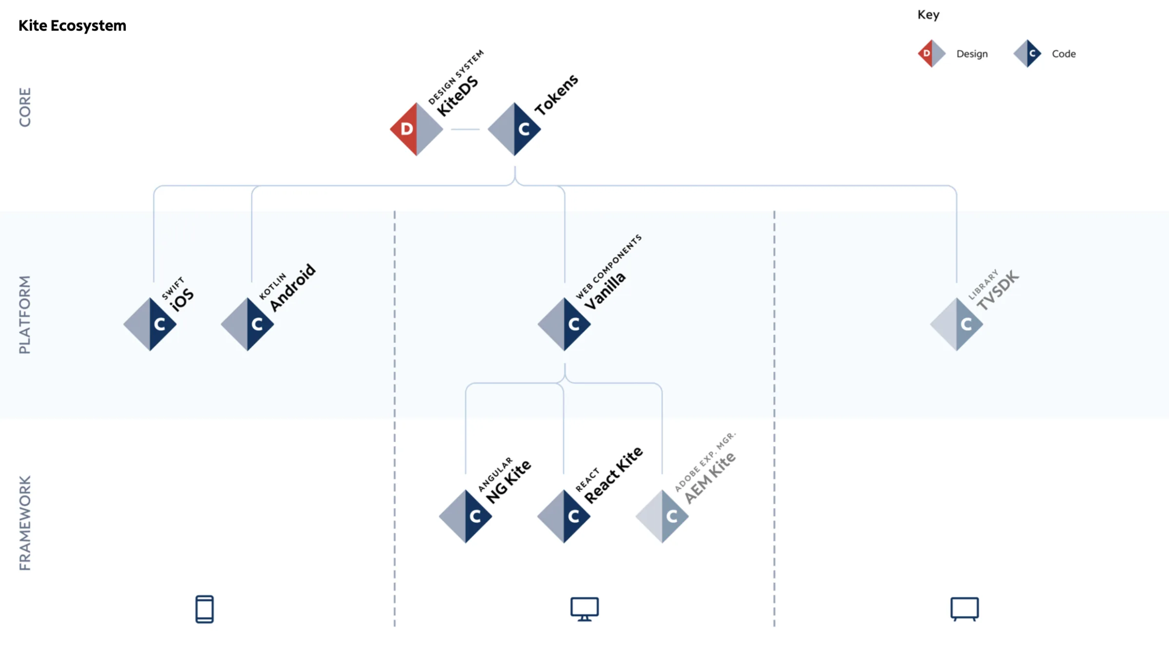
I mapped out the exact Kite Ecosystem to define the relationship between design tokens, core libraries, and cross-platform frameworks. But visually mapping it wasn’t enough.
The most critical strategic move was championing a dedicated front-end engineering role focused solely on the design system.
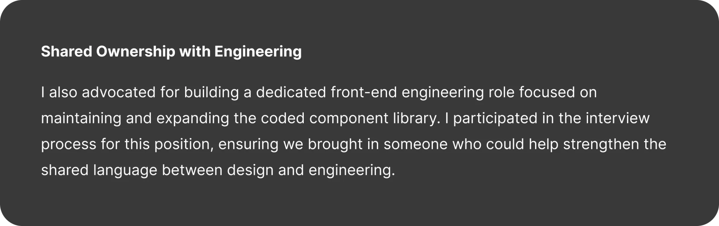
The strategyBy ensuring we hired an engineer specifically for the system’s codebase, we established a single source of truth between the Figma file and the live product — a seamless feedback loop that earned the trust of an engineering org previously burned by inaccurate handoffs.
Results
Measurable organizational impact
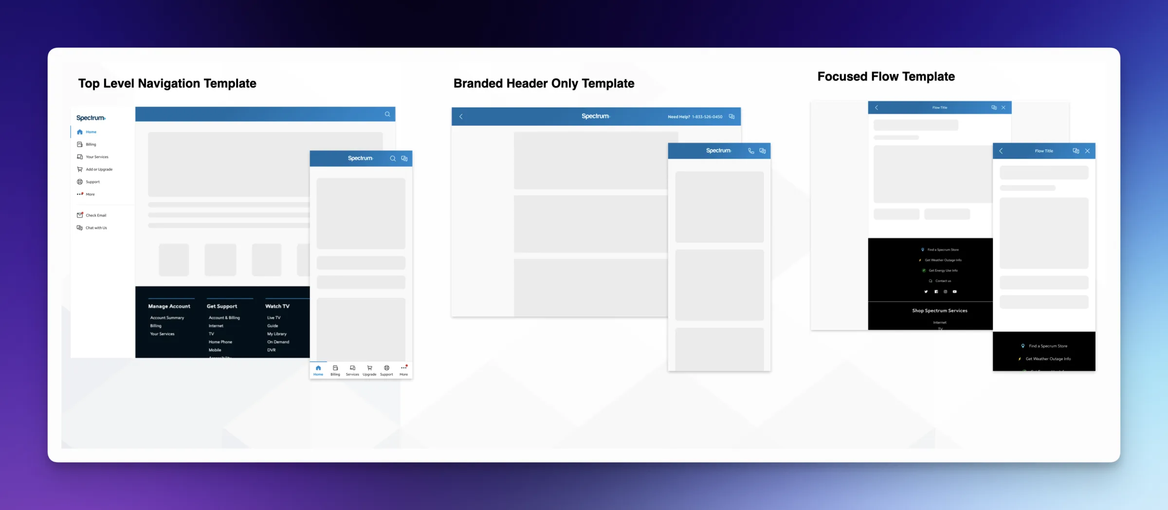
Team sentiment was the most impactful change: designers shifted from feeling isolated in their silos to proactively contributing to the system — they had a voice, and they knew exactly how to use the tool. And trust transformed the relationship with engineering from “handoff” to “co-creation.”
Reflection
Leadership lessons
A design system is a change management project
The hardest problems weren’t visual — they were organizational. The system only works if people adopt it, contribute to it, and trust it.
Sell “slower now for faster later”
Slot components, documentation, and governance all cost time upfront. Framing them as investments in velocity — not process — is what earned executive and team buy-in.
Coach designers to embrace constraints
A system’s constraints are its value. The cultural shift from “the system limits me” to “the system frees me to solve real problems” was the biggest unlock.
Trust is engineered, not assumed
The dedicated engineering partner role converted the design team’s relationship with engineering from handoff to co-creation — and that trust is what made the single source of truth real.
Closing noteBuilding Kite wasn’t just about cleaning up design files. It was about establishing a stable foundation that allowed 10+ teams to confidently build a cohesive, high-quality product experience.