At a glance
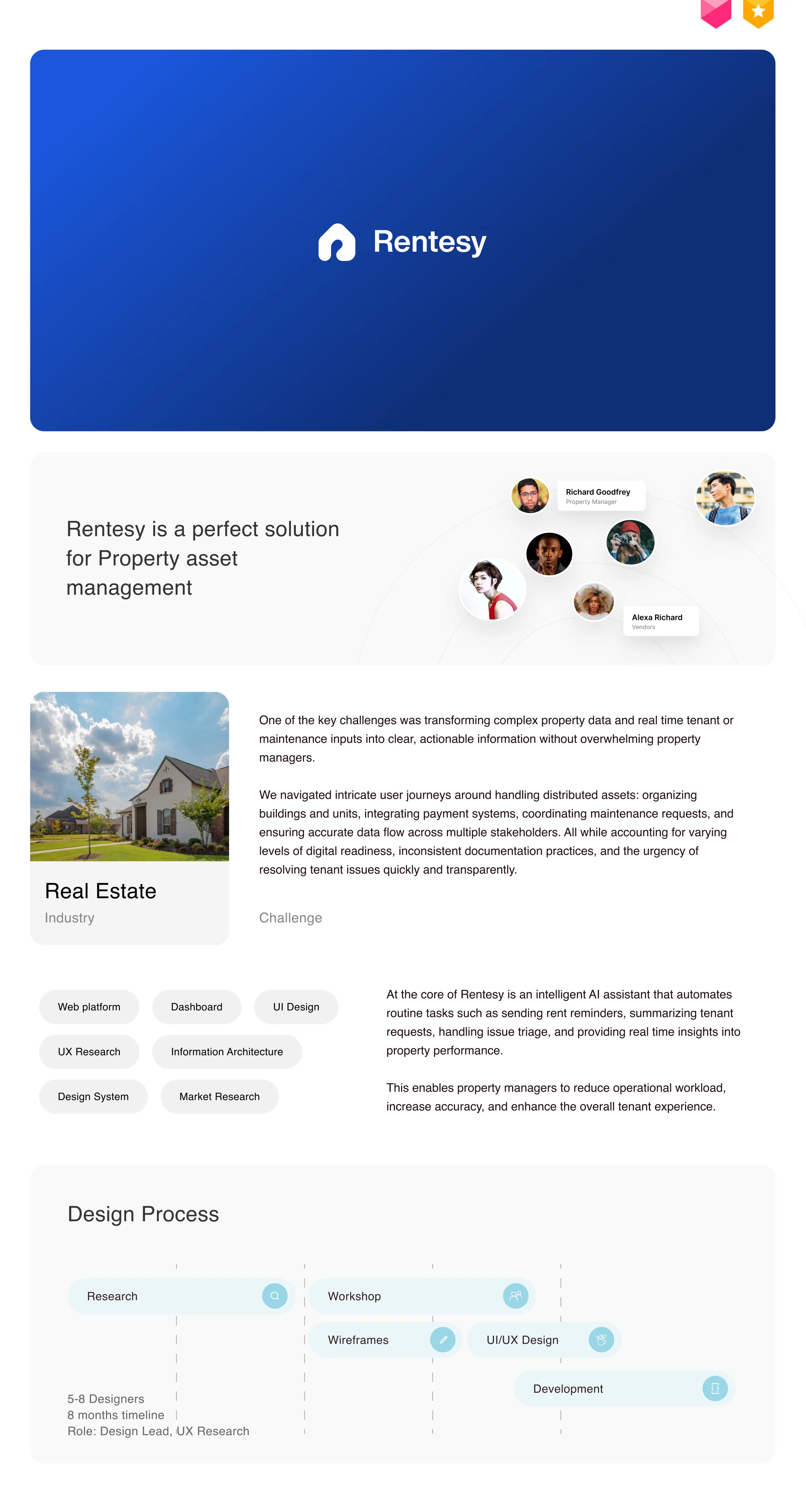
Rentesy is a B2B SaaS platform for property asset management — bringing together the operational work around properties, units, leases, tenants, owners, vendors, maintenance, accounting, communications, files, and reporting. My role was Senior Design Manager, managing two senior designers while driving the information-architecture direction for the product.
The difficult part was not deciding which items should appear in a sidebar. Property management is an interconnected domain: one property can have multiple units, leases, tenants, owners, and vendors, while a single operational task can move between several of those entities.
The fundamental questionHow should the product organize information so that people can understand what they are managing, what needs attention, and what they can do next?
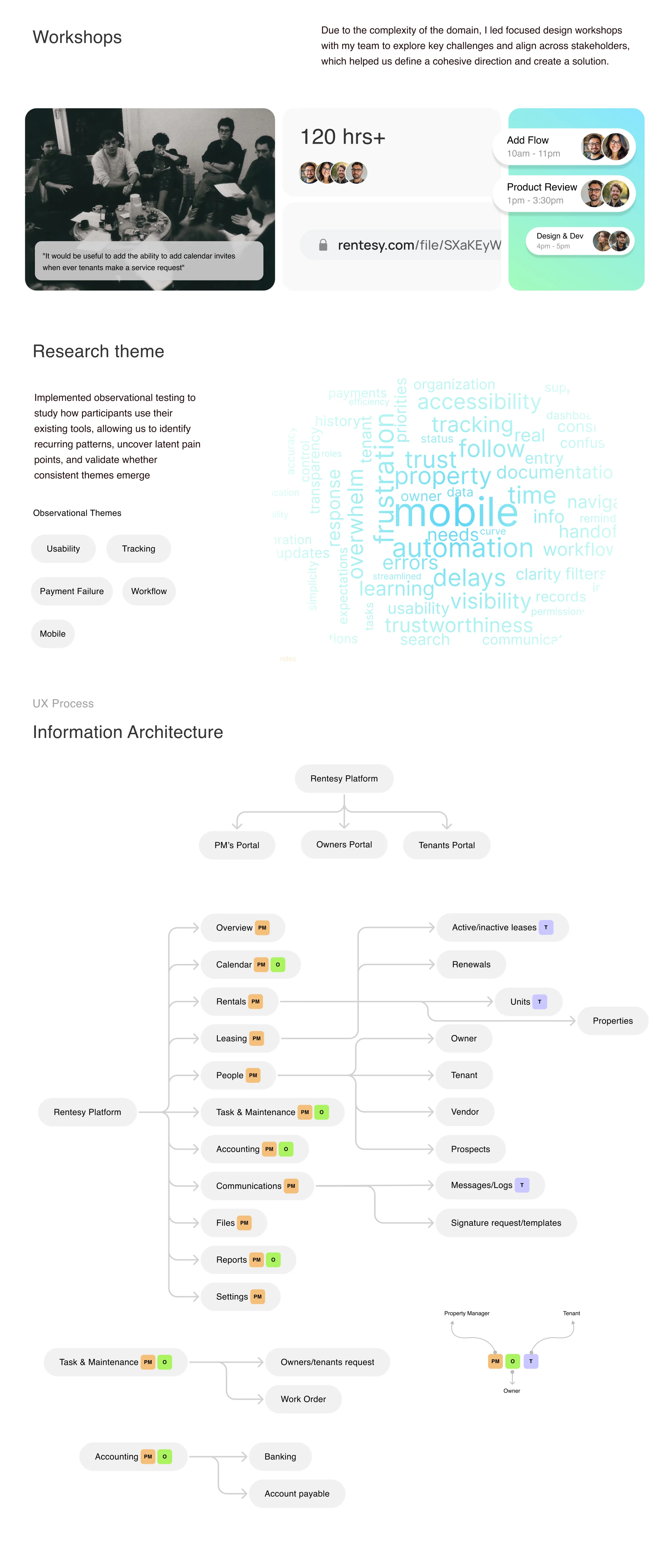
The resulting architecture separates the platform into clear role-based portals while preserving the relationships between the underlying business objects:
The architecture was also designed mobile-first — mobile treated as a constraint for establishing priority and hierarchy, not as a smaller version of the desktop product.
Honest framingThe documented outcomes are project-reported (scale and support-ticket reduction) rather than independently verified measurements; research sample sizes and controlled before/after metrics are not claimed.
The problem
Property management is not a single workflow
A property manager does not work in one linear journey. A typical day can involve:
- Checking portfolio health
- Reviewing leases and renewals
- Responding to tenant requests
- Assigning a vendor to maintenance work
- Following up on owner requests
- Checking rent or payment information
- Sending communications
- Reviewing documents
- Generating reports
These activities are connected by the same underlying objects:
And at the same timeProperty → Owner → Accounting → Reports
This creates the IA challenge: if the product is organized only around features, the user can understand individual tools but loses the relationship between the things they are actually managing.
The old mental model
The early structure was heavily feature-oriented — a reasonable starting point for a growing SaaS product, but harder to navigate as functionality expands. The risk is a navigation system that effectively says:
“Here are all the things the system can do.”
A mature property-management product needs to answer:
“Here is the portfolio you manage, the people and assets connected to it, and the work that needs your attention.”
That distinction drove the redesign.
The domain analysis
Map the domain before touching navigation
Before changing navigation, I mapped the domain itself. The architecture revealed several different kinds of objects:
| Object type | Examples | Why it matters |
|---|---|---|
| Assets | Properties, Units | The physical portfolio being managed |
| People | Owners, Tenants, Vendors, Prospects | Participants connected to assets and workflows |
| Agreements | Leases, Renewals | The contractual relationship around a unit |
| Operations | Tasks, Maintenance, Work Orders | Work that needs to be completed |
| Money | Accounting, Banking, Accounts Payable | Financial operations around the portfolio |
| Communication | Announcements, Messages, Logs | Communication between participants |
| Documents | Files, Signature Requests, Templates | Evidence and operational records |
| Insight | Reports | Aggregated information for decision-making |
The principle this exposedThe product is not really a collection of features. It is a network of related business objects and workflows.
The architectural model
Three levels: role, domain, relationships
Role
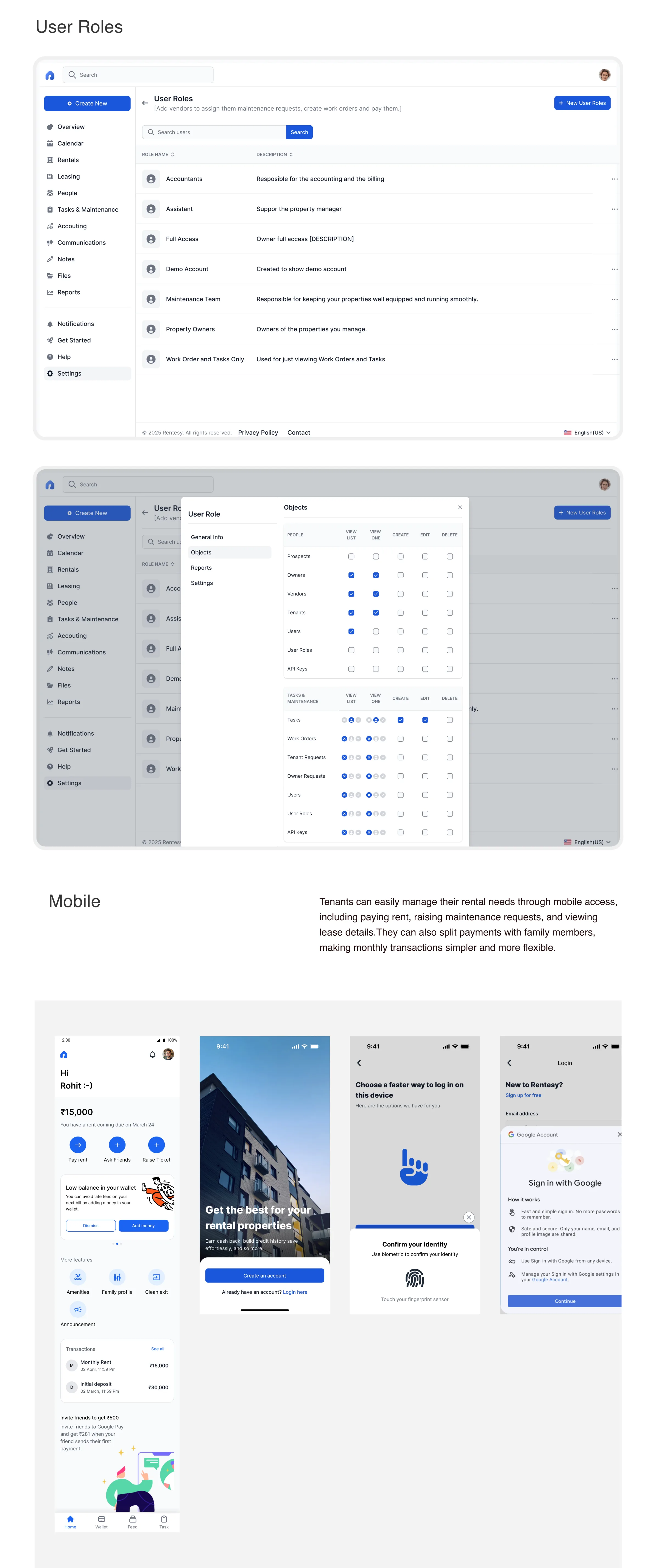
Rentesy supports different participants — Property Managers, Owners, Tenants (and Vendors in operational workflows). The architecture begins with role and responsibility, rather than forcing every user through the same product structure.
Operational domain
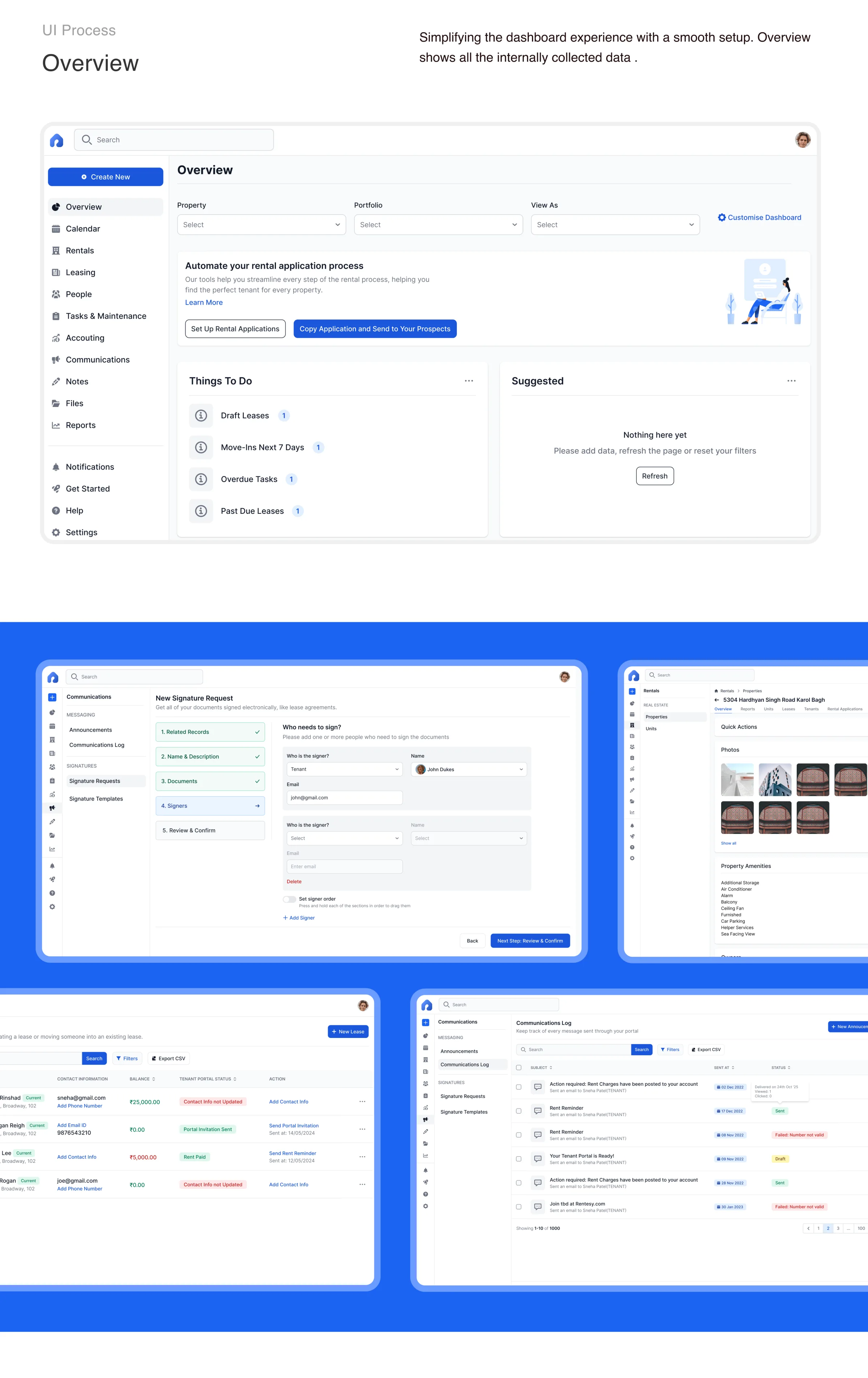
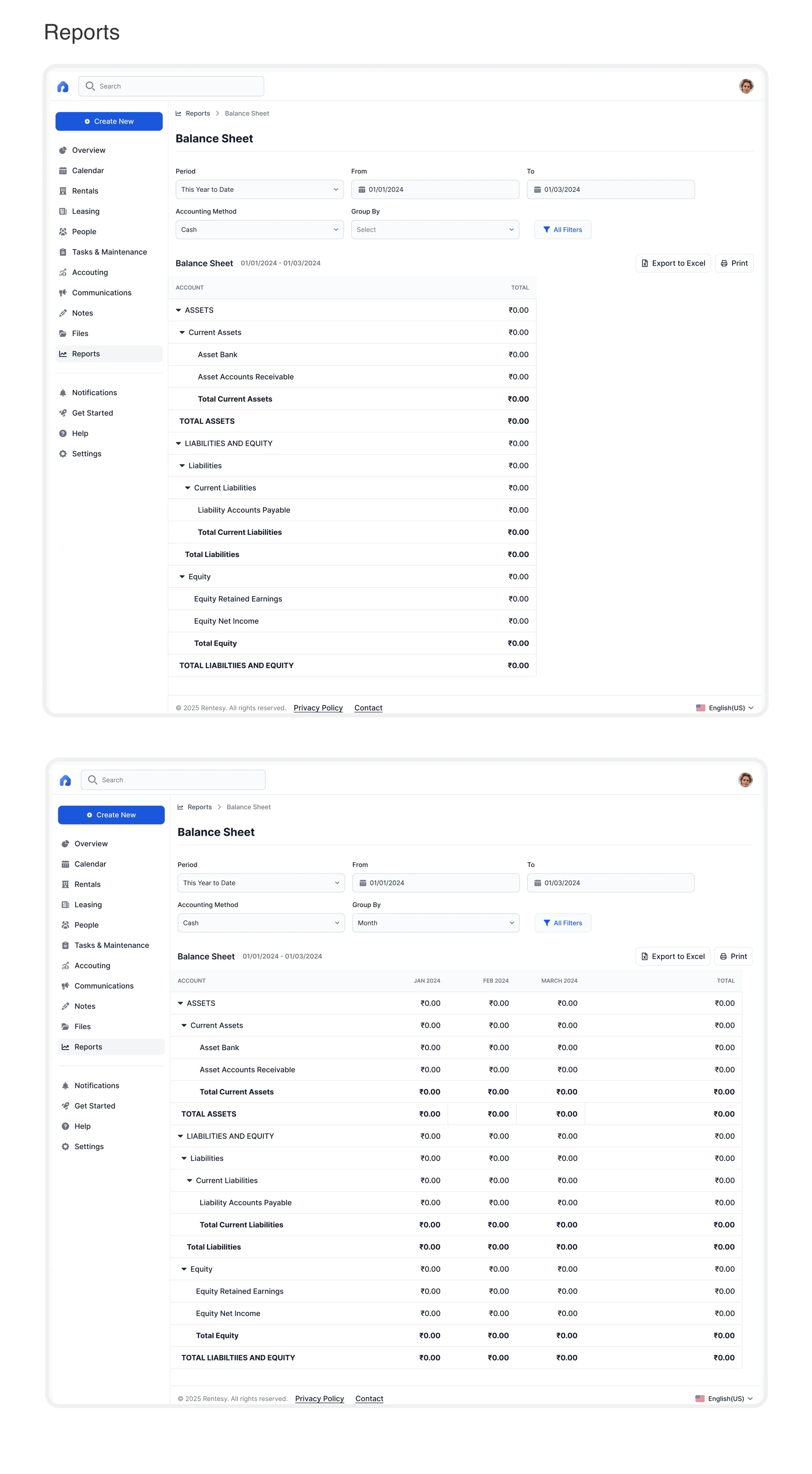
For the Property Manager portal the major domains become: Overview, Calendar, Rentals, Leasing, People, Tasks & Maintenance, Accounting, Communications, Files, Reports, Settings — recognizable areas of work, without pretending the underlying objects are independent.
Business relationships
The deeper IA connects domains through relationships: Rentals → Units → Properties; Leasing → Active/Inactive Leases → Renewals; People → Owners/Tenants/Vendors/Prospects; Communications → Messages/Logs/Signature Requests; Tasks & Maintenance → Requests → Work Orders; Accounting → Banking/Accounts Payable.
The goal was not to eliminate complexity. The goal was to make the complexity legible.
What was added
Three structural additions
A role-based product structure
- PM’s Portal
- Owners Portal
- Tenants Portal
Each role gets a clearer starting point — a property manager should not have to interpret tenant-specific workflows before they can understand their own workspace.
Clear ownership of business objects
One of the biggest improvements was making relationships explicit. “Tasks & Maintenance” exposes the workflow — Request → Assignment → Work → Resolution — rather than treating maintenance as a single feature. Accounting becomes Accounting → Banking / Accounts Payable rather than a generic financial bucket.
A stronger relationship between people and assets
Property management is fundamentally relational: a property can contain units; a unit can have a lease; a lease can have a tenant; a property can have an owner; a maintenance request can involve a vendor. The architecture treats these relationships as first-class navigation and interaction concepts — reducing the risk of forcing users to repeatedly start from a feature menu when they already know the object they are working with.
The key trade-offs
Choosing which complexity to expose
A senior-level IA decision is rarely about finding a perfect structure. It is about choosing which complexity to expose and which complexity to absorb.
Trade-off 1 — Feature-first vs. object-first
| Option | Benefit | Cost |
|---|---|---|
| Feature-first | Familiar for SaaS users; easy to map to product teams | Can fragment workflows across multiple areas |
| Object-first | Mirrors the user’s real-world mental model | Can make the navigation more complex |
| Hybrid | Keeps recognizable work areas while exposing relationships underneath | Requires stronger IA rules |
Decide: hybrid
Primary navigation remains understandable as work areas, while the deeper architecture connects those areas through properties, units, people, leases, and requests — avoiding both a flat feature list and an overly abstract “everything is an object” model.
Role-specific portals, shared concepts
One global navigation would be consistent but irrelevant — a tenant doesn’t need a property manager’s hierarchy. Role-specific entry points share the same underlying model: Property / Unit / Person / Lease / Request / Communication. Presentation and permissions change; meaning doesn’t.
Work domains over property-first nesting
A property-centric IA is tempting, but making everything sit under a property makes recurring operational tasks harder to find. “What maintenance requests need attention today?” shouldn’t require entering a property first. Keep work domains as direct navigation areas, with property/unit relationships preserved inside them.
Dashboard as orientation, not navigation
A dashboard overloaded with every metric looks powerful but doesn’t help users decide what to do next. The overview orients: “What is happening?” The navigation answers: “Where do I go to manage it?” That separation keeps the IA stable even when dashboard content changes.
Same model, different density
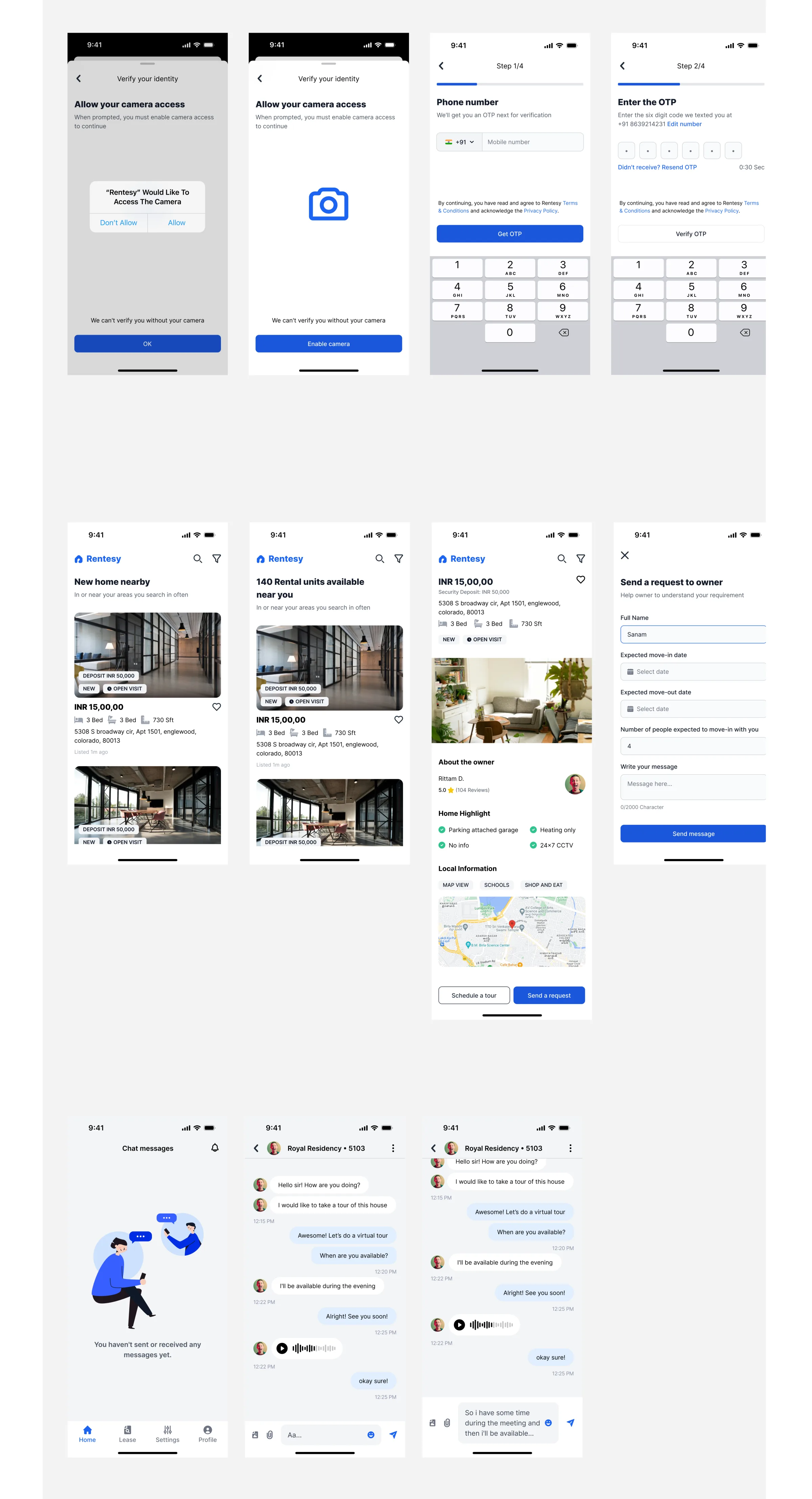
Property management is dense — tables, statuses, dates, financial values. Desktop can show much at once; mobile cannot. Mobile-first forces the hierarchy: What is this? What needs attention? What can I do? What supporting information do I need? That hierarchy then expands on web.
Structured complexity, not removed complexity
The trade-off is not simple vs. complex — the complexity is real. It is unstructured complexity vs. structured complexity: keep the information available, but introduce stronger grouping, hierarchy, and progressive disclosure so experienced managers can go deep without forcing every user to process everything at once.
What could have gone wrong
Six risks, six mitigations
The navigation becomes too large
If every new feature becomes a top-level item, the sidebar becomes a product roadmap rather than an IA. Mitigation: rules for what qualifies as a primary navigation domain versus a sub-feature.
Role-based portals become silos
“Maintenance request” could mean different things in each portal. Mitigation: shared business-object definitions and terminology across roles — the role changes permissions and view, not the underlying meaning.
Everything becomes a property
Putting every workflow under a property makes cross-property work harder. Mitigation: support both portfolio-level work and property-level context.
The dashboard becomes a dumping ground
Once the overview is the first screen, every team wants their content there. Mitigation: define its job as orientation, prioritization, and entry into workflows — not full feature coverage.
Mobile-first becomes mobile-only
Desktop risks becoming a tall stack of mobile components. Mitigation: keep the same IA, but let web increase density, comparison, and simultaneous visibility.
Permissions are treated as a UI problem
A PM, owner, tenant, and vendor interact with the same data differently. Mitigation: define access at the business-object and action level, not only at the screen level.
What I would validate
Structural IA is strong; measurements are not claimed
The artifacts show the structural IA and final UI directions, but they do not provide enough evidence to claim quantitative improvements across the whole product. For a production-level IA, I would explicitly validate:
| Category | What to validate |
|---|---|
| Findability | Locating a property or unit quickly; finding all open maintenance across the portfolio; understanding Rentals vs. Leasing; predicting where a new task appears |
| Cross-object comprehension | Property→unit→lease relationships; which tenant belongs to which lease; vendor clarity inside a work order; moving between related objects without losing context |
| Role comprehension | Does each portal communicate who it is for? Are owner/tenant workflows distinct? Do users understand what they are allowed to do? |
| Mobile usability | High-frequency tasks without excessive navigation; usable mobile patterns for tables; status visibility without deep scrolling; one-hand form use |
| System states | Loading, empty states, errors, permission restrictions, missing data, pending work, failed payments, incomplete requests, async updates |
Mobile-first as a constraint
Mobile tests whether the hierarchy actually works
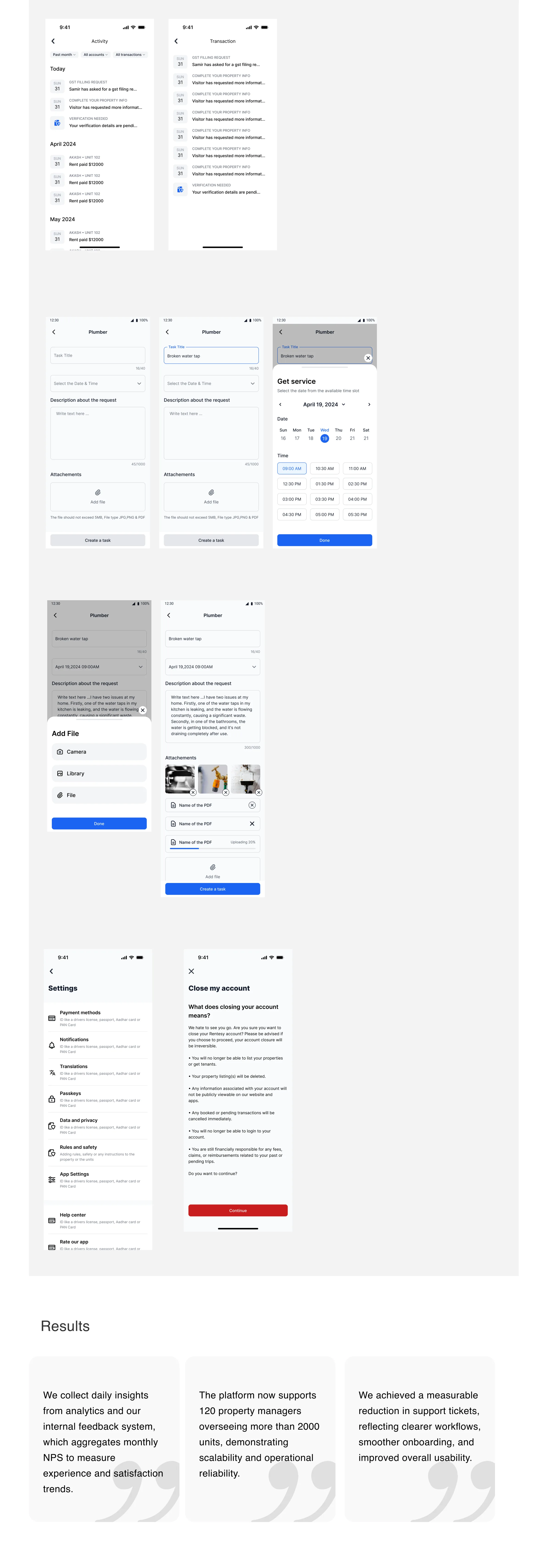
Mobile was not treated as a separate deliverable. It was used to test whether the hierarchy actually worked. The mobile screens demonstrate several principles:
One primary task per view
Forms such as maintenance requests focus the user on the information required to complete that step.
Progressive disclosure
Complex choices — scheduling, attachments, supporting information — are revealed when needed rather than presented as one dense form.
Persistent core navigation
The mobile experience retains a small number of high-value destinations while allowing deeper navigation inside each workflow.
Context before action
The user sees the relevant property, person, or task before being asked to perform a consequential action — important when many actions have operational or financial consequences.
Web & mobile: one system
Two expressions of the same business model
Same business model. Different spatial expression.
| Dimension | Mobile | Web |
|---|---|---|
| Primary hierarchy | Focused, sequential | Broad, simultaneous |
| Navigation | Compact | Persistent |
| Records | Cards / stacked lists | Tables / dense lists |
| Forms | Stepwise | More information visible |
| Related objects | Drill-down | Side-by-side context where useful |
| Actions | Progressive disclosure | More actions visible |
| IA | Shared | Shared |
The design system as an IA enabler
Consistency is a comprehension system
The visual system was intentionally kept systematic: Inter typography, structured color tokens, reusable components, consistent status treatment, predictable spacing and hierarchy.
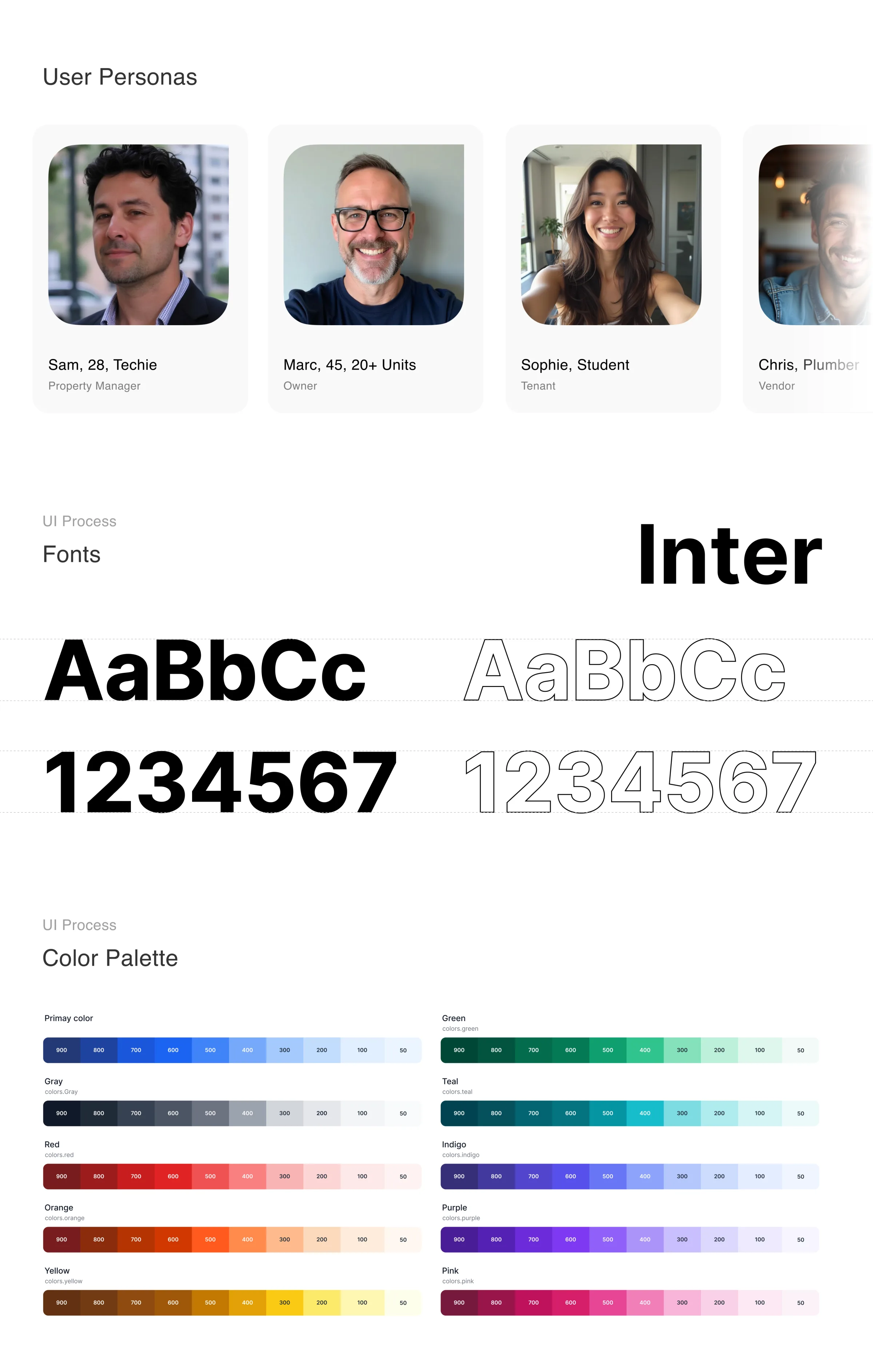
For an enterprise product, consistency is not only visual polish — it reduces the amount of interpretation required when moving between domains. A status pattern used in Maintenance should feel related to the status pattern used in Accounting or Leasing. A form should behave consistently whether the user is creating a task, adding information, or configuring an account.
The design system becomes a navigation and comprehension system, not just a UI library.
The final information model
Not just a sitemap
- PM’s Portal → Overview · Calendar
- Rentals → Units · Properties
- Leasing → Active/Inactive · Renewals
- People → Owners · Tenants · Vendors · Prospects
- Tasks & Maintenance → Requests · Work Orders
- Accounting → Banking · Accounts Payable
- Communications → Announcements · Messages · Signature Requests
- Files · Reports · Settings
- Owners Portal
- Tenants Portal
The important point is that this is not just a sitemap. It is a model of how the business works.
Role & outcome
Leadership, not just screens
As Senior Design Manager, my contribution was broader than producing screens — setting the architectural direction while managing two senior designers and keeping the work coherent across the product:
- Understanding the domain rather than starting from UI patterns.
- Mapping the major business objects and their relationships.
- Challenging the existing navigation where it did not reflect user responsibilities.
- Establishing the role-based product model.
- Defining the relationship between functional areas and business objects.
- Driving a mobile-first hierarchy that could also scale to web.
- Creating reusable patterns and a shared visual language.
- Reviewing design decisions across two senior designers to maintain consistency.
- Balancing product complexity with usability instead of hiding complexity that users genuinely need.
- Thinking through edge cases, permissions, and future scalability before treating the architecture as finished.
The outcome
BeforeFeatures → Screens → Tasks
AfterRole → Domain → Business Object → Context → Action
That shift matters because property management is inherently relational. A maintenance request is not just a “maintenance feature” — it is connected to Property → Unit → Tenant/Owner → Vendor → Work Order → Communication → Financial consequence. The IA needs to preserve that relationship.
Reflection
Principles for enterprise products
Information architecture is a product decision, not a navigation decision.
The better question“What is the user’s relationship to maintenance, property, people, leases, and work — and how should the product reflect that relationship?”
Understand the domain before designing the menu
If the business model is unclear, the navigation will usually be unclear too.
Separate objects from actions
A property is an object. A work order is an object. “Assign vendor” is an action. Keeping those concepts distinct makes the architecture easier to scale.
Design for the smallest meaningful context first
Mobile forces prioritization. That is useful even when the final product is primarily used on desktop.
Do not remove complexity that users actually need
Instead, organize it.
Make trade-offs visible
A good IA is not one with no complexity. It is one where the complexity is intentional, explainable, and manageable.