At a glance
Spectrum Mobile supports a large, multi-service customer ecosystem spanning internet/TV, voice, webmail, and mobile. The challenge was to create consistency across solutions and platforms — and the most important architectural decision in this work was not visual.
It was deciding what the customer should think they are managing.
The legacy experience organized mobile lines primarily through plan groupings — “By the Gig,” “Unlimited,” “Unlimited Plus.” The redesigned model shifts the center of gravity to the individual line of service and its associated device, plan, usage, financing/upgrade state, and actions:
The shift makes the architecture extensible: the line becomes the stable entity, while plan type, device state, upgrade eligibility, usage, and service features become attributes or contextual capabilities around it.
Honest framingNo quantitative business outcomes, usability metrics, or post-launch data were supplied for this work — none are invented here. The evidence is architectural: the model, the trade-offs, and the risks.
The problem
What was wrong with the old model?
The legacy mobile service page was structured around plan categories. Each plan section contained multiple lines/devices, and the customer had to scan through those groups to locate a person or device.
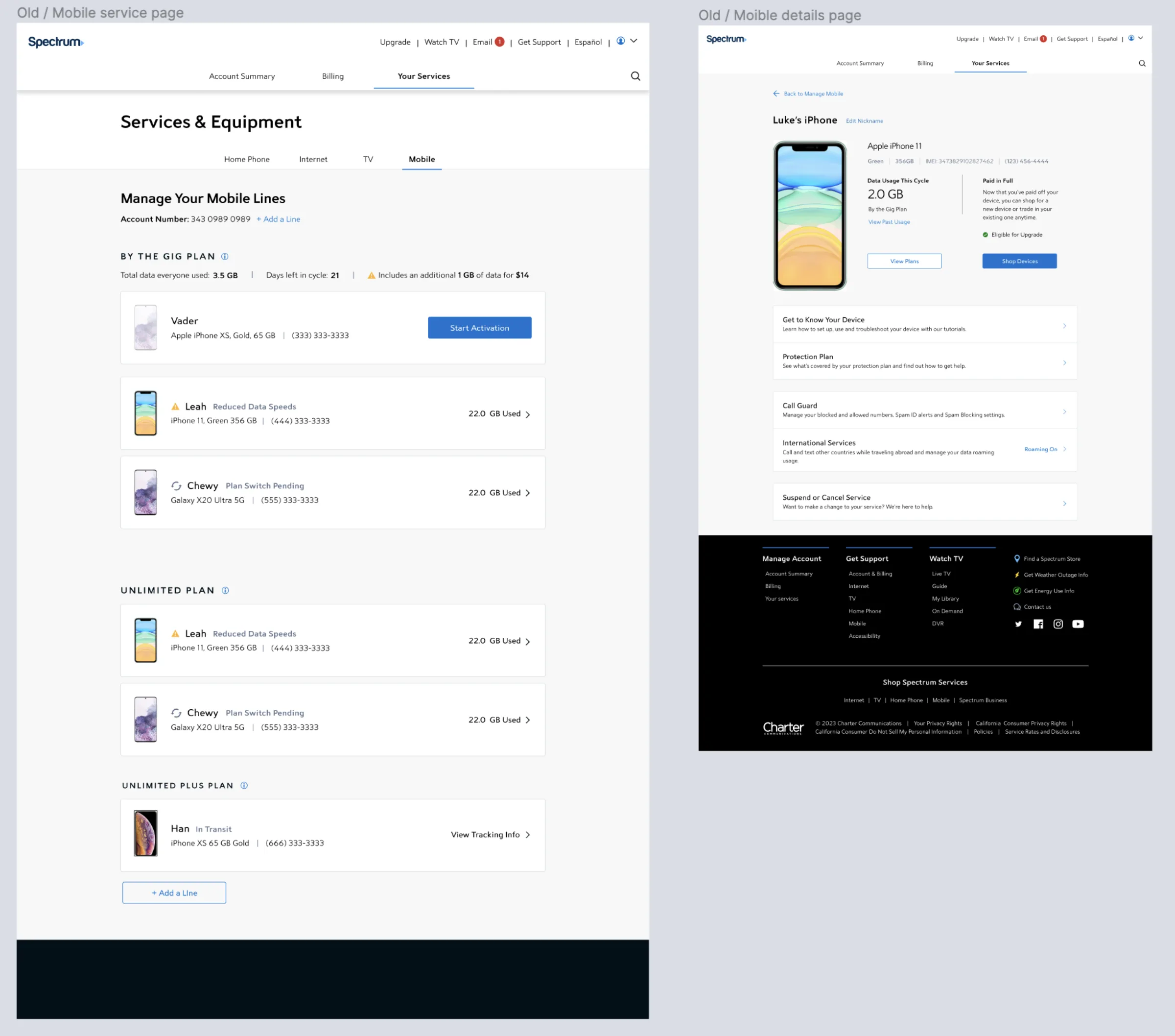
The consequences of that model:
- Lines are grouped by plan, not primarily by the customer or device they are trying to manage.
- The same line can require different kinds of actions depending on its device, financing, usage, and service state.
- Important state information — upgrade eligibility, reduced data speed, pending states, device usage — competes with basic line identity.
- The architecture makes the plan feel like the parent object, even though many customer tasks are actually line-specific.
- As lines and states grow, scanning depends on remembering which plan group a line belongs to.
The senior-level design question
The questionWhat is the most stable object around which the information architecture should be organized?
A plan can change. A device can change. Upgrade eligibility can change. Usage changes continuously. But the line of service is the durable object tying these states together — which led to a line-first architecture rather than a plan-first one.
The architectural reframing
Old mental model → new mental model
- By the Gig → Line / Device ×3
- Unlimited → Line / Device ×2
- Unlimited Plus → Line / Device
- Your Services → Mobile
- Lines of Service
- Line A · Line B · Line C
- Individual Line Info
- Device Info → details, financing, management
- Plan Info → plan, usage, features
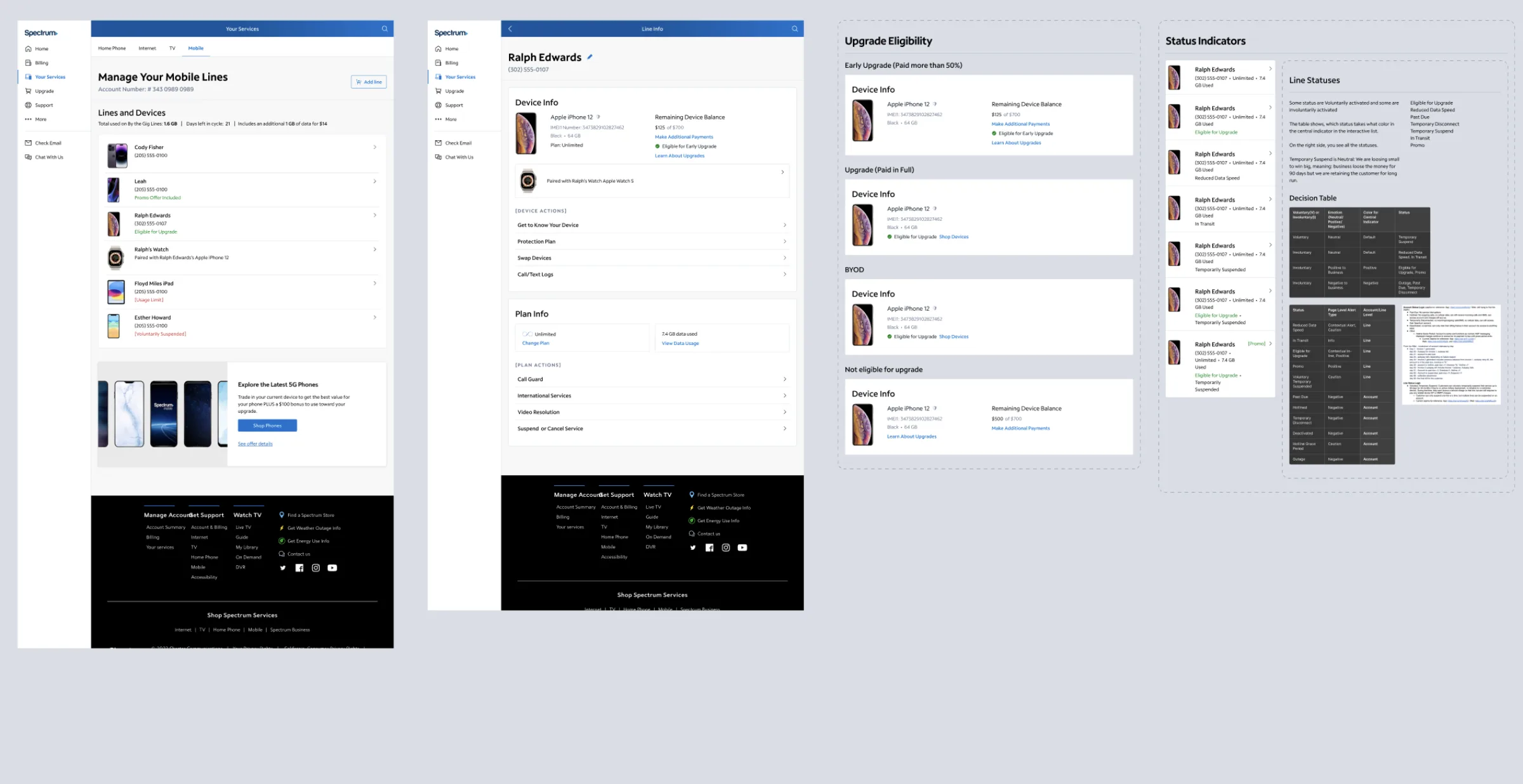
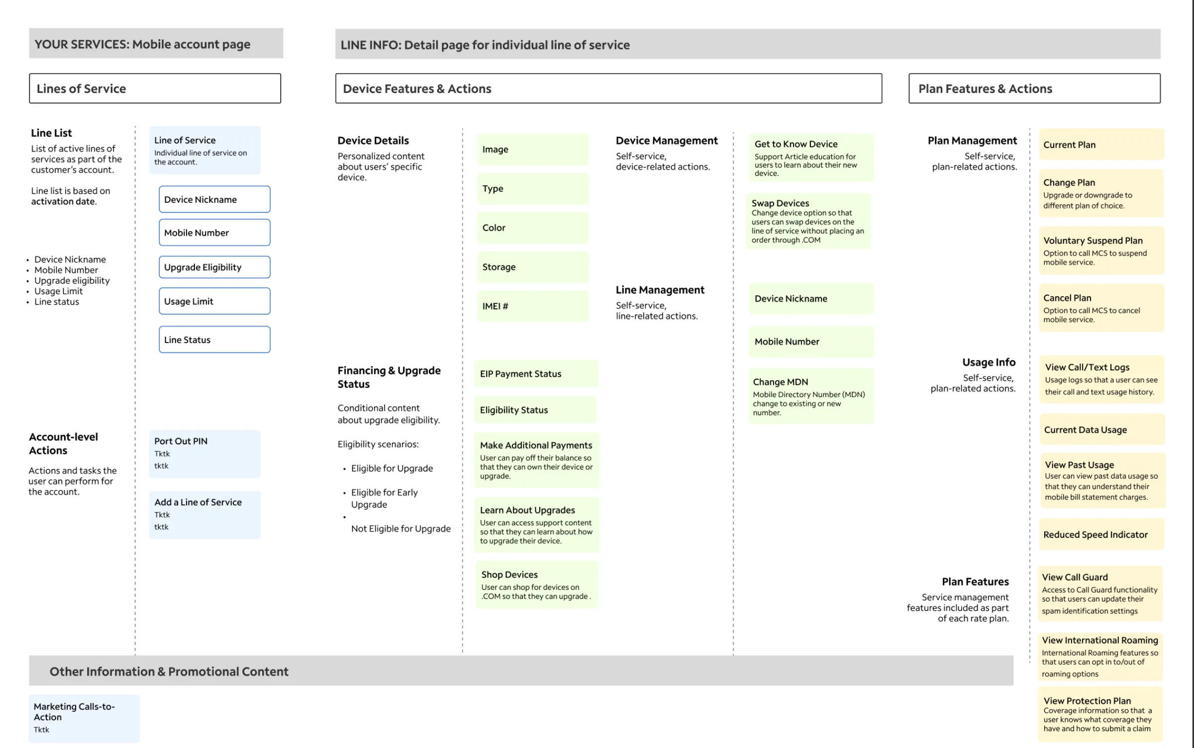
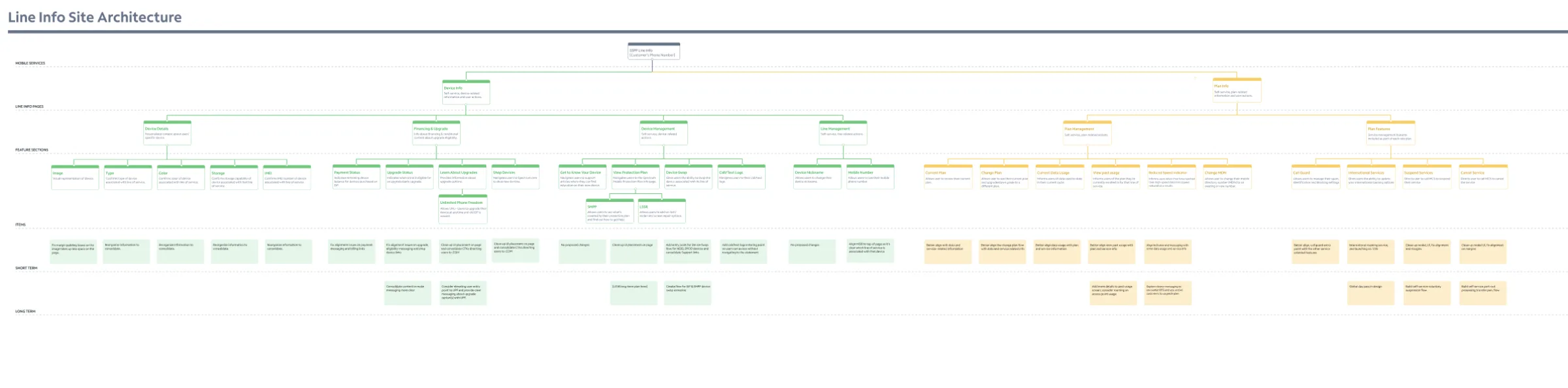
The research/design architecture explicitly separates the mobile account page (Lines of Service) from the individual Line Info detail page, then separates the detail page into Device Features & Actions and Plan Features & Actions.
The line as an object
What I added to the architecture
A dedicated line-level object
The redesign establishes Line of Service as the core entity. The line list contains:
- Device nickname
- Mobile number
- Upgrade eligibility
- Usage limit
- Line status
The architecture also specifies that the line list is ordered by activation date. The list now answers:
“Which line am I managing?” — before asking “Which plan is it on?”
That is a stronger foundation for a multi-line account.
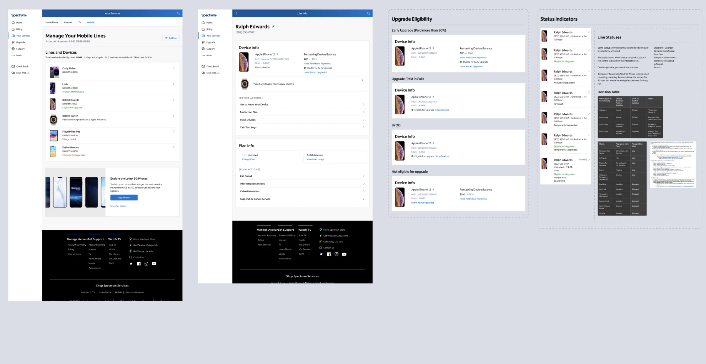
A dedicated Line Info detail page
Selecting a line leads to a dedicated Line Info page that consolidates everything belonging to that line and divides it into two meaningful domains:
Device
Device details, financing / upgrade status, device management, line management.
Plan
Current plan, plan management, usage information, plan features.
This separation is one of the strongest architectural improvements: it prevents the page from becoming a flat inventory of unrelated actions.
The information hierarchy
Four layers, each with one job
Account
Account-level actions stay separate from line-level actions — Port Out PIN, Add a Line of Service, marketing CTAs. This prevents account-wide tasks from being attached to a single line.
Line
The customer-selected object. Identity = nickname, mobile number, status, usage-related state, upgrade eligibility.
Device and Plan
Inside a line, information splits into two domains — Device (image, type, color, storage, IMEI, EIP payment status, eligibility) and Plan (current plan, plan changes, data usage, reduced-speed indicator, Call Guard, international roaming, protection plan).
Actions
Grouped by what they affect: Swap Devices, Change MDN, Make Additional Payments, Change Plan, Suspend/Cancel Service, View Call/Text Logs, View Data Usage.
The architecture moves from information → context → action, rather than presenting every capability as an undifferentiated menu.
The key trade-offs
Decisions made explicit
Trade-off 1 — Plan-first vs. line-first
| Option | Advantage | Cost |
|---|---|---|
| Plan-first | Makes plan comparison immediately visible; mirrors how the business categorizes services | Forces customers to scan plan groups to find a line; harder to scale as states and plans grow |
| Line-first | Maps to the customer’s task: “I need to fix/manage this line” | Reduces the prominence of plan-level comparison |
Decide: line-first
Plan becomes an important attribute of the line rather than the parent navigation structure. The line is the more stable object — plan, device, usage, and eligibility can all change without requiring a new architectural identity.
Progressive disclosure over dense tables
The line list is about identification and status (“Which line is this and what is its current state?”); the detail page is about action (“What can I do with this line?”). A clean separation between finding and managing.
One page, two conceptual domains
A flat IA would mix IMEI, device balance, swap, protection plan, current plan, data usage, international services, and cancellation. Keep one Line Info destination, but with clear Device and Plan sections — one mental model (“I am managing this line”), semantic boundaries intact.
State-driven content over permanent blocks
Upgrade behavior is not universal: Eligible for Upgrade, Eligible for Early Upgrade, Not Eligible for Upgrade. Financing & Upgrade Status becomes conditional content — relevant, but it requires reliable state definitions and a consistent backend-to-UI mapping (a Status Indicators decision table).
Same object model, different spatial expression
Mobile-first: Line Info becomes a vertically ordered sequence of sections. Web keeps the same conceptual architecture but uses horizontal space for denser layouts and persistent navigation — never a separate desktop mental model.
Vertical length for contextual completeness
The detail page is intentionally long on mobile — the cost is scrolling; the benefit is a complete set of line-management capabilities without navigating across disconnected pages.
What could have gone wrong
Risks the change introduces
The strongest senior-level story is not “the new architecture is perfect.” It is understanding the risks introduced by the change — and how they were mitigated:
The plan becomes too hidden
Plan-first customers could work harder. Mitigation: keep current-plan information visible near the top of Line Info and expose plan actions as a distinct domain.
Line Info becomes a dumping ground
Once “line” is the primary object, every feature wants to attach to it. Mitigation: enforce ownership rules — account actions → account, line → line, device → device, plan → plan, promotional content → supporting layer.
Status colors become ambiguous
Multiple line states mapped to visual indicators is powerful but dangerous if states are too similar or color is the only differentiator. Statuses need clear semantic definitions, textual labels, and accessible non-color cues.
Edge cases overwhelm the clean model
Financing states, pending changes, reduced speeds, suspension, disconnection, swaps, eligibility changes, add-ons — a happy-path architecture breaks when these overlap. Mitigation: treat state modeling as part of the IA, not a UI detail.
Mobile-first becomes mobile-only thinking
Designing for the smallest viewport can lead to excessive stacking on desktop. Mitigation: preserve the hierarchy, but let web use columns, persistent navigation, and denser presentation.
Validation gaps
What still needs explicit validation
The artifacts provide a strong structural IA, but they do not provide quantitative usability results, task-completion metrics, analytics, research sample sizes, or a complete edge-case specification. For production, these would be explicitly validated:
| Category | What to validate |
|---|---|
| Findability | Can customers find a specific line quickly? Do they understand activation-date ordering? Can they distinguish people, devices, and numbers? |
| State comprehension | “Eligible for Upgrade” vs. “Early Upgrade” without decoding color; pending/reduced-speed states; status consistency across mobile and web |
| Action ownership | Does the customer know whether an action changes the device, line, or plan? Is “Suspend or Cancel” clearly scoped? Is “Change MDN” understood? |
| Multi-line management | Comparison, search/filter, sorting, bulk management, cross-line usage — future validation opportunities |
| System states | Loading, empty states, errors, unavailable data, permission restrictions, partially completed changes, async operations |
The mobile-first strategy
The architecture in its most constrained form
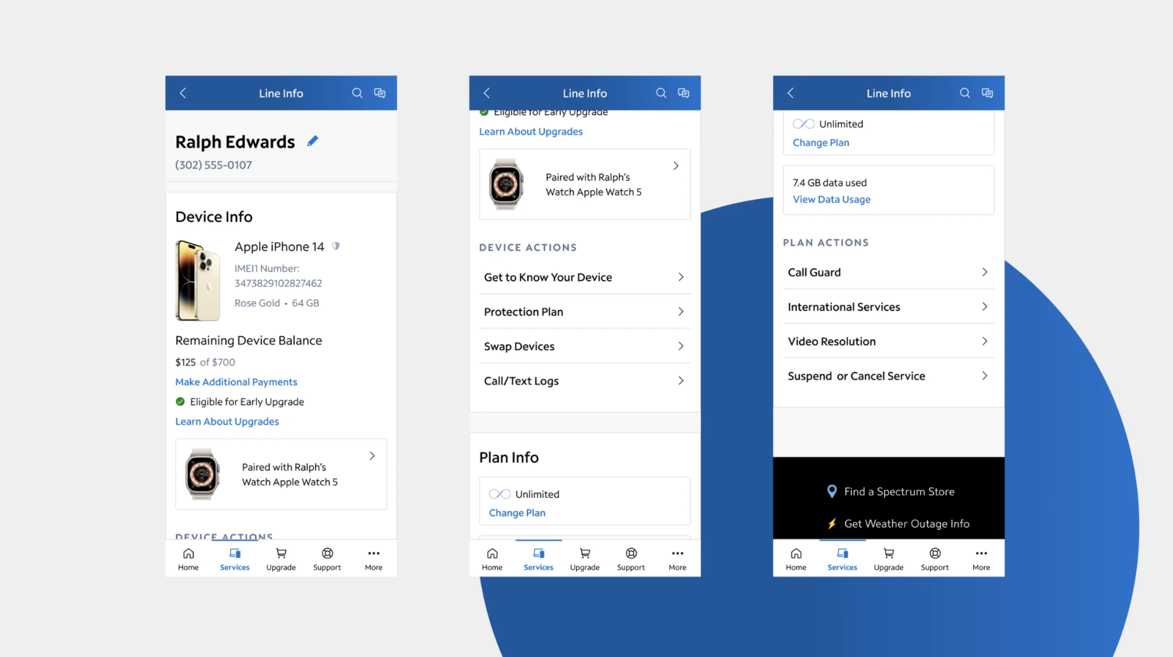
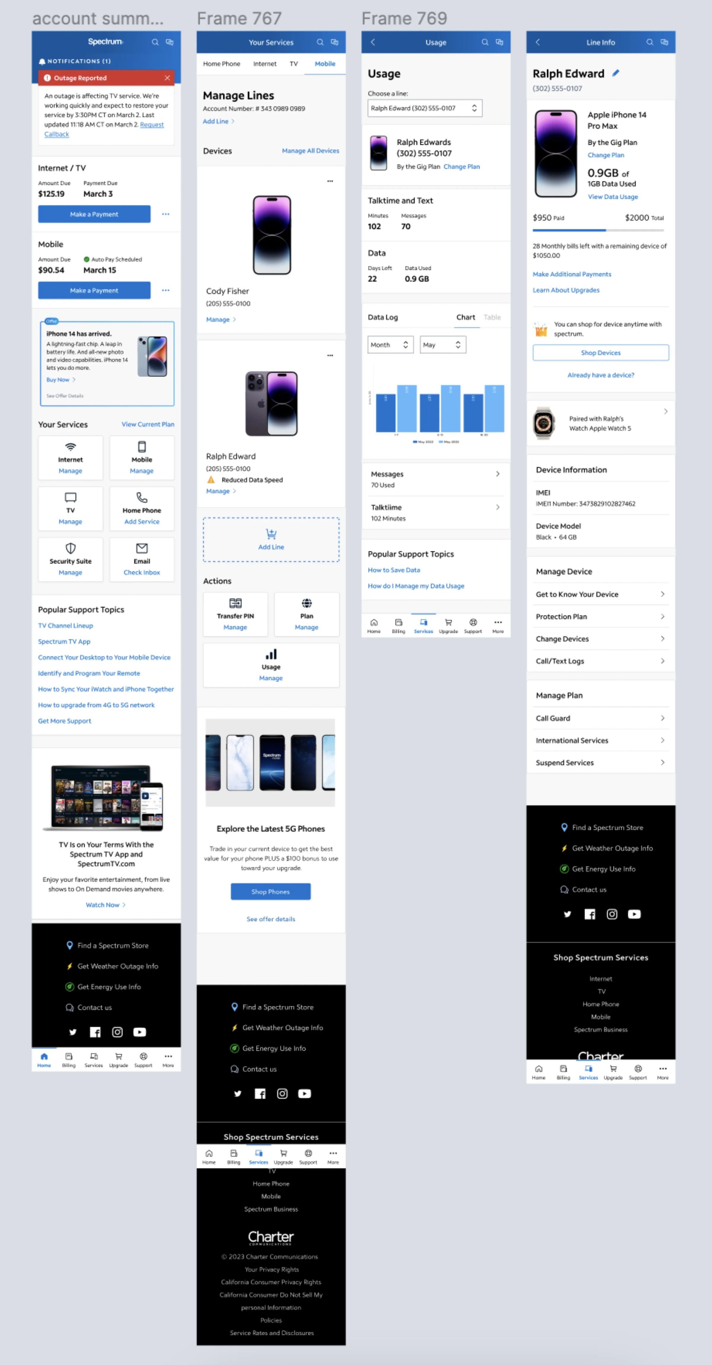
The mobile experience demonstrates the architecture at its most constrained. The flow becomes:
This hierarchy is strong on mobile because each screen has a clear job: the Services screen is about selecting the service and line; the Line Info screen is about managing the selected line. That separation reduces the navigation required to move from identification to action.
Cross-platform system thinking
One architecture, two spatial expressions
The work was not simply a mobile redesign followed by a desktop adaptation. The architecture was designed as a shared system and then expressed differently by viewport.
| Dimension | Mobile | Web |
|---|---|---|
| Primary object | Line of Service | Line of Service |
| Navigation | Compact bottom navigation + contextual header | Persistent side navigation + contextual header |
| Line list | Stacked cards / list | Wider list / table-like presentation |
| Detail page | Vertical sections | Wider grouped sections |
| Actions | Progressive disclosure | More simultaneous visibility |
| IA | Shared | Shared |
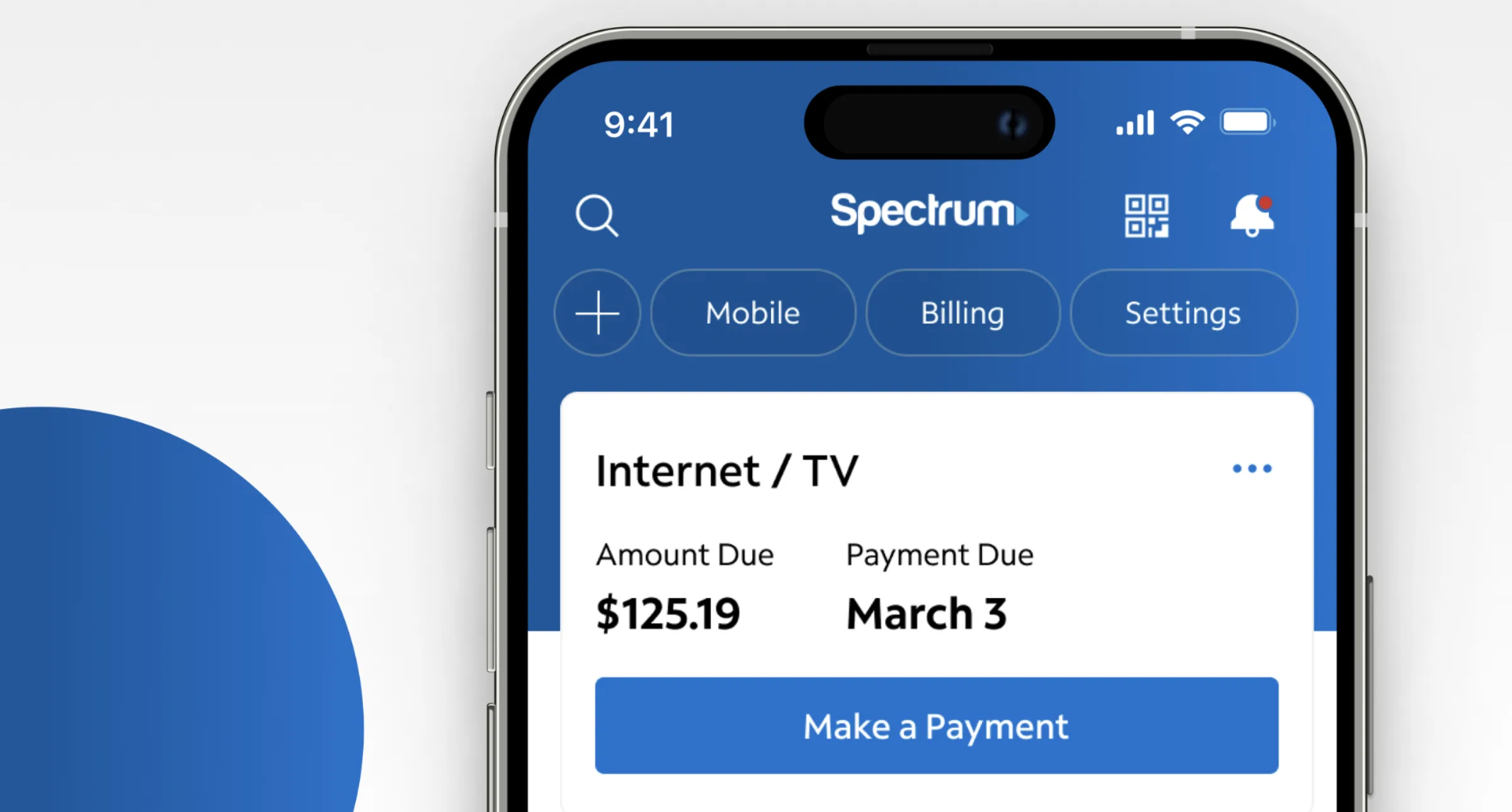
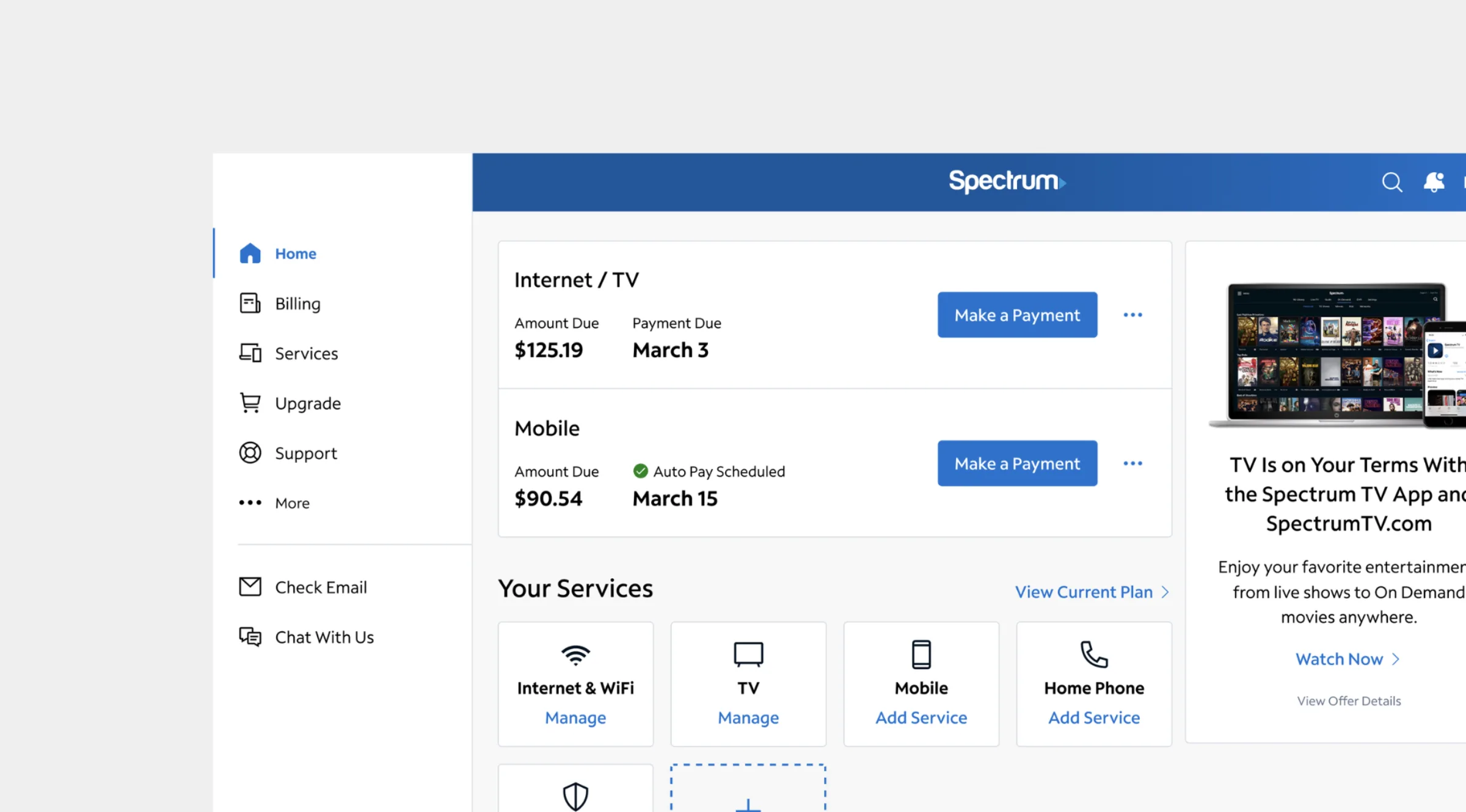
Responsive design is not simply shrinking desktop UI. It is preserving the same information model while changing how much of it can be exposed at once.
Role & outcome
The shift in mental model
The senior-level contribution
- Analyzed the existing line-management model and identified that plan grouping was not the strongest long-term organizing principle.
- Reframed the information architecture around the line of service.
- Separated account, line, device, and plan responsibilities.
- Modeled conditional states, especially financing and upgrade eligibility.
- Created a scalable hierarchy that could support a growing number of line states and actions.
- Designed mobile-first, using mobile constraints to establish hierarchy and priority.
- Translated the same architecture to web, rather than creating an unrelated desktop experience.
- Defined reusable templates and status logic to support consistency.
- Validated the experience through user testing, as documented in the project brief.
- Supported development, ensuring the architectural intent survived implementation.
The outcome
Before“Find the plan, then find the line.”
After“Find the line, then manage its device and plan.”
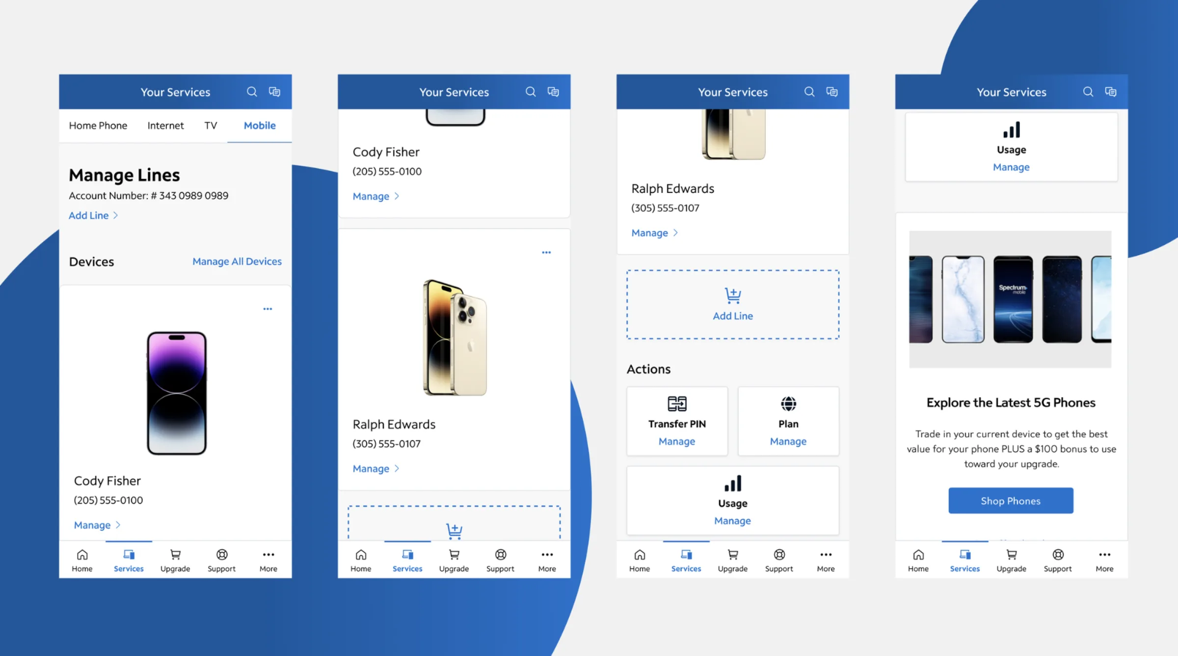
More than a UI refresh: the line is the stable customer-facing object; device and plan are structured domains; states determine relevant information and actions; account-level actions remain distinct; and mobile and web share the same conceptual model. The redesign trades some plan-level visibility for better line-level findability and action clarity — the central design decision, and the reason the architecture scales.
Reflection
What made this senior-level work
The hard part wasn’t deciding where to put the buttons. It was deciding what the customer was actually managing.
Once the line of service became the primary object, the rest of the architecture became easier to reason about:
That decision chain — not the screens themselves — is the core value of the redesign.