At a glance
Project brief
The goal of this project was to improve the UX of a bike rental platform to better address the decline in bike rides and payment checkouts.
Project overview
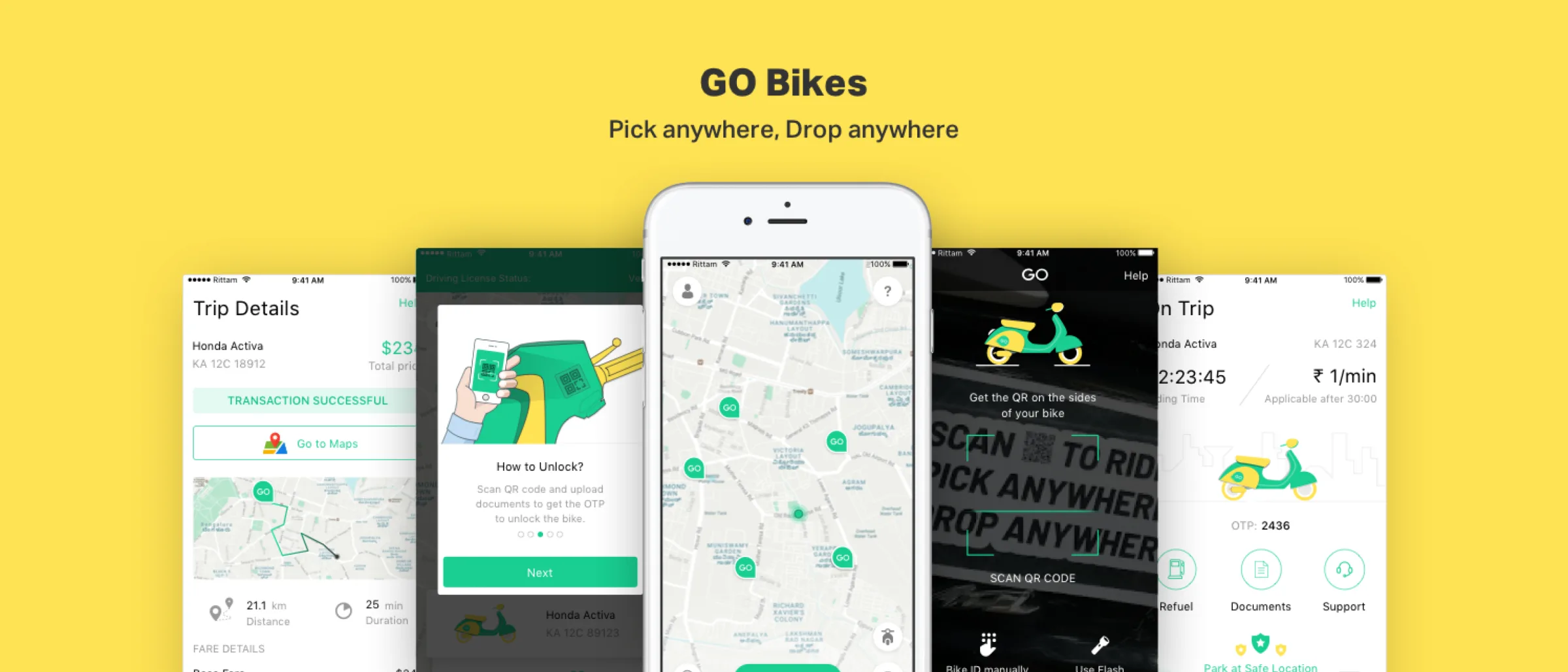
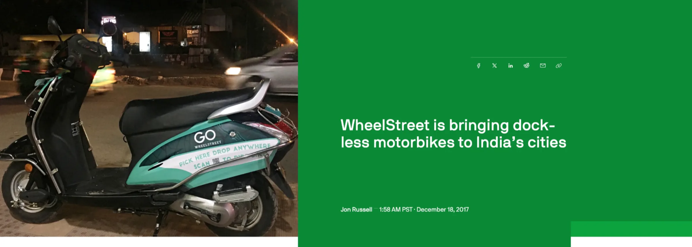
I designed a platform that enables users to take a bike from one place and safely drop it at a particular location once the ride is finished — a seamless dockless experience.
Outcome
The product was launched on the iOS platform in 2018.
The problem
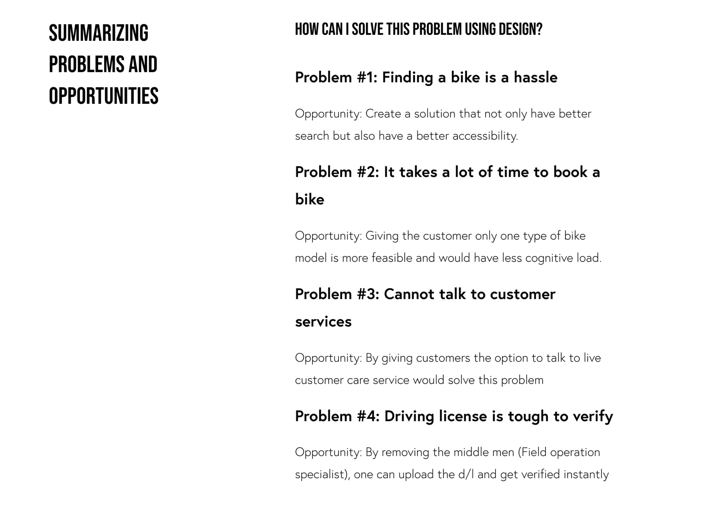
The hassle of renting a bike
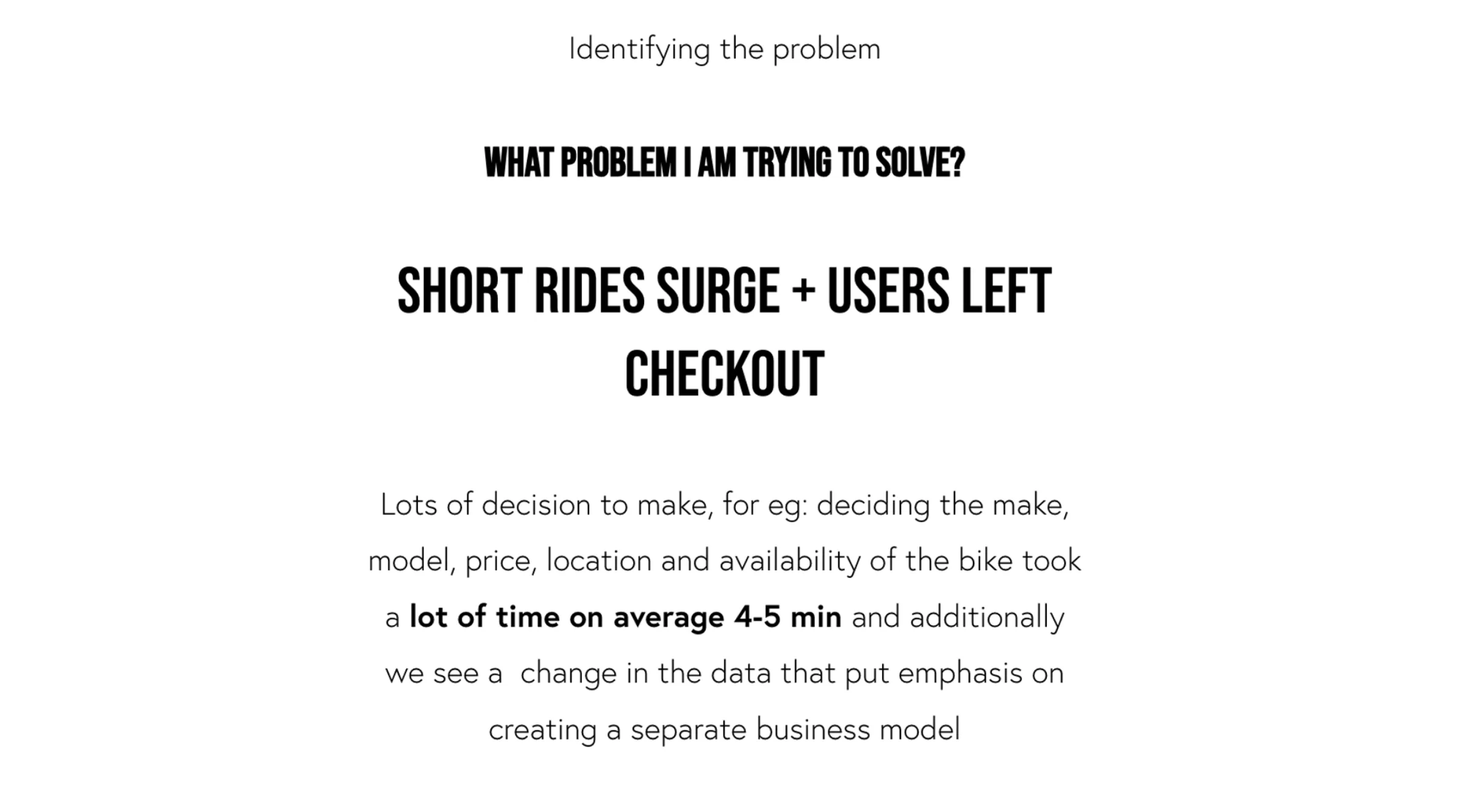
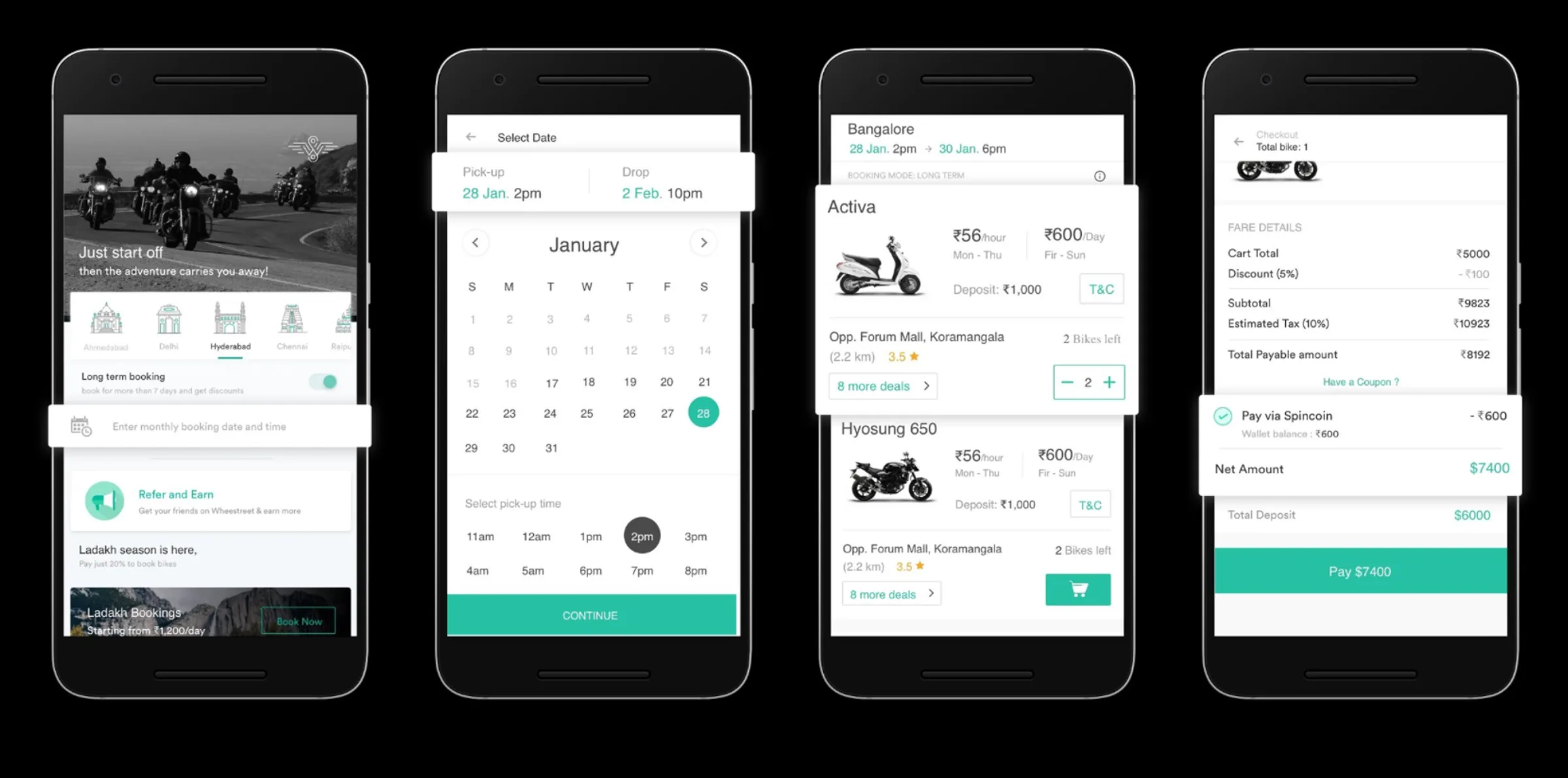
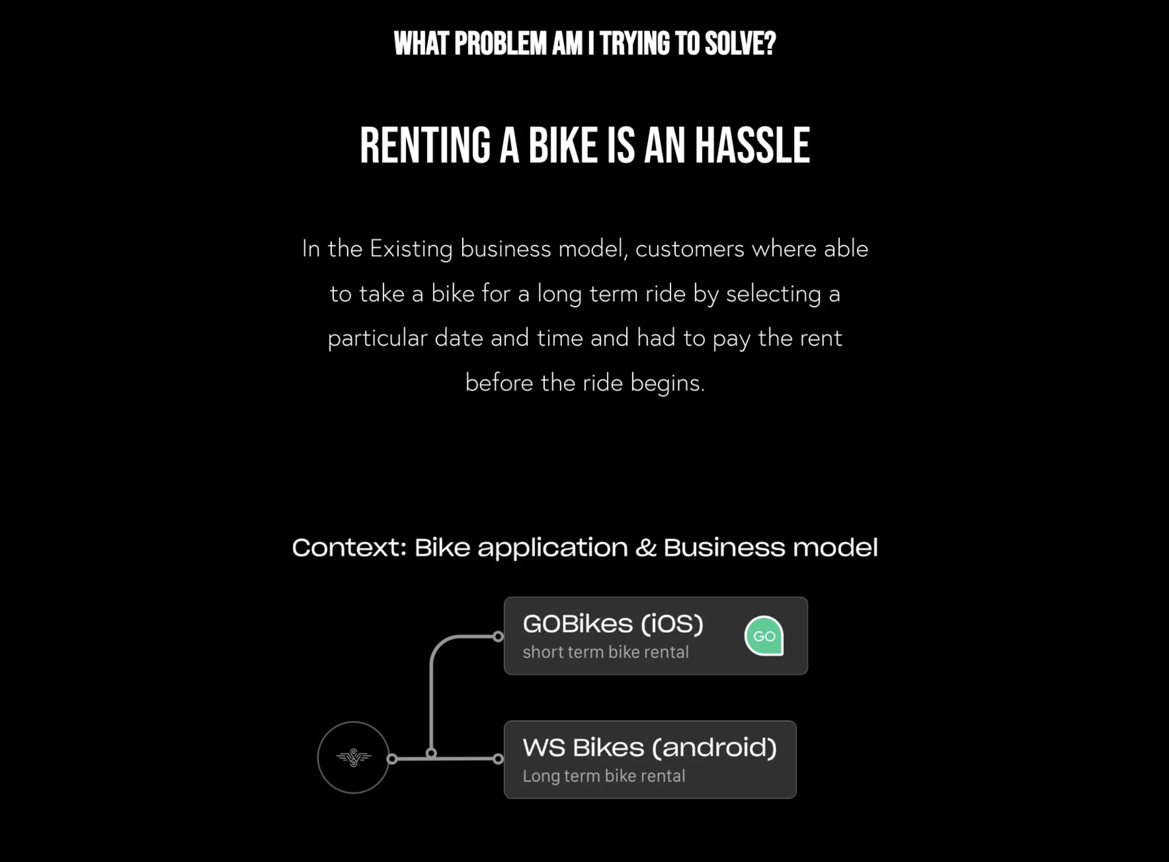
When analyzing the existing business model, I identified a significant divergence between user needs and the product offering. The platform was originally designed for long-term rentals — requiring users to select a specific date, time, and pre-pay — which created severe friction for users who simply needed a bike for a quick commute.
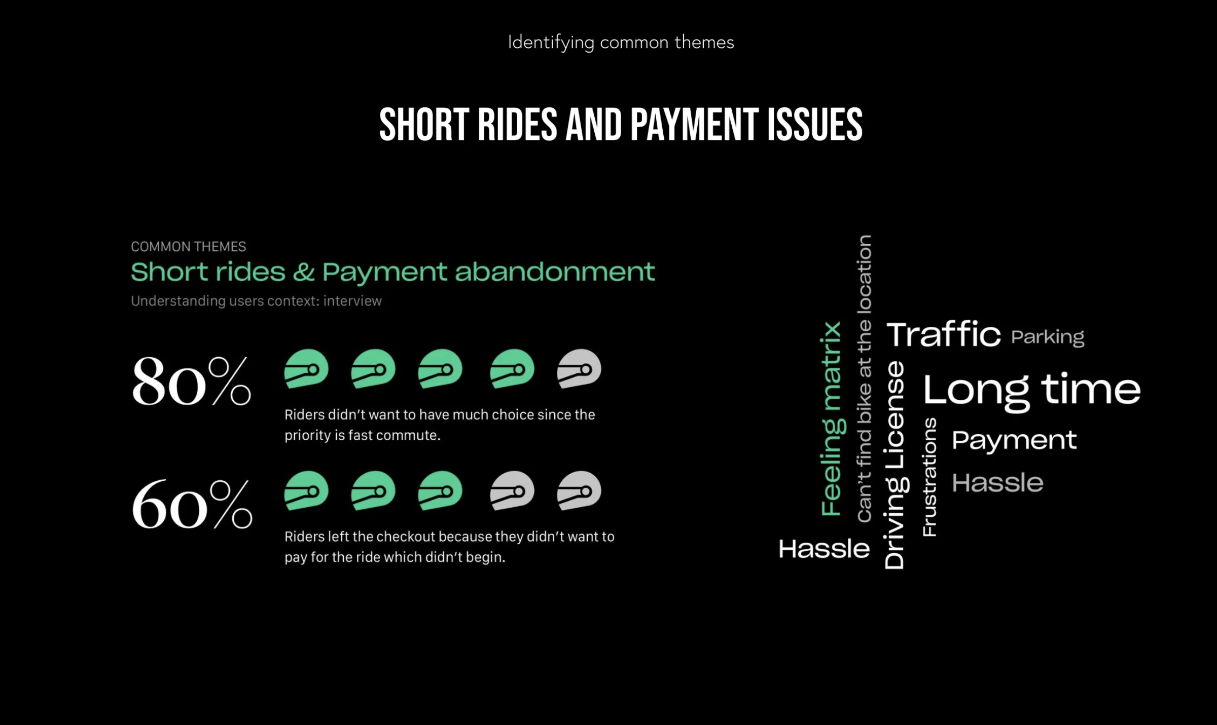
As data started coming in, it was clear that short rides were surging — but 49% of users were leaving the checkout process.
Research & insights
What the data said
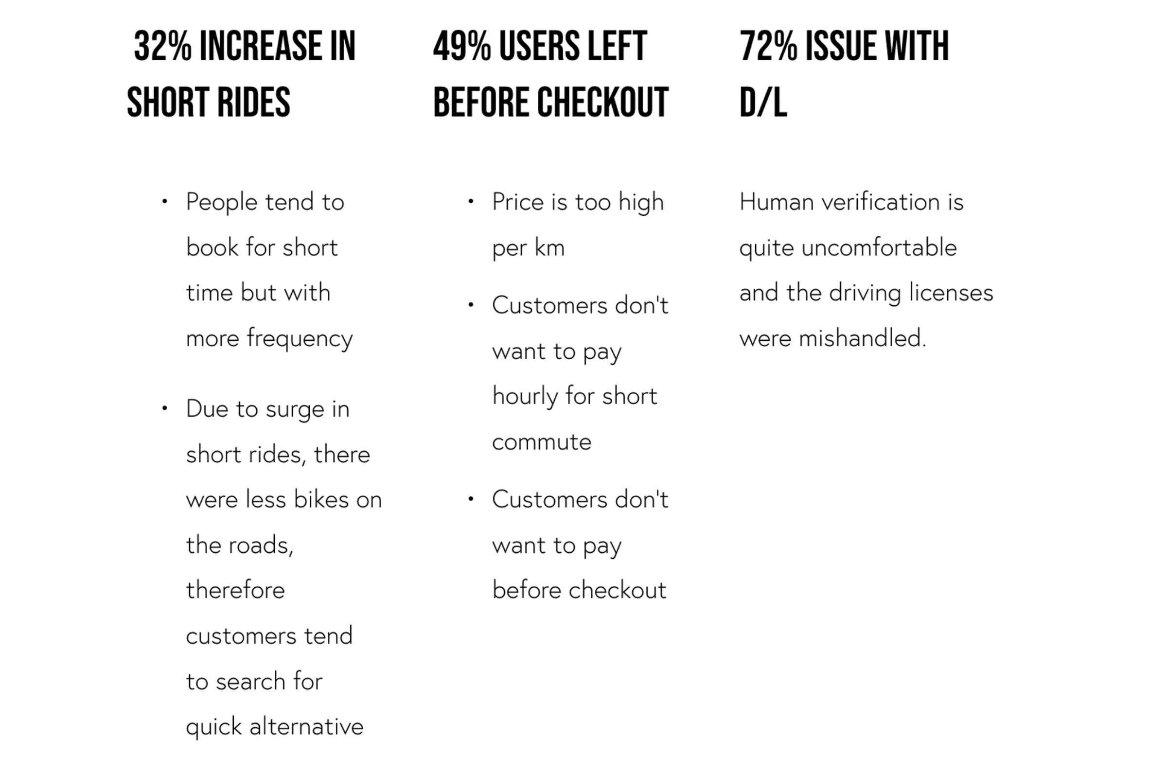
To understand the root of these issues, I conducted deep-dive interviews and analyzed user feedback. The data pointed to three critical pain points:
- 32% increase in short rides — people were booking more frequently for shorter intra-city commutes, but the high price per KM and hourly rates were acting as a barrier.
- 49% checkout abandonment — users didn’t want to pay hourly for short commutes, and the high upfront cost forced them to search for alternatives.
- 72% issue with driver’s license (D/L) verification — the manual human verification process was uncomfortable, and driving licenses were often mishandled.
The feeling matrix showed that users were frustrated by the long time taken to book, the hassle of finding bikes, and the fear of traffic and parking. 80% of riders didn’t want a huge choice of bikes — they prioritized a fast commute.
Personas
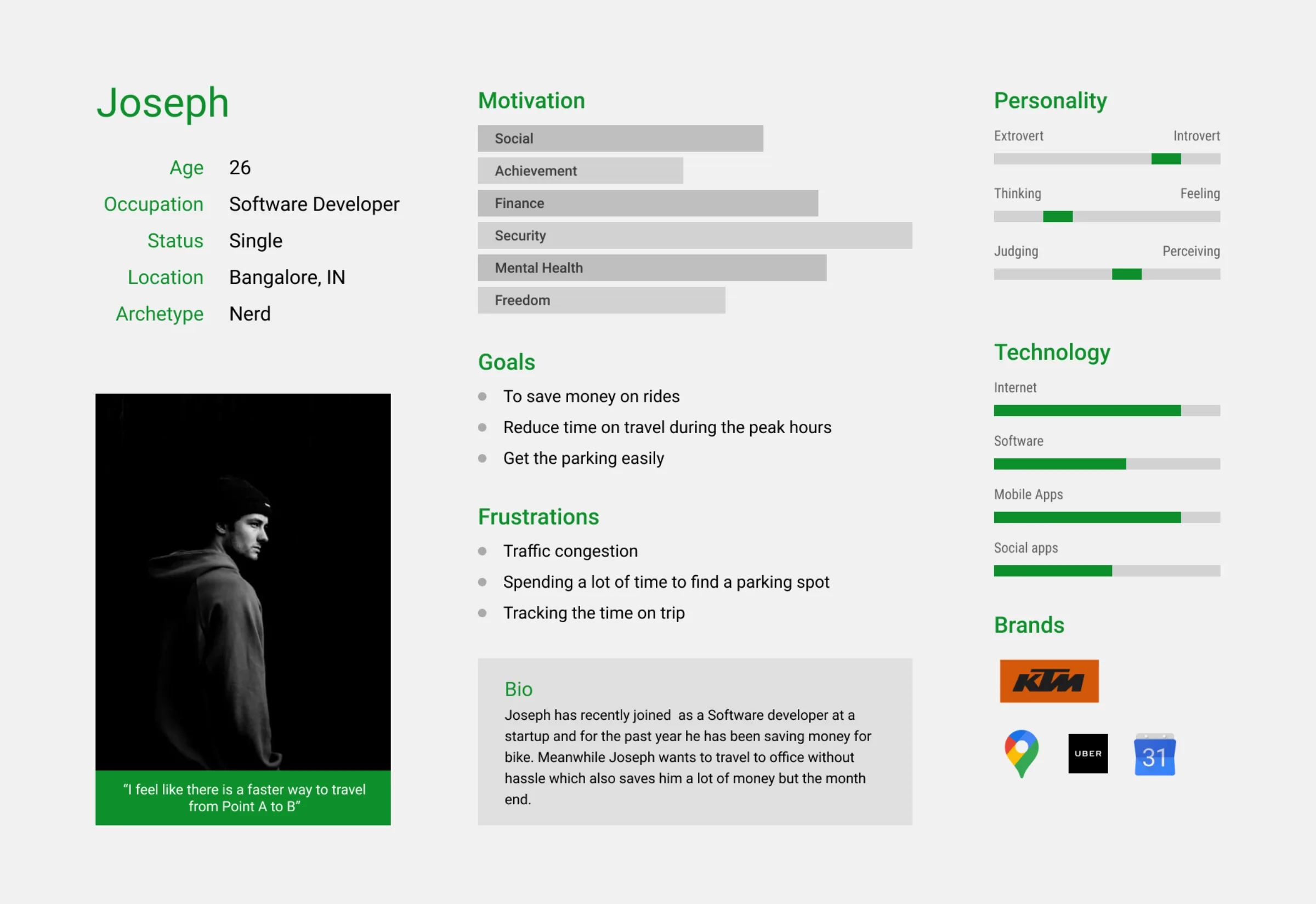
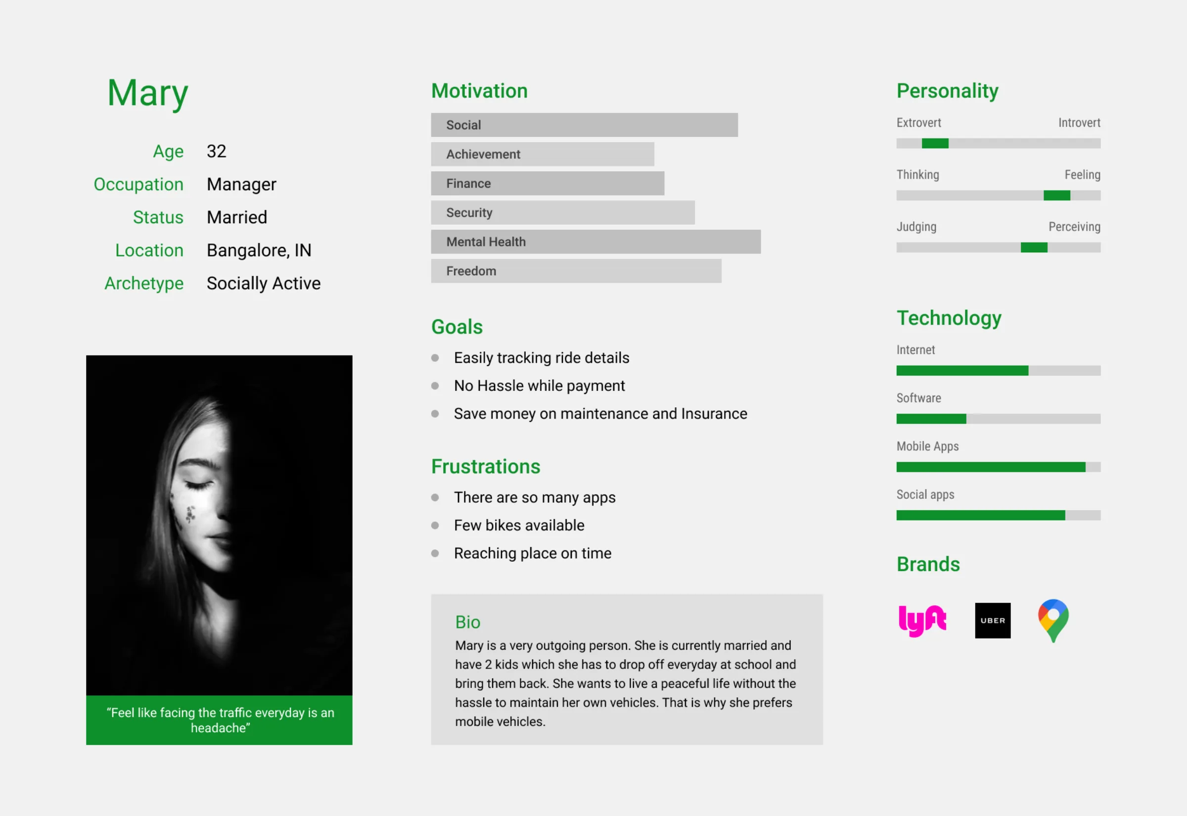
I defined two primary user personas to guide the design decisions:
Software developer
Wants to save money and time on his daily commute. He needs a hassle-free way to travel from Point A to Point B without the burden of bike maintenance or parking. Highly tech-savvy.
Manager
A busy mother who drops her kids off at school. She needs an app that saves her time, tracks her rides easily, and offers a no-hassle payment model — maintaining her own vehicle is a burden.
Competitive analysis
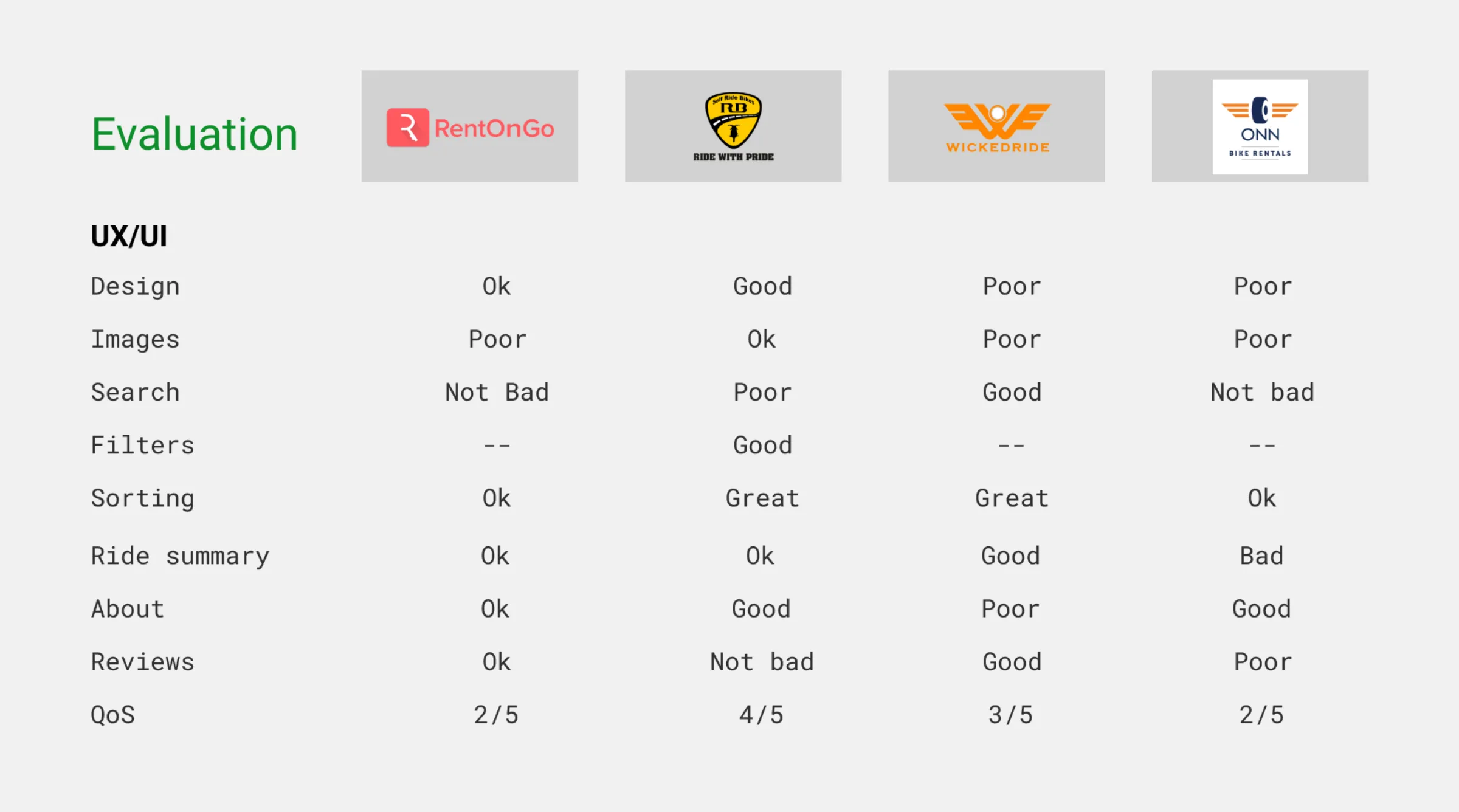
I evaluated four major competitors — RentOnGo, WickedRide, ONN — against my prototype. The analysis revealed that while some competitors had decent sorting, almost all of them suffered from poor UX/UI, poor search, and a lack of filters.
Crucially, their Ride Summary and About sections were subpar, and driving license verification was a notorious bottleneck. This identified a significant white space for a streamlined, mobile-first solution.
IA & user flow
Unlock and go
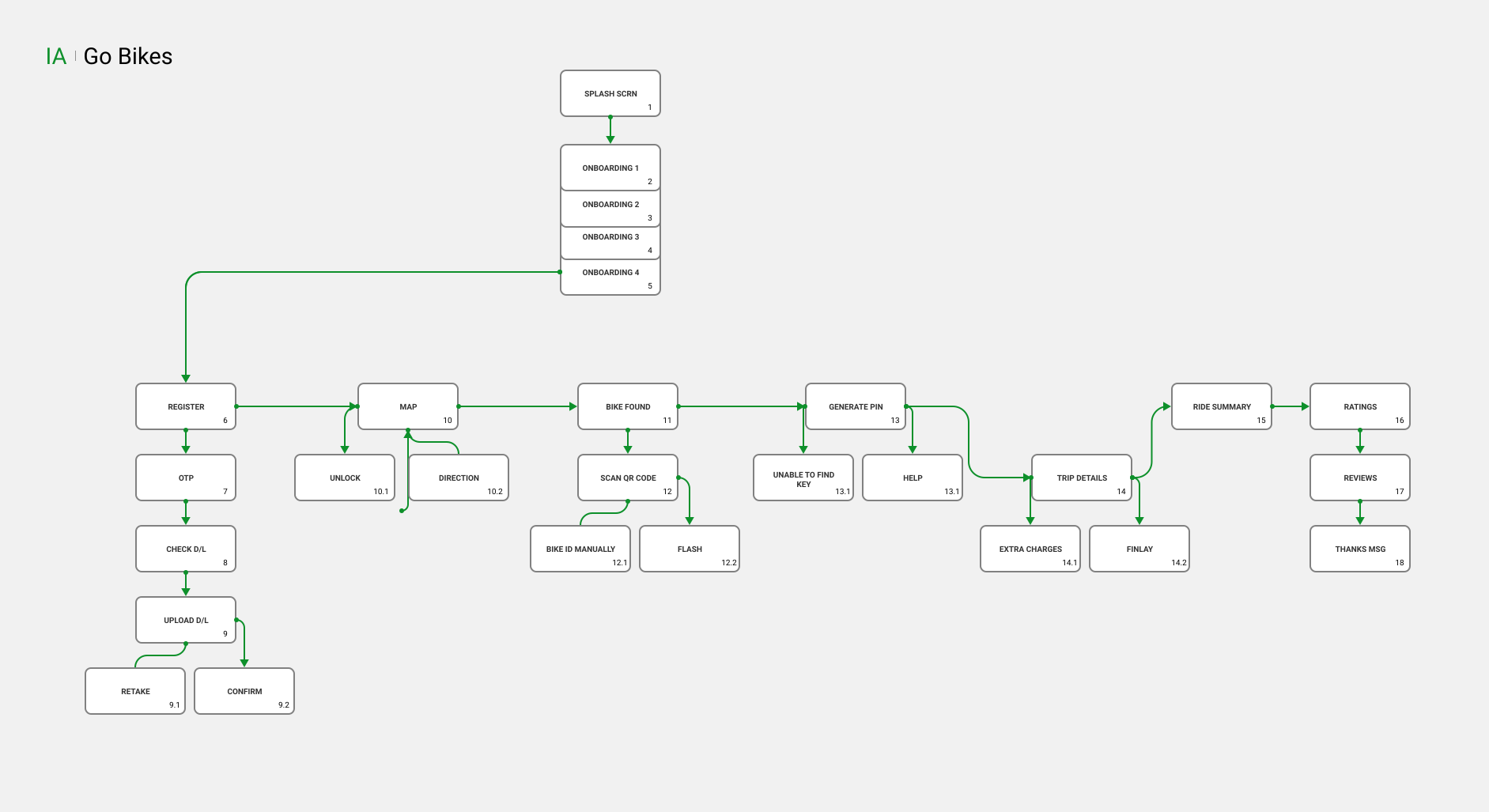
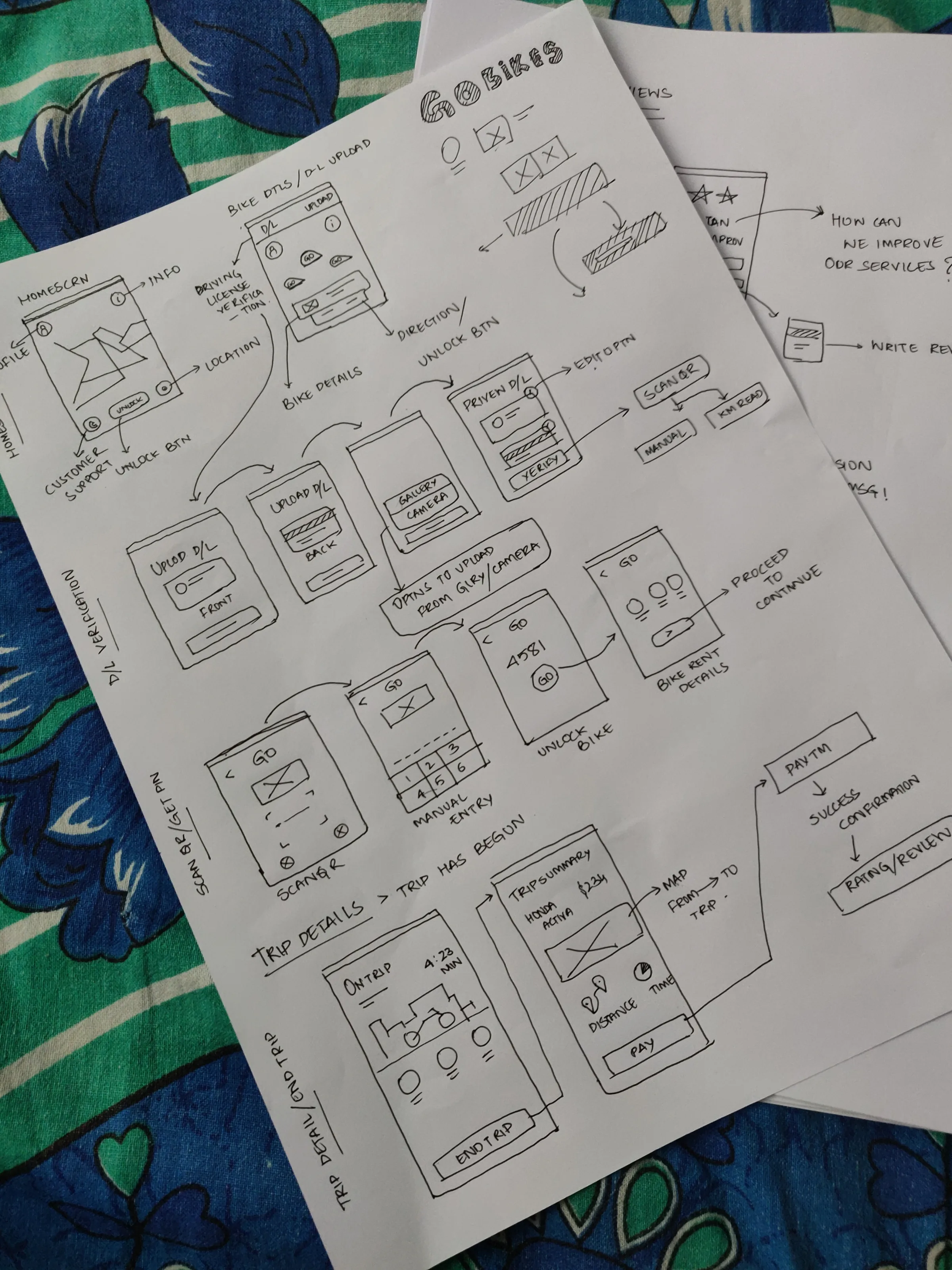
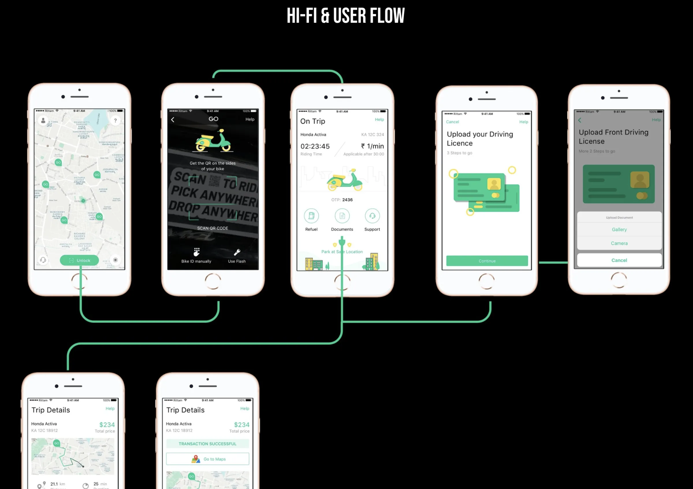
The information architecture was simplified to focus on the core “unlock and go” functionality. The user flow was mapped to reduce cognitive load:
The solution
Design highlights & features
The goal was to build a dockless, app-based rental system that felt effortless. Key features:
Instant D/L verification
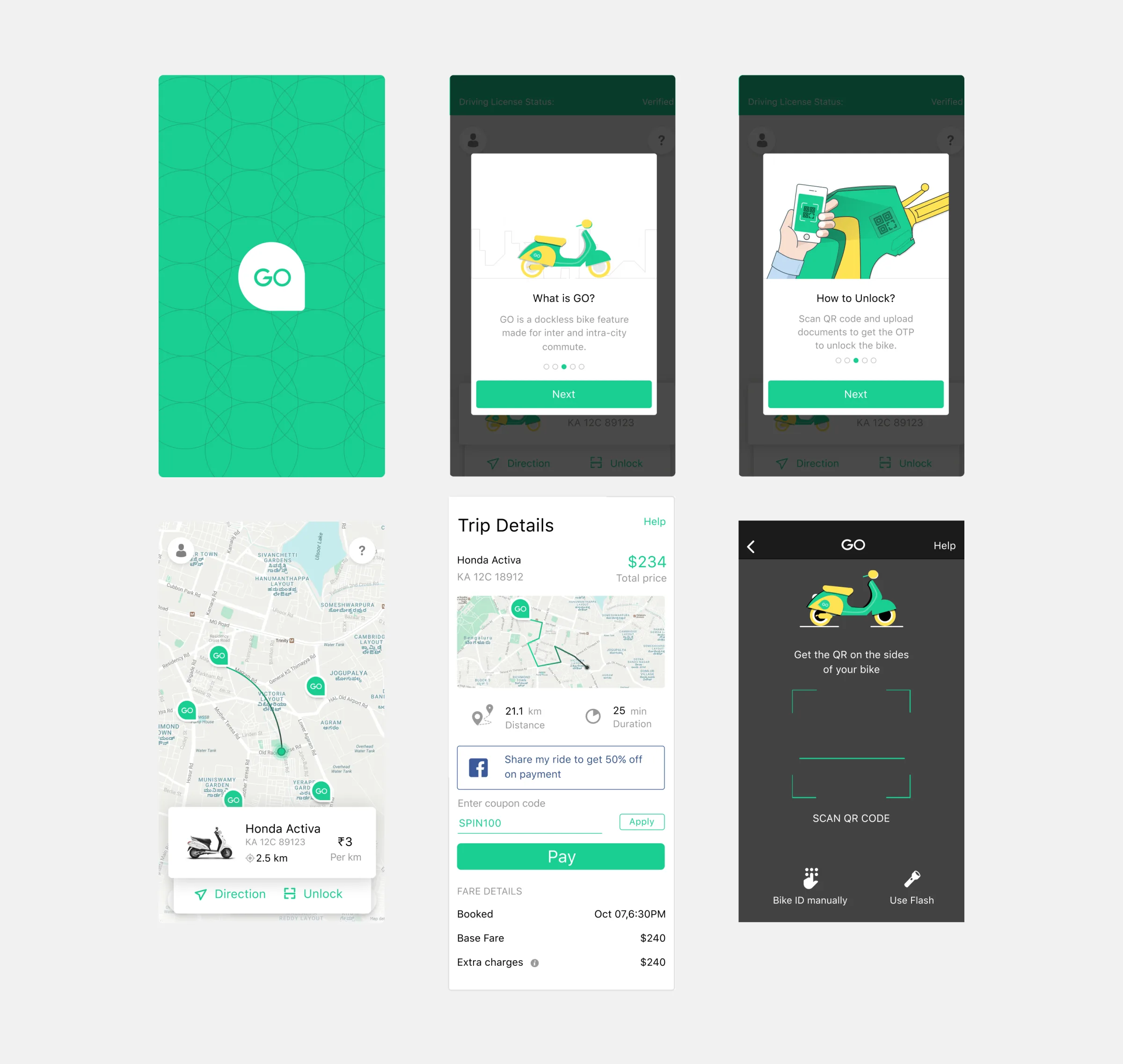
Instead of human verification, I designed an in-app document upload flow with automatic processing, reducing the hassle and onboarding time.
Minimalist selection
To address the “too many choices” pain point, I limited the fleet choice on the landing page to just the relevant bike models available nearby.
Pay after you ride
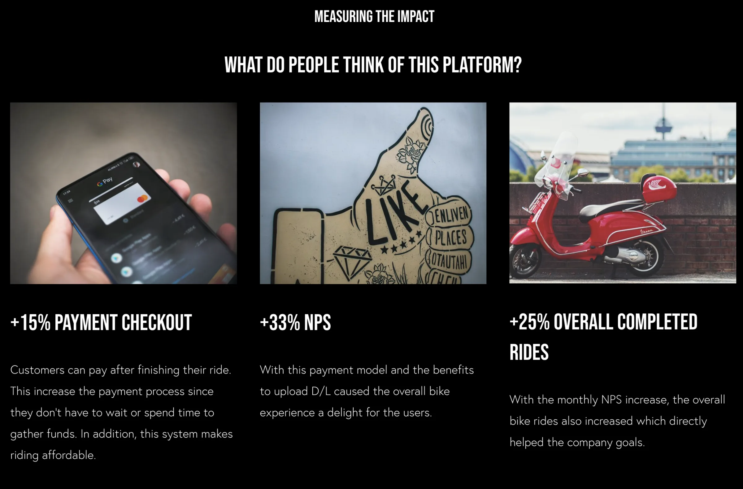
To combat the 49% checkout abandonment, I pivoted the business model to Post-Pay. Users unlock the bike, ride, and are only charged at the end based on time or distance — whichever is more affordable.
Smart unlock
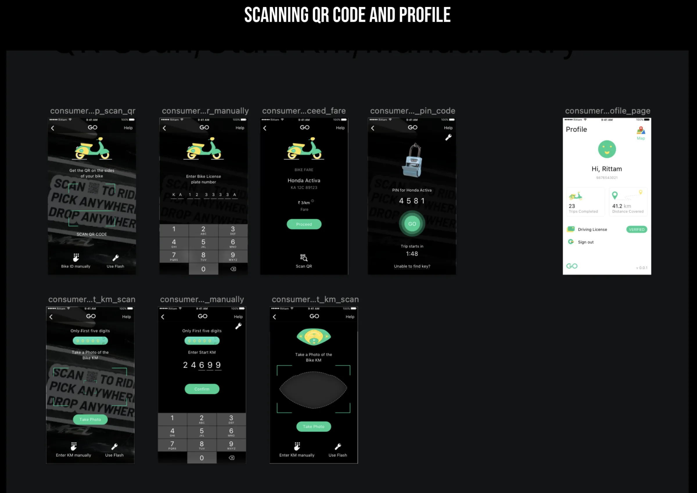
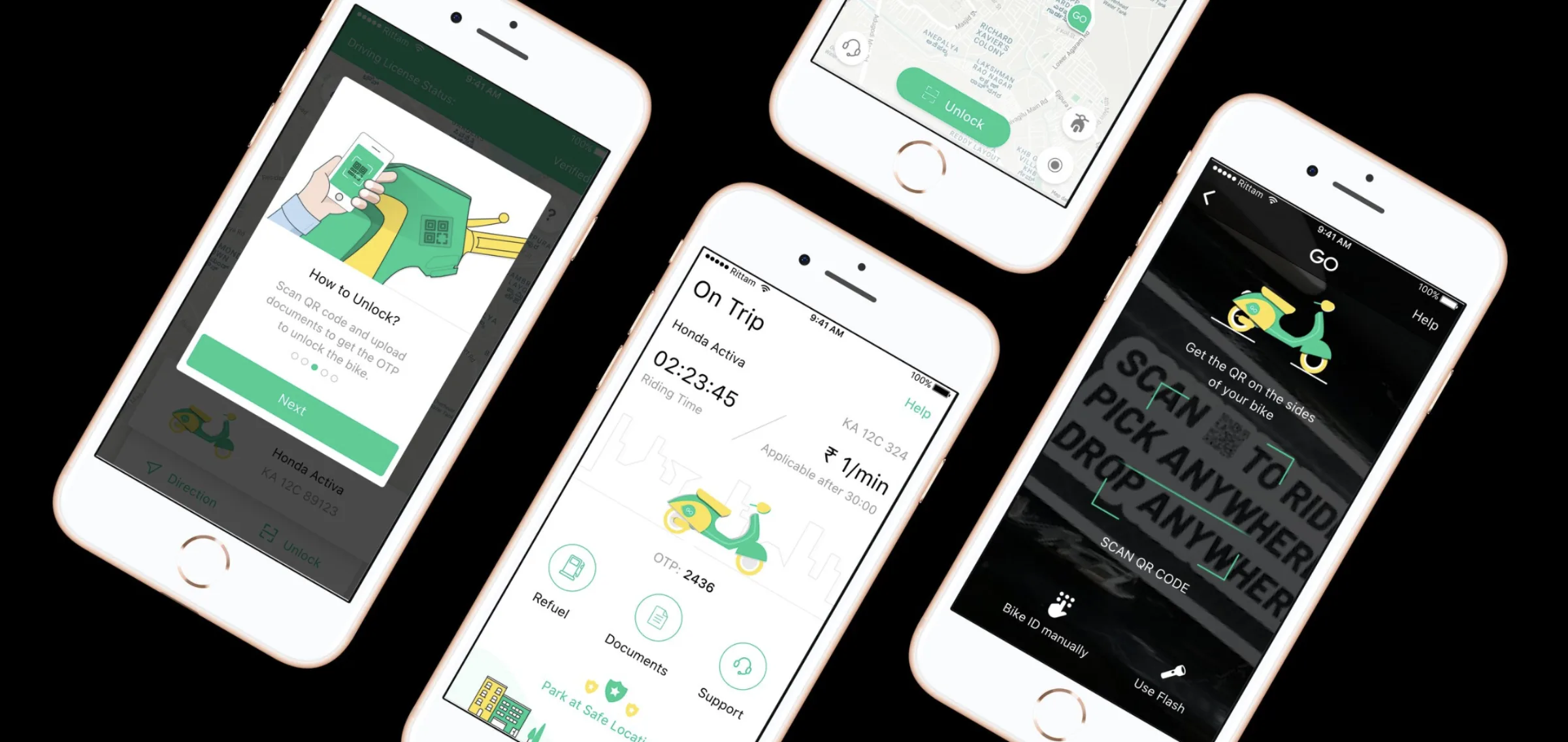
A QR code scanner with manual PIN entry as a fallback for seamless bike unlocking.
Intuitive trip tracking
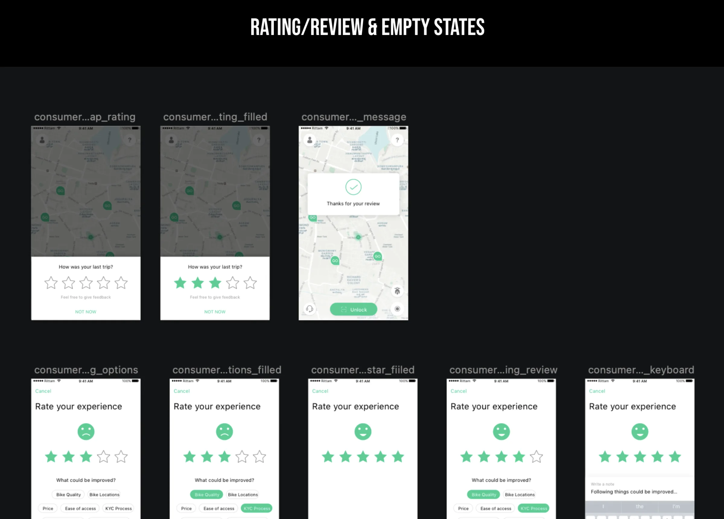
Real-time map view, a live billing counter, and “Park at Safe Location” guidelines to reduce ride anxiety.
SWOT & strategy
Aligning design with business
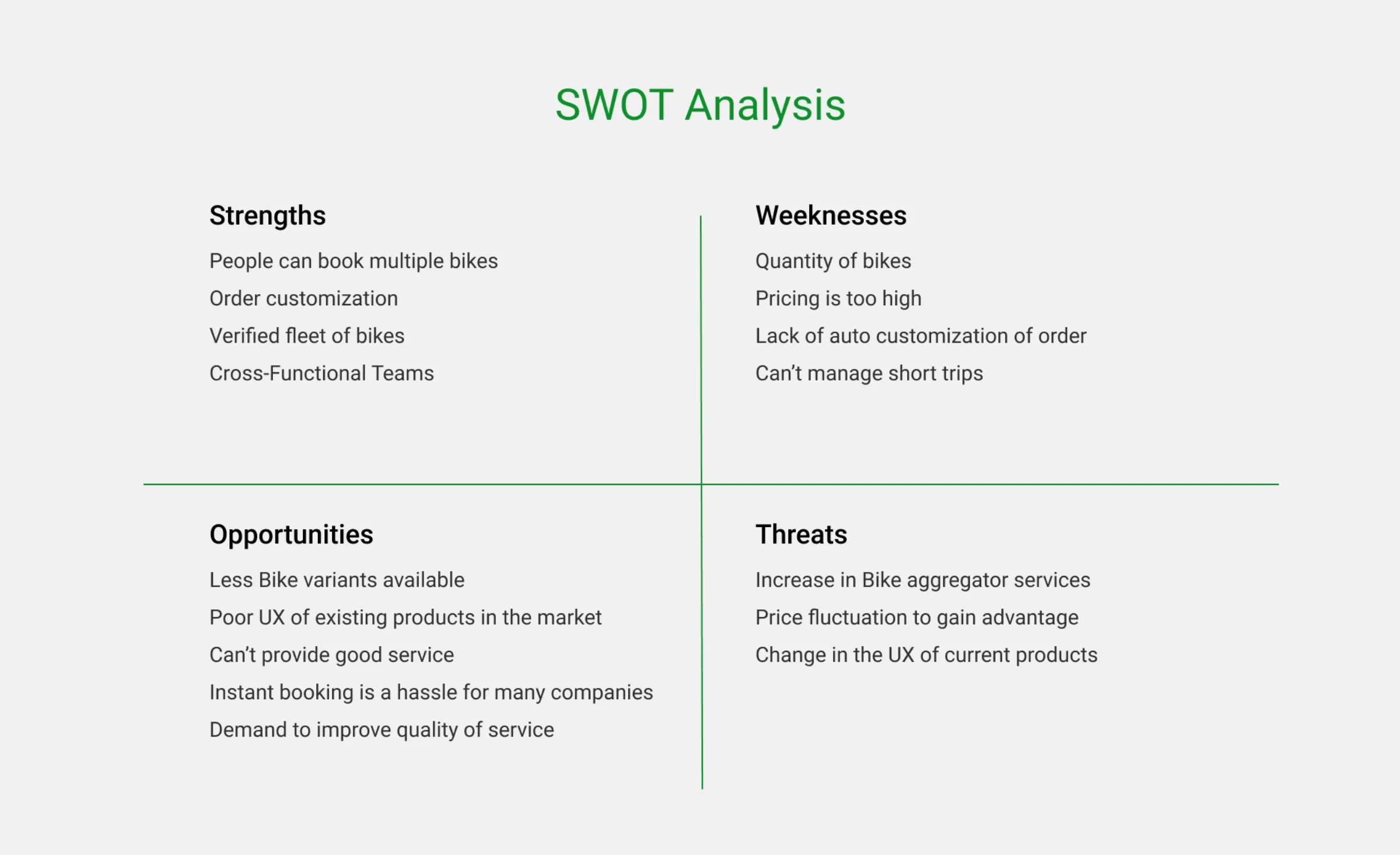
I facilitated a business-level SWOT analysis to align design with company goals:
Strengths
Cross-functional teams, a verified fleet of bikes, and the new short-term model.
Weaknesses
Pricing was too high for short trips, and the UI lacked auto-customization.
Opportunities
Existing competitors lacked good service and had poor UX; demand for improved quality was rising.
Threats
Rising aggregator services and price fluctuations.
Results
Measuring the impact
The redesigned platform launched on iOS in 2018. Post-launch, I tracked the key performance indicators (KPIs) against the baseline from research:
Conclusion
What this project taught me
Business model is part of the UX
The biggest lever wasn’t a screen — it was changing when the customer pays. Aligning the product’s business model with how people actually behave removed a barrier no amount of UI polish could.
Research turns anecdotes into decisions
The surge in short rides and the 49% checkout abandonment gave every design decision a direction — from simplified fleet selection to Post-Pay.
Psychology shapes payment flows
Paying upfront for a service not yet rendered felt wrong to users. Recognizing that psychological barrier made the pivot obvious.
OutcomeThe resulting design not only solved the “hassle” of renting a bike but also directly contributed to the company’s growth metrics — significantly improving the overall quality of service and user satisfaction in the urban mobility sector.