At a glance
A design system is not a UI kit. It is a shared language for making product decisions.
Flux is a design system created for Rentesy to bring visual consistency, reusable patterns, and a more systematic way of designing product experiences. The work spans foundational tokens, layout rules, typography, color, elevation, icons, components, variants, states, documentation, and usage guidance.
The case study is intentionally structured around systems thinking rather than a gallery of screens: what problem the system solves, how the parts relate, what trade-offs were made, and how the system can remain useful as the product grows.
Honest framingQuantitative project metrics — adoption rate, engineering hours saved, defect reduction — were not provided in the source material. They are deliberately not invented here; a measurement plan is included instead.
The challenge
Consistency fails by a thousand reasonable decisions
As a product grows, inconsistency rarely comes from a lack of design skill. It usually comes from many reasonable decisions being made independently.
A button can slowly acquire different heights, radii, colors, icon rules, and states. Inputs can diverge between flows. Spacing becomes a collection of one-off values. Designers recreate components instead of reusing them. Developers translate visual decisions differently across surfaces.
The underlying problem is therefore bigger than visual inconsistency:
- Design decisions become duplicated.
- Patterns become difficult to discover.
- Small differences accumulate into a fragmented experience.
- Handoff requires more interpretation.
- New screens take longer to build consistently.
- The system becomes harder to evolve because its rules are implicit.
Flux addresses this by turning recurring decisions into explicit, reusable system rules.
The opportunity
From screens to a scalable product language
The opportunity was to move Rentesy’s product design from:
Individual screens → reusable patterns → shared rules → scalable product language
Instead of treating every interface as a new composition, Flux establishes a hierarchy:
This structure makes the system useful at two levels:
- Abstract — designers can reason about tokens, patterns, and constraints.
- Concrete — teams can assemble real product experiences from validated components.
Goals & qualities
What Flux optimizes for
Create a consistent visual language
Shared rules for typography, color, spacing, corner radius, shadows, grids, icons, and component states.
Reduce repetitive design work
A component should be designed once, then configured through controlled properties rather than redrawn repeatedly.
Make responsive behavior explicit
Define how the system behaves across desktop, tablet, and mobile.
Make components predictable
Components expose meaningful properties: size, state, variant, icon visibility and position, text, and theme/mode.
Improve communication between design and engineering
Tokens and component properties provide a common vocabulary that is easier to discuss than screenshots alone.
| Quality | What it means in practice |
|---|---|
| Consistency | Similar problems receive similar solutions |
| Scalability | New screens can be composed without reinventing foundations |
| Flexibility | Components support legitimate variations without becoming uncontrolled |
| Clarity | Rules and usage are documented instead of living only in a designer’s memory |
| Maintainability | Changes can happen at the token/component level rather than screen by screen |
Consistency does not mean everything looks identical. A good design system creates controlled variation.
System architecture
The atomic model
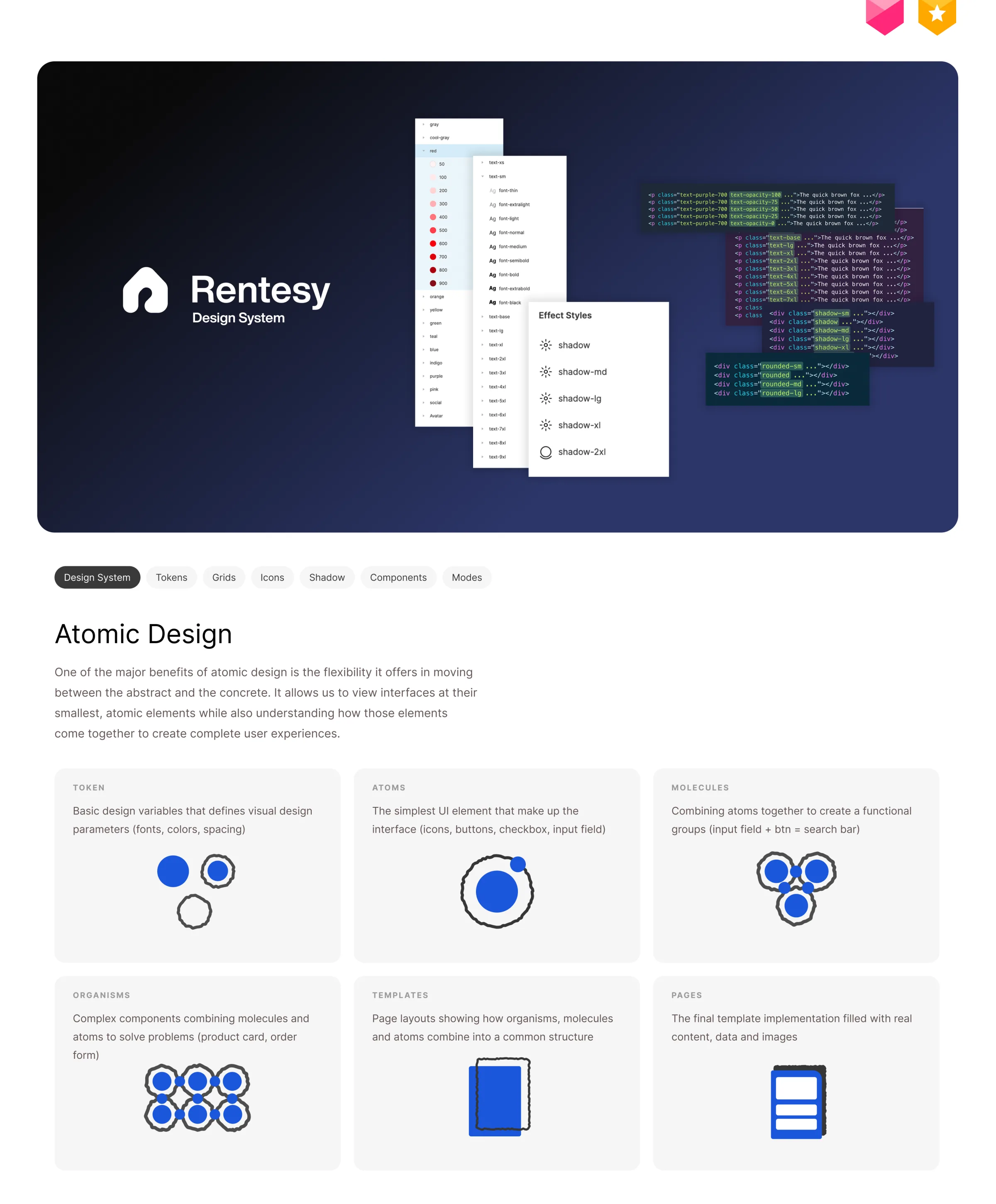
Flux uses atomic design as a mental model for organizing complexity:
- Foundations
- Tokens
- Atoms
- Molecules
- Organisms
- Templates
- Pages
Tokens: separating decision from implementation
Tokens represent the smallest reusable design decisions — colors, typography, spacing, radius, shadows. They are valuable because they separate the decision from the implementation:
A button should not need to know that its primary color is a particular blue value. It should consume a meaningful system value.
Atoms are the smallest meaningful UI elements (icons, buttons, inputs, checkboxes). Molecules combine atoms into functional groups — input + button becomes a search control; icon + label becomes a navigation item. The key principle is composition instead of duplication. Organisms combine molecules into interface structures like product cards, order forms, and navigation. Templates answer “where do the pieces go?”, and pages answer “what does this structure look like with real content, data, and imagery?”
Why the hierarchy mattersIt prevents a common failure mode: jumping directly from a screenshot to a component without understanding the system underneath it.
Foundations · type, space & shape
The visible decisions, made once
Typography as a scale
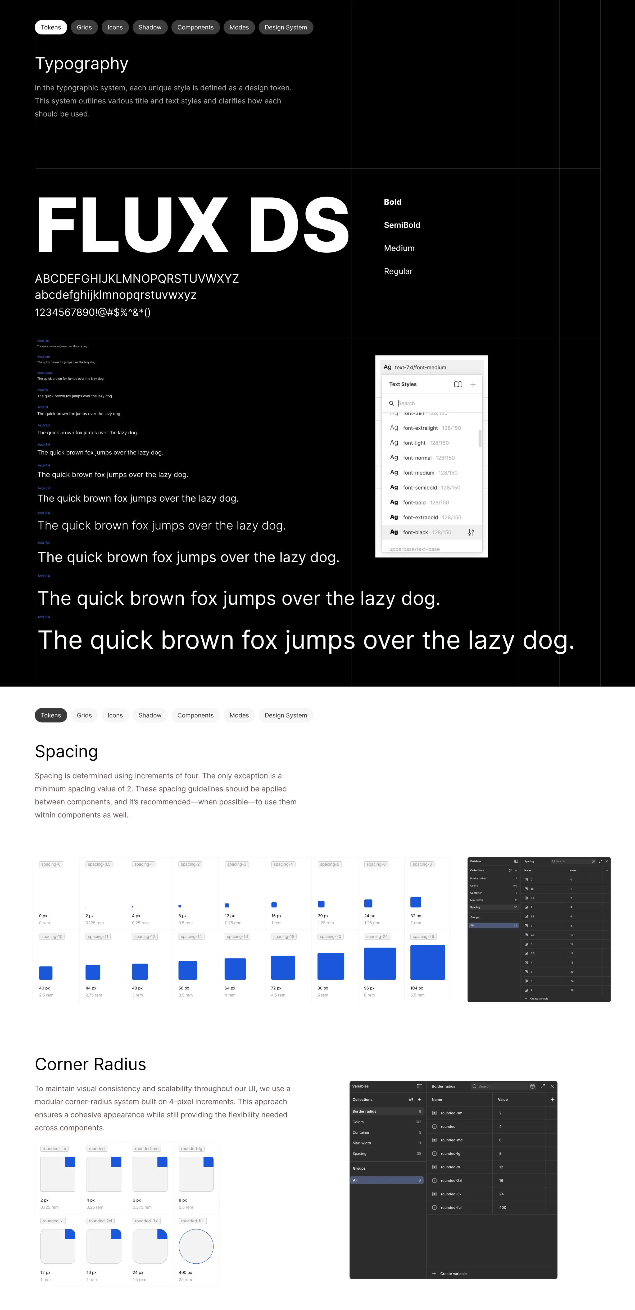
Typography is one of the most visible system decisions — it affects hierarchy, density, readability, and perceived brand quality. The system includes weights from thin through black, multiple text sizes, and a reusable hierarchy:
Without a type scale, every screen can slowly invent its own hierarchy. With one, designers choose from a known vocabulary.
Trade-offA constrained type scale can feel less expressive than designing every headline independently. That is intentional — the system gives up some local freedom in exchange for global coherence.
Spacing: rhythm over arbitrary values
Flux uses an incremental spacing system based primarily on 4px increments. Instead of 17px, 23px, 31px, the system encourages designers to think in reusable increments. Spacing is one of the easiest areas for inconsistency to hide — cards with different internal padding, unrelated section gaps, misaligned controls — and a tokenized scale makes those decisions deliberate.
Radius: a small vocabulary
Radius should communicate component family and hierarchy, not become decoration.
A shared radius vocabulary helps buttons feel related to inputs, cards to other containers, and prevents designers from accumulating one-off corner values. More tokens create flexibility — but too many options increase decision fatigue.
Foundations · color & grids
Semantic color and explicit layout contracts
Primitive vs. semantic thinking
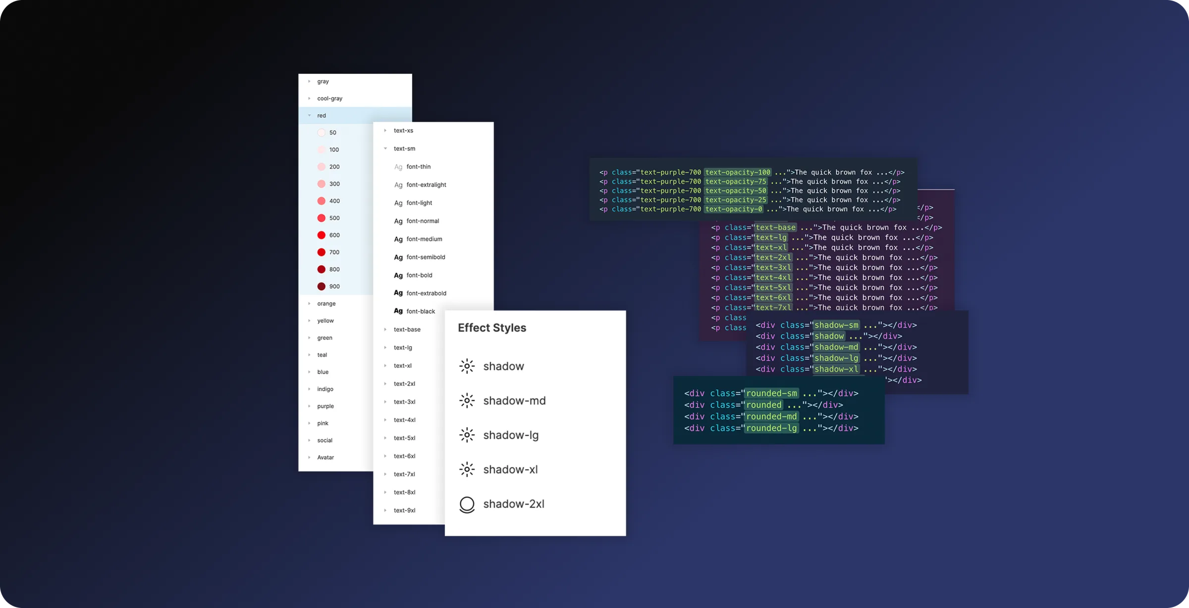
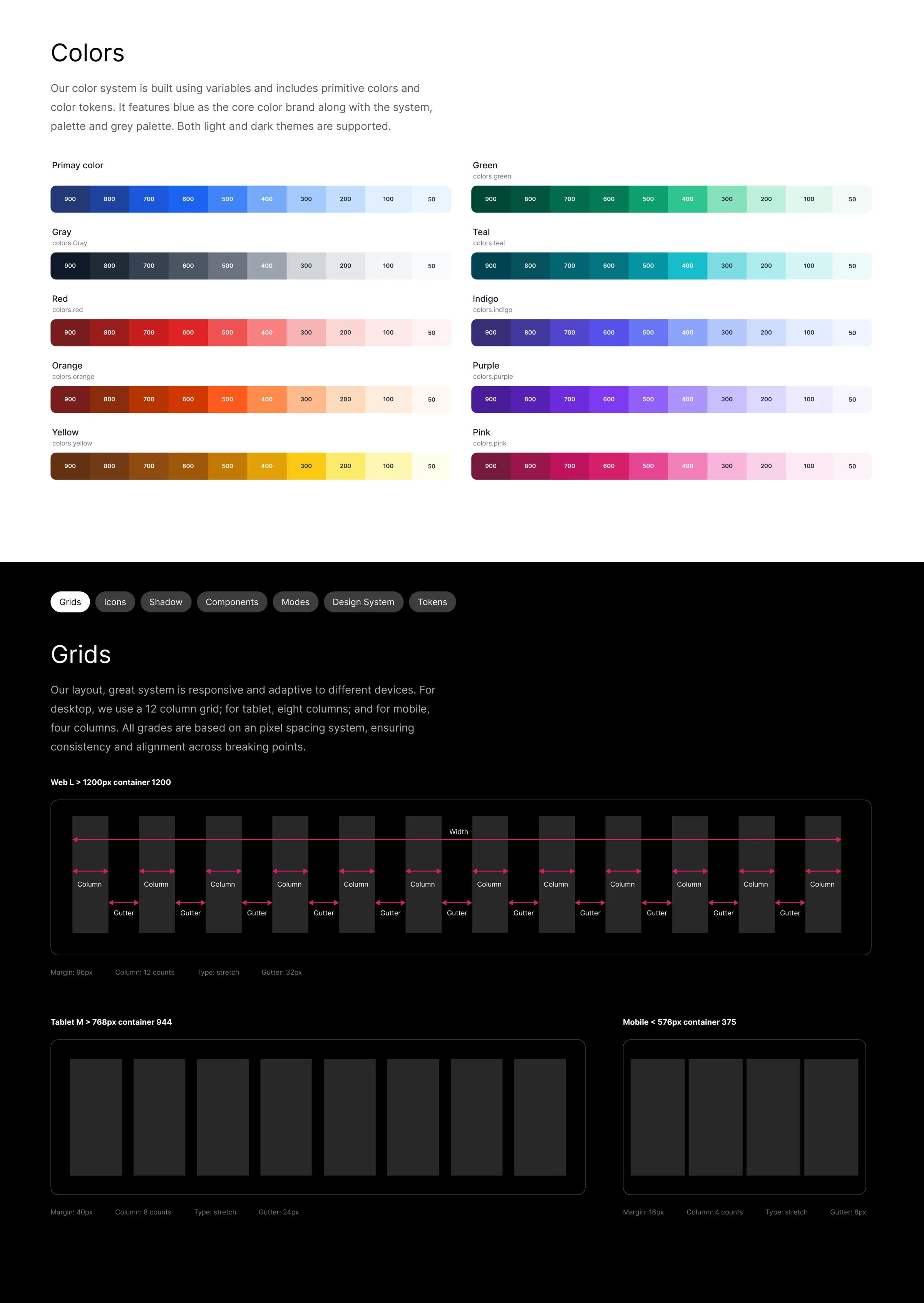
The color system organizes ten palettes — primary, gray, red, orange, yellow, green, teal, indigo, purple, pink — into numbered levels, creating a predictable scale from lighter to darker. A mature system distinguishes primitive tokens (raw palette values like blue-500, gray-700) from semantic tokens (meaningful roles like text-primary, surface-default, action-primary, status-error).
This separation allows the same semantic role to change without requiring every component to understand the underlying palette — and it is what makes light and dark themes possible:
Trade-offA tokenized color architecture adds abstraction. For a tiny product that can feel like overhead — for a growing product, the abstraction pays for itself because a color decision can propagate consistently across many components.
Responsive grids: a layout contract
| Breakpoint | Columns | Gutters | Margin | Container |
|---|---|---|---|---|
| Desktop | 12 | 32px | 96px | ≈ 1200px |
| Tablet | 8 | 24px | 40px | ≈ 944px |
| Mobile | 4 | 8px | 16px | ≈ 375px |
The important part is not the number of columns — it is that the system explains how content should behave as viewport width changes. A fixed grid vocabulary improves alignment, responsive composition, implementation consistency, design review, and handoff.
Foundations · elevation & icons
Depth and iconography as systems
Elevation: shadow as a system
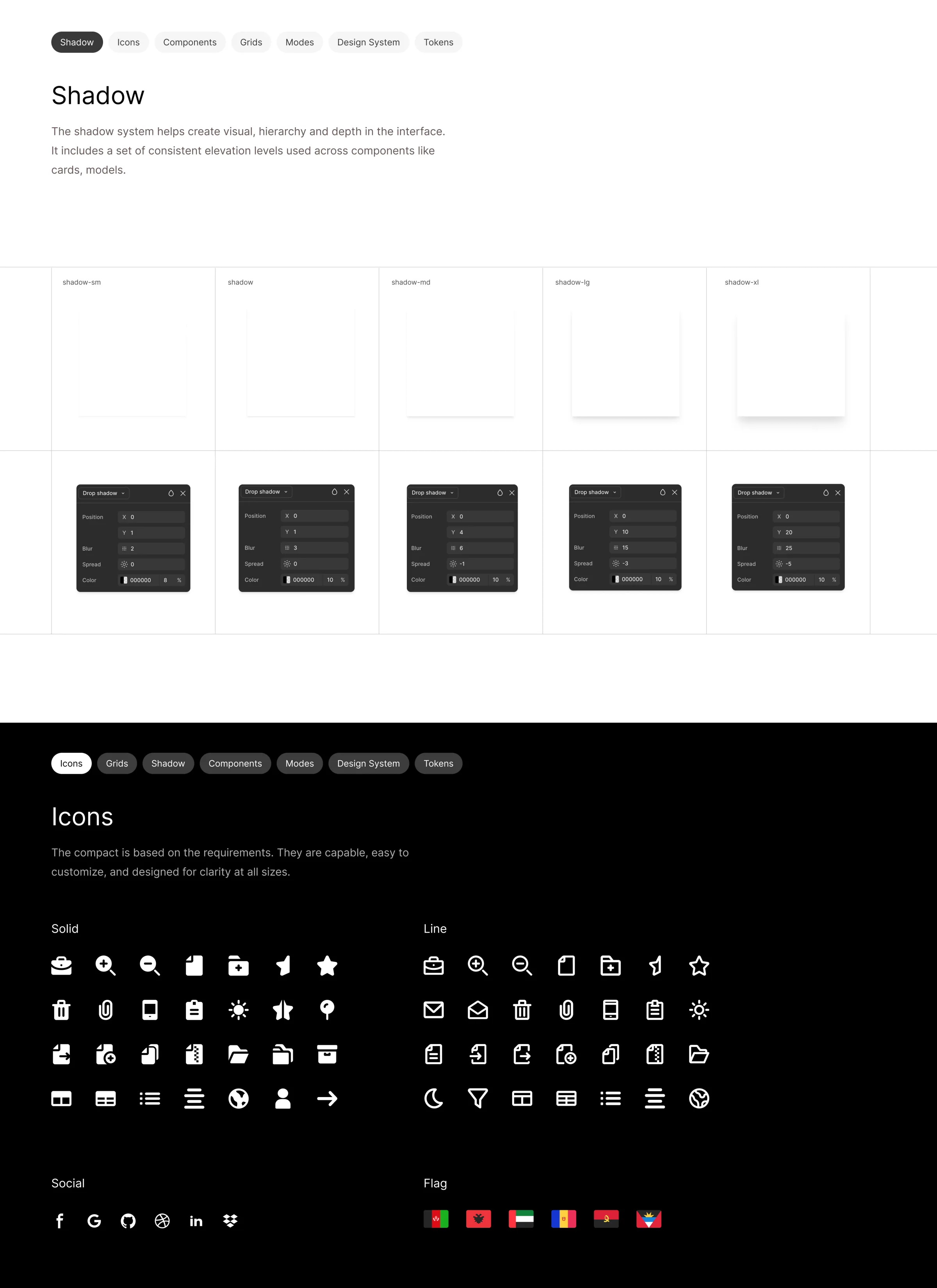
Shadow is treated as a system rather than an ad-hoc visual effect. Documented levels — shadow-sm through shadow-2xl — each correspond to a different combination of x/y position, blur, spread, and opacity. A component floating above a surface should not require a designer to invent a new shadow every time; a small vocabulary creates a consistent visual depth model.
Trade-offThe system sacrifices some ability to create unique atmospheric effects. That is appropriate — elevation should communicate meaning, not simply add visual polish.
Icons: a typography-like vocabulary
Flux includes solid and line icon families, along with social and flag groups. Icons are treated as part of the interface’s typography-like vocabulary — they need consistent stroke/weight, bounding box, visual density, alignment, and optical sizing.
Trade-offSupporting both solid and line styles increases flexibility but also the risk of mixing styles inconsistently. The presence of an icon does not automatically mean every icon style is interchangeable.
Component anatomy · button
One component, controlled properties
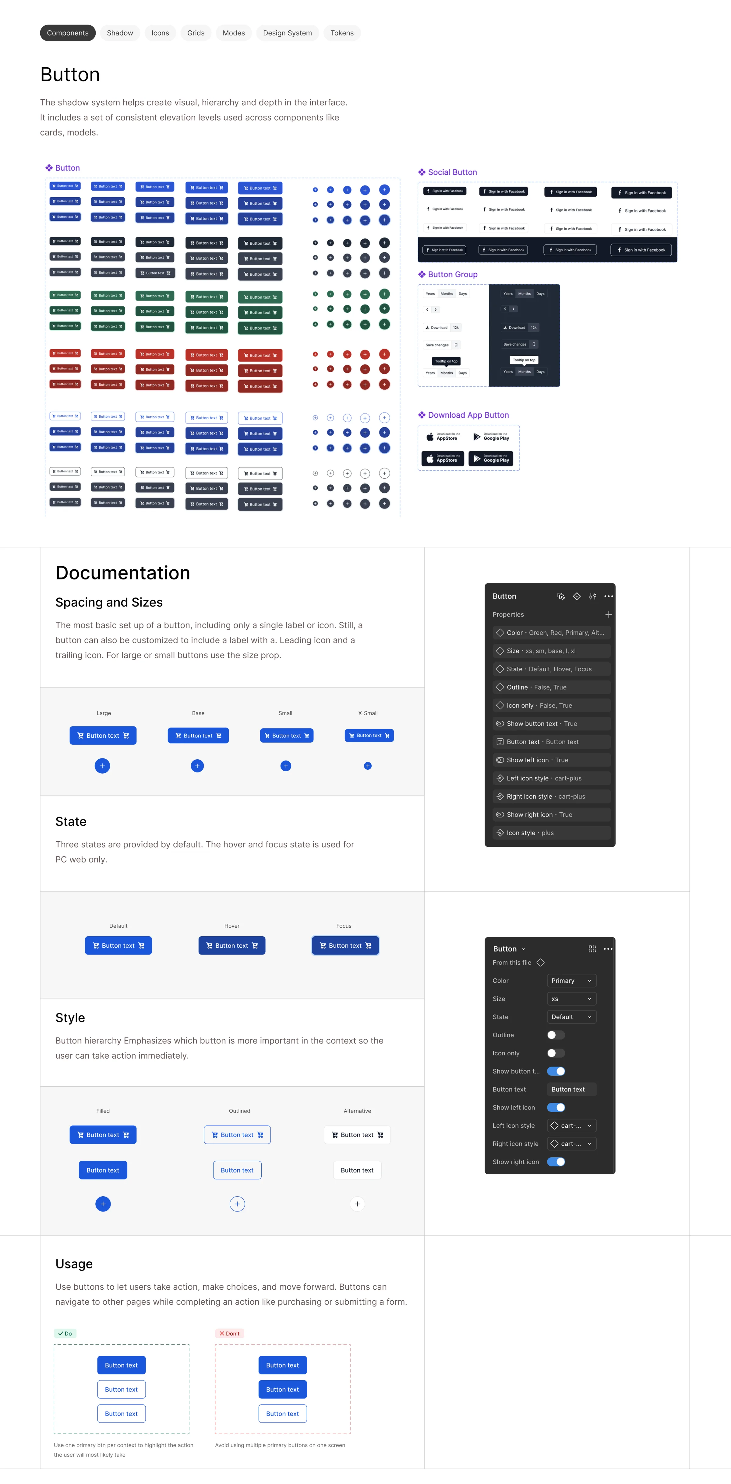
Buttons are a good example of how Flux moves from a visual element to a configurable system. Instead of creating separate components — PrimaryButton, SecondaryButton, SmallPrimaryButton, IconButton, PrimaryButtonWithLeftIcon — the system models the button as a single component with controlled properties:
- Color
- Size
- State
- Outline
- Icon-only
- Show left icon
- Show right icon
- Content
The button system documents four sizes (large, base, small, extra-small), three styles (filled, outlined, alternative), interaction states (default, hover, focus), content options (text, icon-only, left icon, right icon), and multiple semantic color families with their corresponding states.
Usage guidance: behavior, not only dimensions
- Use one primary action when appropriate
- Use secondary/alternative actions for lower-priority choices
- Avoid presenting multiple competing primary actions
A design system should document behavior and intent, not only dimensions.
Trade-offToo few variants → designers create hacks and overrides. Too many variants → the component becomes difficult to understand. Flux sits in the middle by exposing properties that correspond to meaningful design decisions.
Component anatomy · text field
Quality lives in the full interaction lifecycle
Text fields demonstrate the same system thinking. The component supports label, input control, helper text, left/right icons, placeholder, multiple sizes, light/dark behavior — and the full documented state set:
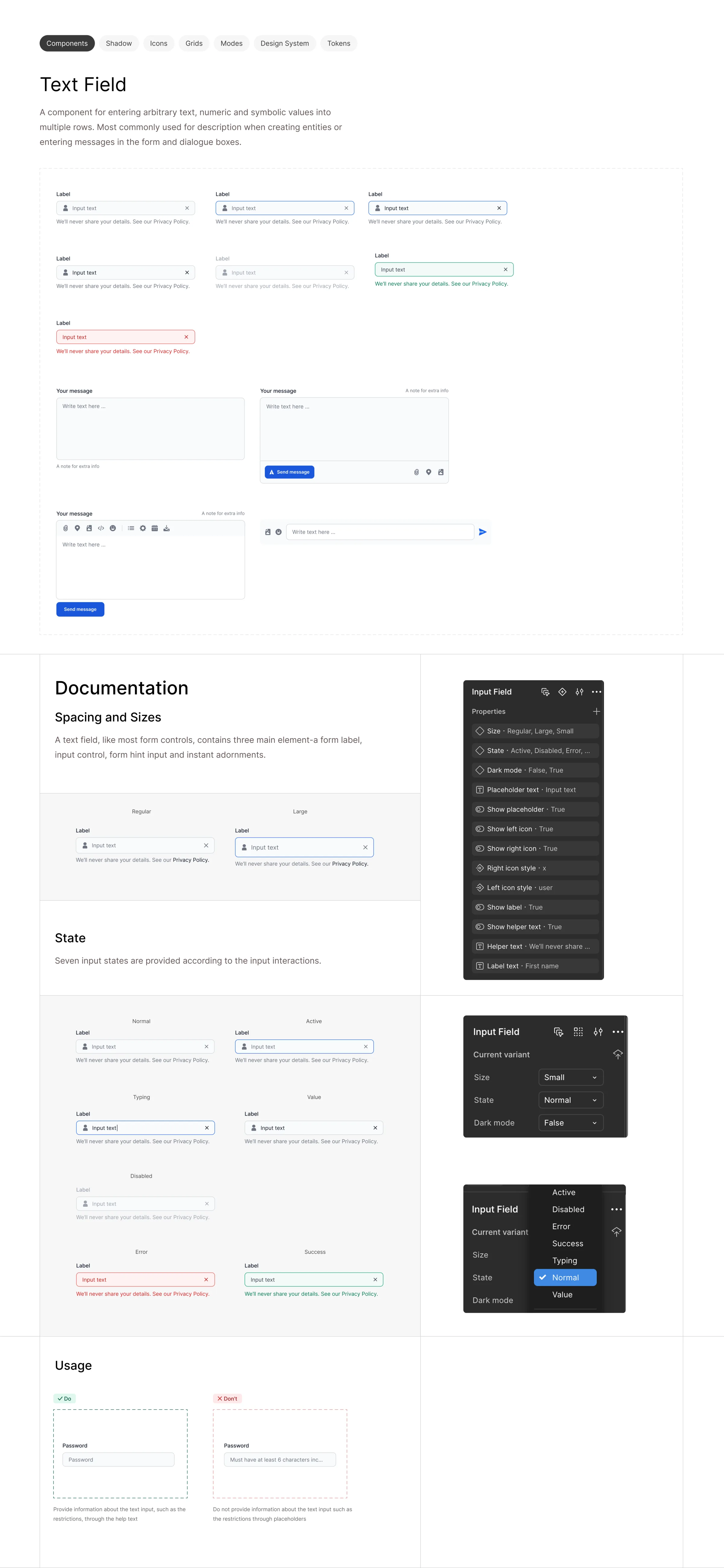
Trade-offMore states mean more design and implementation effort. But omitting states simply pushes that work downstream, where it is more expensive and more likely to become inconsistent.
Form principleHelp users understand what an input requires instead of relying only on placeholder text.
The system distinguishes supporting/helper information from the placeholder itself — supporting better accessibility, clearer validation, easier scanning, and more robust form behavior. A design system moving beyond aesthetics into interaction quality.
The component ecosystem
60+ components and variants
The component library is where the system becomes operational. The source material presents 60+ components and variants — a breadth that matters because a design system becomes valuable when it solves recurring product problems, not only when it defines visual foundations.
Navigation & orientation
Breadcrumbs, steppers.
Feedback
Toasts, progress bars, badges.
Discovery & context
Tooltips, popovers, dropdowns.
Loading
Skeletons, spinners.
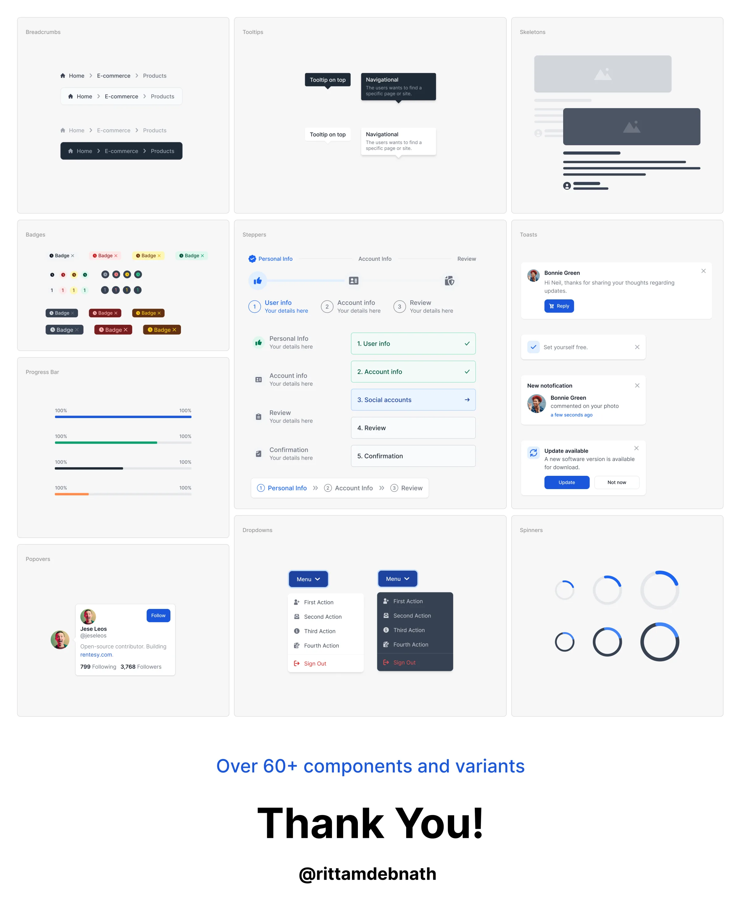
This gives Flux a practical role in the product lifecycle: designers can compose interfaces from established patterns instead of repeatedly solving the same interaction problems.
Documentation & decisions
Documentation is part of the system
One of the most important decisions in Flux is that documentation is part of the system itself. A component is not complete simply because it exists in Figma. A useful component needs:
- An API
- Visual examples
- States
- Variants
- Usage guidance
- Constraints
- Implementation intent
Documentation changes from a reference archive into a decision-making tool.
The system’s decision hierarchy
A useful way to understand Flux is as a chain of responsibility:
The diagnostic questionWhen something feels wrong, the team can ask: at which layer does the problem belong? Wrong blue → token problem. Inconsistent padding → spacing problem. Wrong button state → component problem. Confusing action hierarchy → pattern problem.
Key trade-offs
What was optimized for — and what was deliberately sacrificed
A compelling design-system case study should not pretend every decision was universally correct. The value is in understanding what was optimized for and what was deliberately sacrificed.
Consistency vs. flexibility
A system with no constraints is not a system. Flux prioritizes scalable consistency for recurring product UI over arbitrary one-off styling.
Abstraction vs. speed
Tokens add an abstraction layer. For a single screen it can feel slower than styling directly — across dozens of screens it removes repeated decision-making. Optimize for cumulative product velocity, not one-screen speed.
Variant coverage vs. complexity
Every additional variant increases flexibility and maintenance cost. Variants should represent meaningful product states or semantic choices — not every possible visual permutation.
Pixel precision vs. system rhythm
A designer can always find a slightly different spacing value that looks perfect in isolation. The system asks: does this value improve the whole product? Favor reusable scales over isolated perfection.
Documentation vs. maintenance cost
Documentation takes time and becomes stale if nobody owns it. But undocumented systems transfer that cost to every future designer and developer. Document the decisions users of the system actually need to make.
Rich iconography vs. consistency
More icons create coverage but increase the possibility of visual inconsistency. Use a constrained visual language and make solid/line usage intentional.
Beyond a library
Accessibility & engineering readiness
Three levels the system operates at
Visual
How should it look?
Behavioral
How should it respond?
Systemic
How should future designers and engineers reproduce the decision?
Accessibility as a system property
The visual material does not provide a complete accessibility audit, so accessibility outcomes should not be claimed as completed. But Flux creates a strong foundation for an accessibility layer. Future validation should explicitly cover:
| Area | What to validate |
|---|---|
| Color | WCAG contrast, interactive states, error/success without color alone |
| Focus | Visible keyboard focus, consistent treatment, logical order |
| Forms | Persistent labels, helper/error messaging, clear required/invalid states |
| Buttons | Sufficient target size, accessible names, icon-only labeling |
| Motion | Reduced-motion behavior, non-color status, loading announcements |
A mature design system should treat accessibility as a system property, not a screen-by-screen checklist.
Engineering readiness
The strongest next step is mapping design tokens directly to implementation tokens, so the design file and product code describe the same system:
| Design | Code |
|---|---|
| spacing-4 | --spacing-4 |
| rounded-md | --radius-md |
| shadow-lg | --shadow-lg |
Governance & measurement
A design system is a product of its own
Without governance, a design system tends to decay. A lightweight Flux governance model could include contribution, review, and release:
- Is this problem recurring?
- Can an existing component solve it?
- Does it require a new token?
- Is the behavior documented?
- Are all states defined?
- Does it work responsively?
- Is accessibility considered?
- Does it increase or decrease system complexity?
Patch
Small visual/bug correction.
Minor
Backward-compatible component or token addition.
Major
Breaking change to a component contract.
Measuring success
Because the provided material contains no verified quantitative metrics, the strongest approach is to define what should be measured rather than invent results:
| Category | What to track |
|---|---|
| Adoption | % of product UI using Flux components, new screens using system primitives, component reuse frequency |
| Efficiency | Time to design common flows, approval → implementation time, time resolving visual inconsistencies |
| Quality | Post-release UI defects, inconsistent component instances, accessibility issues, custom overrides |
| System health | Unused/duplicate components, one-off variants, documentation freshness, token adoption |
| Developer experience | Time to find a component, time to implement a documented pattern, implementation questions per component |
The most meaningful metric is not how many components exist. It is: how much product work can happen without inventing the same solution again?
Reflection
What success looks like
If two people solve the same interface problem independently, their solutions should converge.
Not because they produce identical screens — but because they naturally reach for the same tokens, the same components, the same states, the same spacing rhythm, the same interaction patterns, and the same responsive rules. That is the real value of a design system.
The most important lesson from Flux is that a design system should be judged by the decisions it prevents teams from having to make repeatedly. The visible output is a library of colors, typography, spacing, radii, shadows, icons, components, and variants — but the real product is the invisible layer underneath.
In one sentenceFlux is best understood not as a collection of UI assets, but as an operating system for product design decisions.